Benjamin Moore Cabot (CC-480) is a refined, versatile neutral that exudes understated elegance and timeless charm. This soft gray-beige hue, often referred to as a "greige," strikes the perfect balance between warm and cool tones, making it a favorite among interior designers for its adaptability and ability to complement a diverse range of styles. Whether you're crafting a serene sanctuary or a sophisticated living space, Cabot offers a subtle yet impactful backdrop that elevates any room.
Cabot (CC-480) features nuanced undertones that contribute to its universal appeal. Its gray base is delicately warmed by beige undertones, creating a hue that feels cozy without overpowering the space. Depending on the lighting, Cabot may lean cooler in rooms with abundant natural daylight or warmer in areas with incandescent or soft white bulbs. This chameleon-like quality makes it an excellent choice for both contemporary and traditional interiors.
Benjamin Moore Cabot (CC-480) pairs beautifully with a wide array of coordinating colors, allowing you to create harmonious palettes tailored to your design vision. Here are some complementary shades to consider:
Cabot's adaptability makes it suitable for a variety of spaces and design purposes. Its neutral foundation ensures it works well in residential, commercial, and even transitional settings. Below are some of its best uses:
Cabot creates an inviting atmosphere, making it a go-to choice for shared living spaces. Pair it with plush furniture, textured throws, and metallic accents for a cozy yet chic vibe.
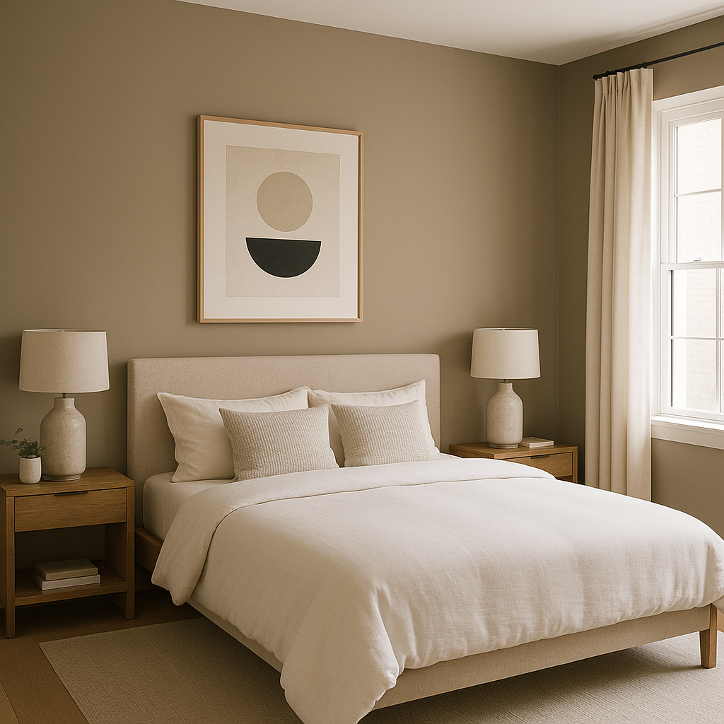
The soothing balance of gray and beige in Cabot fosters relaxation and tranquility, ideal for creating a restful retreat. Combine it with soft pastels or deep jewel tones to personalize the space.
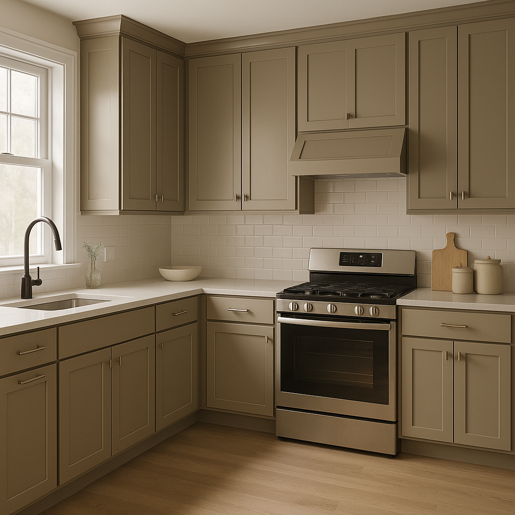
For kitchens, Cabot is a fantastic choice for walls or cabinetry, where its neutral tone brings understated elegance. Pair it with brass hardware or marble countertops for a timeless look.
Cabot's muted sophistication works wonderfully in bathrooms, especially when paired with crisp white tiles or brushed nickel fixtures. Add pops of color through towels or artwork for an eye-catching contrast.
Its subtle demeanor makes Cabot a perfect choice for transitional spaces like hallways and entryways, where it effortlessly ties together adjoining rooms with varying color schemes.
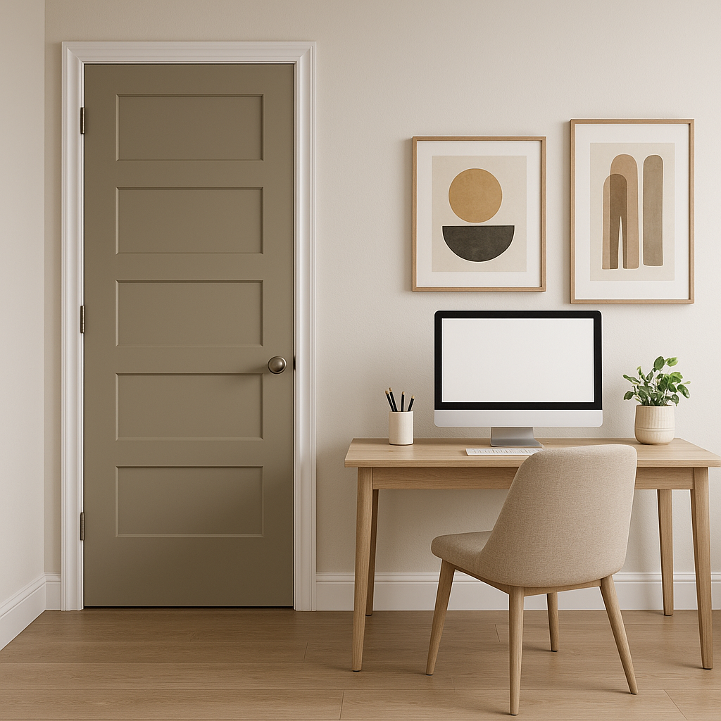
For home offices or workspaces, Cabot provides a neutral canvas that promotes focus and productivity. Pair it with darker wood furniture and modern lighting for a professional yet inviting ambiance.
Cabot (CC-480) stands out for its ability to adapt to any interior design style, from classic and traditional to modern and minimalist. Its balanced undertones ensure it never feels too stark or overly warm, offering the ideal middle ground for homeowners seeking a neutral palette. Whether you're designing a cozy family home or a sleek commercial space, Cabot is a dependable choice that delivers both style and substance.
Test Cabot in different lighting conditions before committing to it. Sampling the color in your space will help you observe how its undertones shift throughout the day, ensuring it aligns perfectly with your vision.
View Colors Only by Brand (No Imagery):
Sherwin-Williams
|
Benjamin-Moore
|
Behr
|
Valspar
Live on the Eastern Slope of Colorado and looking for a local painting professional, check out all our painting services and reach out for a free estimate.
Copyright © 2026 : Wild Fox Painting Inc. : 12435 Mead Way, Littleton, CO 80125


