Benjamin Moore Tiramisu (CC-486) is a rich, warm neutral that evokes the comforting hues of the dessert it's named after. With a delicate balance of earthy sophistication and timeless appeal, this paint color brings an inviting warmth to both modern and traditional interiors. Its versatility and understated charm make it a popular choice for homeowners and designers alike.
Tiramisu (CC-486) is best described as a medium tan with subtle brown undertones. It leans slightly warm, with a creamy softness that feels like a hug for your walls. These undertones lend the shade a grounded, organic quality—perfect for creating spaces that feel cozy yet refined.
The undertones also include hints of muted peach and beige, which help Tiramisu adapt beautifully to various lighting conditions. In rooms with ample natural light, it may appear lighter and more golden, whereas in dimmer spaces, it shifts toward a deeper, earthier tone. This chameleon-like quality ensures that Tiramisu remains versatile without losing its character.
Benjamin Moore Tiramisu pairs effortlessly with a wide range of colors, making it a dream for creating harmonious palettes. Here are some ideas for complementary and coordinating colors:
Neutral Pairings: To maintain a cohesive, neutral look, pair Tiramisu with Benjamin Moore White Dove (OC-17) or Simply White (OC-117). These crisp whites brighten the space and provide a clean contrast to Tiramisu’s warmth.
Earthy Complements: For a serene and grounded feel, consider darker browns and taupes like Benjamin Moore Kendall Charcoal (HC-166) or Revere Pewter (HC-172). These shades amplify Tiramisu’s natural elegance and create depth in your design.
Soft Accents: Add a hint of color with muted greens, blues, or terracottas. Shades like Benjamin Moore Constellation (AF-540) or Venetian Red (HC-181) offer subtle contrast while maintaining the overall warmth and sophistication of the palette.
Bold Contrasts: If you’re seeking drama, pair Tiramisu with deep jewel tones like Benjamin Moore Hale Navy (HC-154) or Black Beauty (2128-10). This combination creates striking contrast and adds a contemporary flair.
Tiramisu (CC-486) is a versatile shade that works beautifully in various spaces and applications. Below are some ideal uses for this warm neutral:
Tiramisu’s warm undertones make it a perfect choice for living rooms where comfort and sophistication are key. Use this shade as a main wall color and complement it with plush textiles in earthy tones. Pair it with wooden furniture or accents to enhance the organic feel of the space.
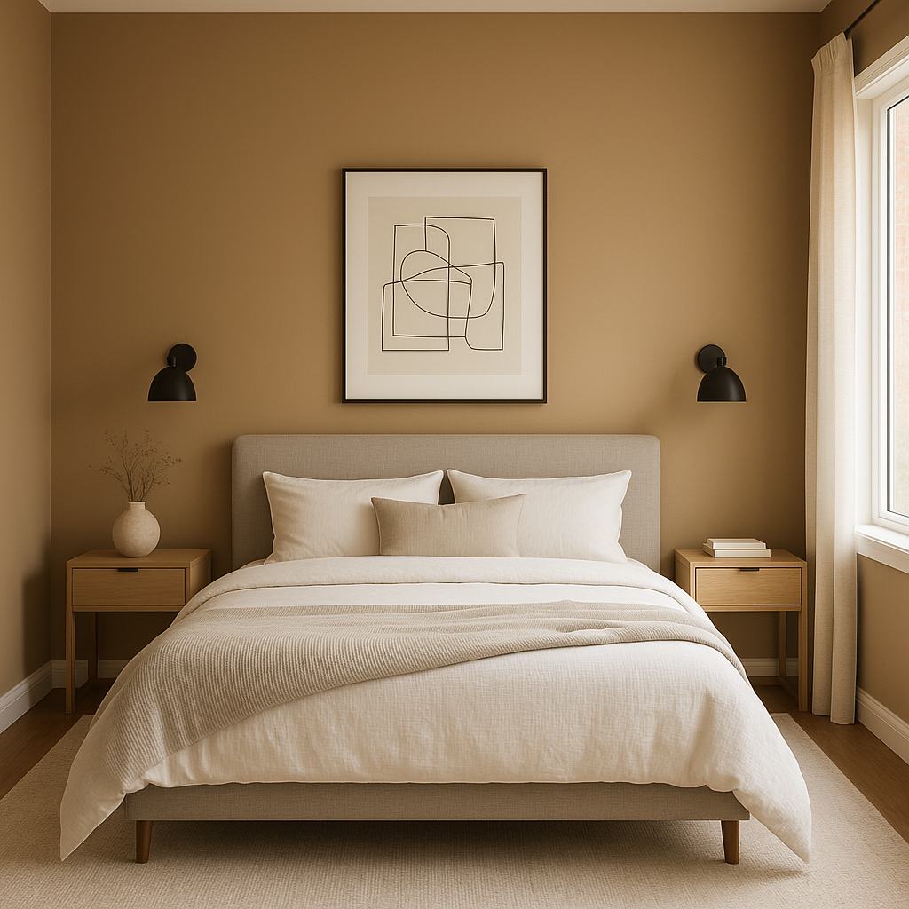
As a calming and cozy hue, Tiramisu is an excellent choice for creating a restful atmosphere in bedrooms. Pair it with soft bedding in ivory, beige, or muted greens for a tranquil retreat. Add metallic accents like brushed gold or bronze for a touch of luxury.
If you’re looking to create a warm and inviting dining area, Tiramisu delivers beautifully. Its rich tones promote a sense of intimacy and make the space feel welcoming, ideal for entertaining guests. Consider pairing it with deep wood finishes and bold accent colors for a classic yet striking look.
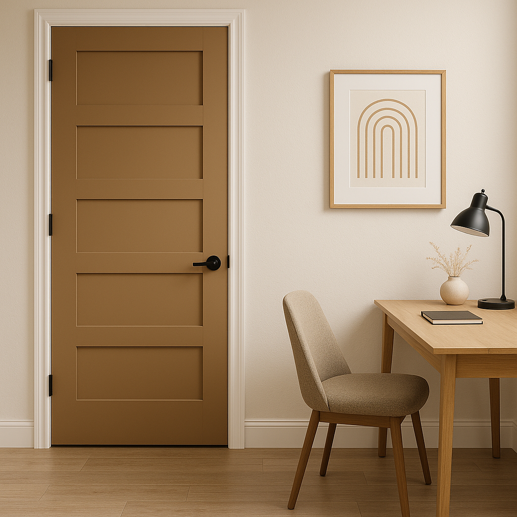
Tiramisu’s adaptability makes it a great choice for transitional spaces like hallways and entryways. It provides warmth without overwhelming the area, creating a seamless flow between rooms. Add contrast with white trim or doors for a polished appearance.
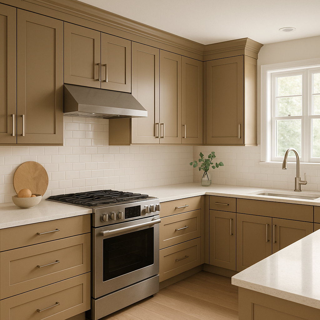
For kitchens, Tiramisu can shine as a backdrop to wooden cabinetry or stone countertops. It complements both traditional and modern designs, making it a flexible option for spaces that need both functionality and style.
It’s essential to consider lighting when choosing Benjamin Moore Tiramisu (CC-486). In rooms with abundant natural light, it appears lighter and more golden, giving the space a sunny, inviting vibe. In artificial or dim lighting, it takes on a deeper, cozier tone, making it ideal for spaces where warmth and intimacy are desired. Always test the color in your specific lighting conditions before committing to ensure it aligns with your vision.
Tiramisu (CC-486) is more than just a paint color—it's a design element that can transform your home. Its warm, earthy tones exude comfort while remaining versatile enough to pair with a variety of styles and palettes. Whether used in a living room, bedroom, or kitchen, Tiramisu creates a timeless backdrop that enhances any space. For those seeking a neutral that’s anything but ordinary, Benjamin Moore Tiramisu is an exceptional choice.
View Colors Only by Brand (No Imagery):
Sherwin-Williams
|
Benjamin-Moore
|
Behr
|
Valspar
Live on the Eastern Slope of Colorado and looking for a local painting professional, check out all our painting services and reach out for a free estimate.
Copyright © 2026 : Wild Fox Painting Inc. : 12435 Mead Way, Littleton, CO 80125


