Benjamin Moore High CC-620 is a sophisticated and versatile neutral paint color that effortlessly bridges the gap between modern minimalism and classic elegance. Its understated charm makes it a favorite among homeowners, interior designers, and decorators looking to create a space that exudes calmness and refinement. Whether you're designing a cozy living room, a serene bedroom, or a sleek kitchen, this hue offers endless possibilities for enhancing your interiors.
High CC-620 is a warm greige (a blend of gray and beige) that features subtle undertones of taupe and a slight hint of green. These undertones give the color a dynamic quality that shifts beautifully throughout the day, depending on the lighting. In natural light, it leans toward a soft beige with warmth, while under artificial lighting, the gray nuances come forward, lending a more contemporary feel. The hint of green ensures that it never feels too cool or stark, making it an excellent choice for achieving balance in a space.
Benjamin Moore High CC-620 pairs effortlessly with a variety of coordinating colors, offering both contrast and harmony. Here are some ideas to inspire your palette:
Trim and Accents: To highlight architectural details like crown molding or wainscoting, opt for crisp whites such as Benjamin Moore Chantilly Lace OC-65 or White Dove OC-17. These clean whites add a touch of brightness and elegance, creating a stunning contrast against High CC-620’s warm tones.
Soft Neutrals: For a monochromatic look, pair High CC-620 with lighter greige shades like Classic Gray OC-23 or Edgecomb Gray HC-173. These colors flow seamlessly together, making them ideal for open-concept spaces.
Earthy Greens and Blues: Bring out the subtle green undertones by incorporating earthy hues such as October Mist 1495 or Saybrook Sage HC-114. For a serene coastal vibe, consider soft blues like Palladian Blue HC-144 or Woodlawn Blue HC-147.
Bold Contrasts: If you’re looking for a dramatic pairing, use deep, moody tones like Hale Navy HC-154 or Kendall Charcoal HC-166. These darker shades create depth and sophistication, making them perfect for accent walls or cabinetry.
The versatility of High CC-620 allows it to shine in a variety of spaces and design styles. Here are some of the best applications for this timeless shade:
High CC-620 provides a welcoming backdrop for living spaces, allowing furniture, artwork, and textiles to take center stage. Its warm greige tone works well with both traditional and modern furniture styles, making it a go-to choice for gathering areas.
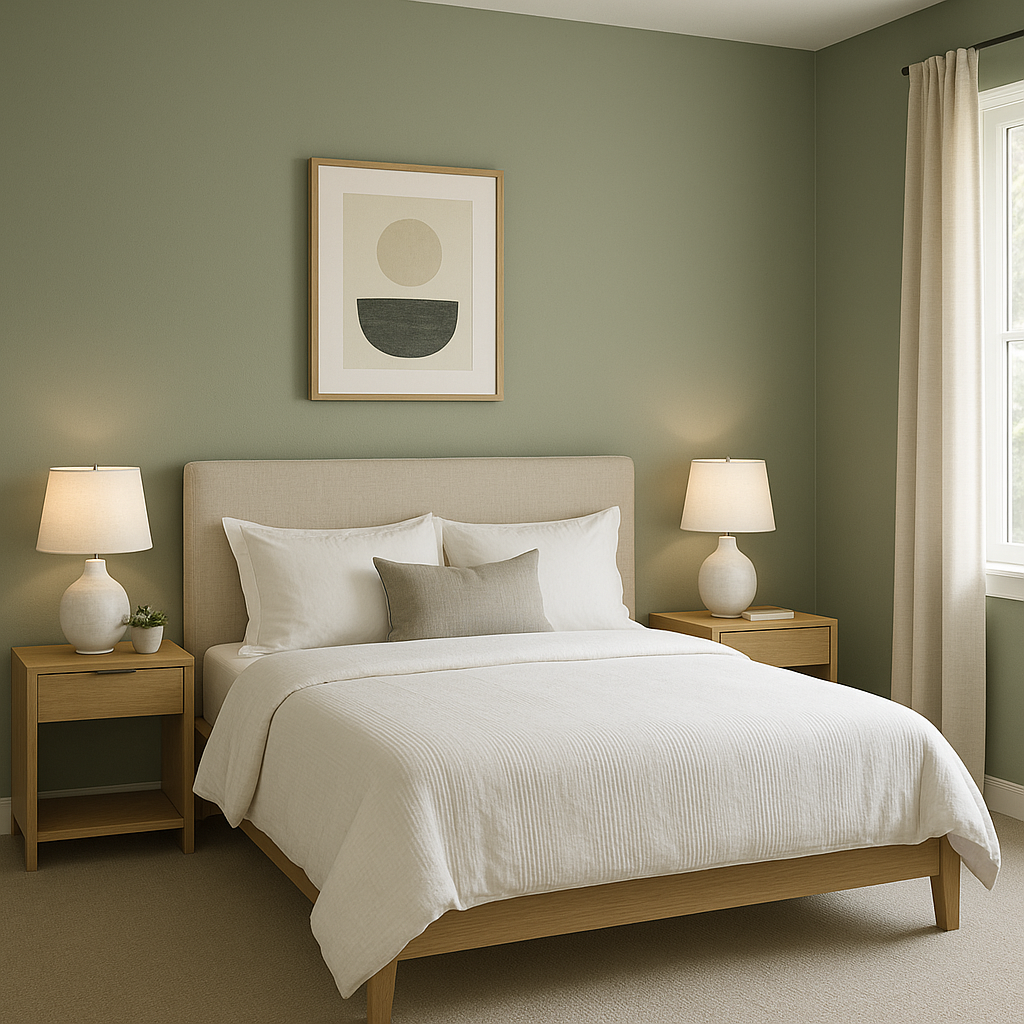
Create a tranquil retreat by using High CC-620 on bedroom walls. Its soft, neutral hue promotes relaxation and pairs beautifully with plush bedding in soft whites, muted greens, or dusty blues.
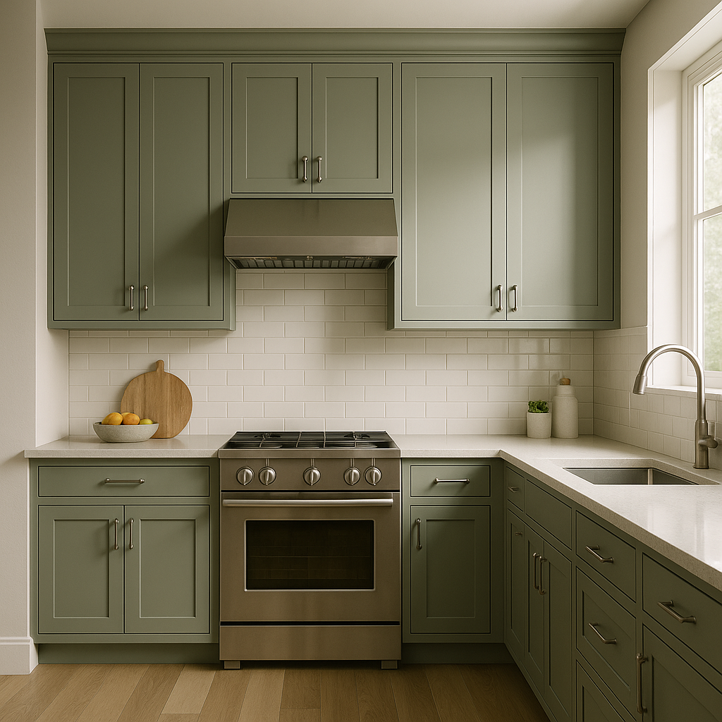
For kitchens, High CC-620 pairs wonderfully with white cabinetry and natural stone countertops. It adds warmth to dining areas, especially when combined with wood accents and metallic finishes.
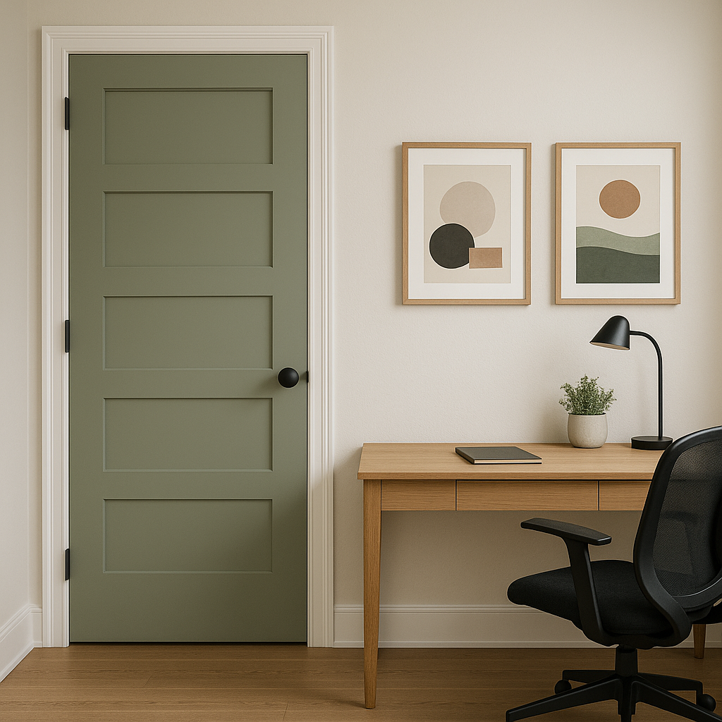
If you're designing a home office, High CC-620 offers the perfect balance of calm and focus. Pair it with darker, grounding tones for furniture and shelving to create a professional yet inviting workspace.
The subtle sophistication of High CC-620 makes it an excellent choice for bathrooms. Its ability to reflect different undertones depending on the light adds depth, while its neutral palette complements a wide range of tile and fixture finishes.
The beauty of High CC-
View Colors Only by Brand (No Imagery):
Sherwin-Williams
|
Benjamin-Moore
|
Behr
|
Valspar
Live on the Eastern Slope of Colorado and looking for a local painting professional, check out all our painting services and reach out for a free estimate.
Copyright © 2026 : Wild Fox Painting Inc. : 12435 Mead Way, Littleton, CO 80125


