Benjamin Moore Blue (CC-640) is a classic, mid-tone blue that exudes timeless elegance and versatility. Perfectly balanced, this shade sits comfortably between cool and warm tones, making it an adaptable and captivating choice for a wide range of spaces. Whether you're looking to create a serene atmosphere, add a pop of color, or build a sophisticated design narrative, Benjamin Moore Blue has the versatility to deliver stunning results.
Benjamin Moore Blue (CC-640) carries subtle gray undertones, which lend it a refined and subdued quality. These undertones soften the vibrancy of the blue, making it feel grounded and sophisticated rather than overly bold or saturated. The gray undertones also allow the shade to adapt beautifully to varying lighting conditions, whether bathed in natural sunlight or illuminated by artificial light.
In brighter spaces, Benjamin Moore Blue may lean slightly cooler, showcasing its crisp blue character. In dimmer or warmer lighting, the gray undertones become more pronounced, giving the hue a cozy, almost smoky appeal. This dynamic quality ensures the color remains visually engaging throughout the day.
Benjamin Moore Blue (CC-640) pairs seamlessly with a variety of complementary and contrasting shades, making it an incredibly versatile choice for interior design. Here are some coordinating colors that work beautifully with this hue:
Benjamin Moore Blue (CC-640) is a versatile shade that can be employed in a variety of spaces, from contemporary to traditional interiors. Its adaptability and classic appeal make it suitable for both small accents and large-scale applications.
Use Benjamin Moore Blue on walls to create a welcoming and serene environment. Pair it with light-colored furniture and natural textures, such as rattan or oak, for a coastal-inspired feel. Alternatively, combine it with deeper shades like Hale Navy for a more dramatic and sophisticated look.
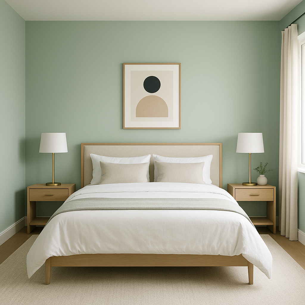
The calming nature of Benjamin Moore Blue makes it an excellent choice for bedrooms. Pair it with soft whites, muted grays, and plush textiles to evoke a peaceful retreat. Consider adding metallic accents, such as brushed gold or silver, for a touch of elegance.
Benjamin Moore Blue shines in bathrooms, offering a fresh, spa-like ambiance. Combine it with crisp white tiles, polished chrome fixtures, and soft green accents for a rejuvenating space that feels clean and modern.
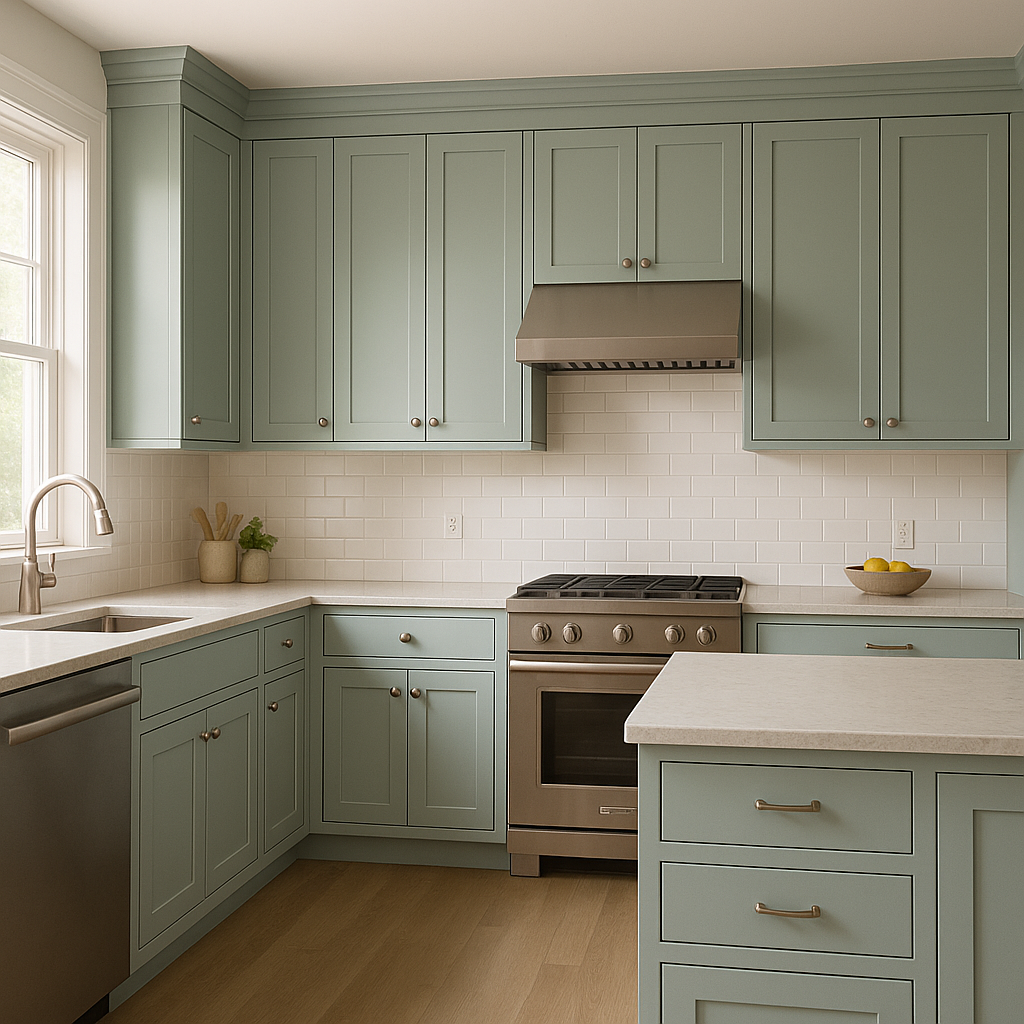
In kitchens, Benjamin Moore Blue can be used for cabinetry to create a bold yet timeless look. Pair it with white countertops and backsplash tiles for a crisp contrast or with warm wood tones for a cozy farmhouse aesthetic.
If you're hesitant to commit to an entire room in blue, an accent wall featuring Benjamin Moore Blue can make a stylish statement. Use it to highlight architectural details, such as built-in shelving or a fireplace, and complement it with coordinating neutral shades.
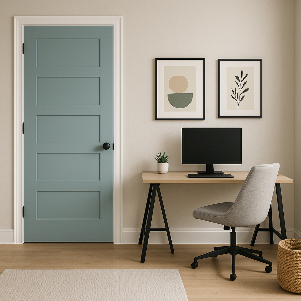
Benjamin Moore Blue is equally stunning when applied to exterior spaces. Use it for front doors or shutters to add a pop of color and curb appeal. It pairs beautifully with white trim and gray siding for a classic and eye-catching facade.
Benjamin Moore Blue (CC-640) is more than just a paint color—it's a design tool that brings personality and sophistication to any space. Its ability to balance vibrancy with subtlety ensures that it remains timeless, while its adaptability to different lighting and styles makes it a practical and enduring choice. Whether you're designing a cozy bedroom, a modern kitchen, or an elegant living room, this shade offers endless possibilities for creating a space that reflects your taste and style.
View Colors Only by Brand (No Imagery):
Sherwin-Williams
|
Benjamin-Moore
|
Behr
|
Valspar
Live on the Eastern Slope of Colorado and looking for a local painting professional, check out all our painting services and reach out for a free estimate.
Copyright © 2026 : Wild Fox Painting Inc. : 12435 Mead Way, Littleton, CO 80125


