Benjamin Moore Provincial CC-664 is a sophisticated, versatile neutral that embodies warmth and subtlety. This rich color strikes the perfect balance between beige and taupe, making it a timeless choice for a variety of interior styles. Its understated elegance and adaptability allow it to serve as either a primary wall color or a complementary accent, effortlessly enhancing the ambiance of any room.
Provincial CC-664 features warm undertones that lean towards soft brown with a hint of gray, creating a grounded yet modern feel. These warm undertones lend a cozy and inviting atmosphere, making it an excellent choice for creating spaces that feel comfortable and refined. Its neutral nature ensures it pairs well with a wide range of colors, making it incredibly versatile.
The slight gray undertone lends Provincial a contemporary edge, preventing it from feeling overly traditional or dated. This makes it perfect for both classic and modern interiors, seamlessly bridging the gap between old-world charm and current design trends.
Provincial CC-664 pairs beautifully with both warm and cool tones, offering a wealth of design possibilities. Here are some coordinating color suggestions to help you craft a harmonious palette:
Whites and Off-Whites: Pair Provincial with soft whites like Benjamin Moore Simply White (OC-117) or Chantilly Lace (OC-65) for a clean, crisp contrast that feels fresh and timeless. These whites will allow Provincial to stand out while maintaining an airy aesthetic.
Greens: Add depth and character by pairing it with soothing greens like Benjamin Moore Saybrook Sage (HC-114) or October Mist (1495). The earthy tones of Provincial complement the organic richness of green, creating a serene, nature-inspired palette.
Blues: For a striking yet classic combination, consider pairing Provincial with muted blues such as Benjamin Moore Stonington Gray (HC-170) or Boothbay Gray (HC-165). These colors enhance Provincial's warm undertones while adding a cool, calming balance.
Dark Accents: If you're aiming for a bolder look, deep charcoal hues like Benjamin Moore Kendall Charcoal (HC-166) or dark navy shades such as Hale Navy (HC-154) can create a dramatic, high-contrast pairing.
The versatility of Provincial CC-664 makes it suitable for a wide range of applications throughout the home. Whether you're designing a cozy living space, a sophisticated office, or a tranquil bedroom, this hue adapts beautifully to different environments.
Use Provincial CC-664 on the walls of your living room to create a warm, inviting space perfect for relaxing or entertaining. Pair it with soft white trim and natural wood furniture for a classic yet modern look.
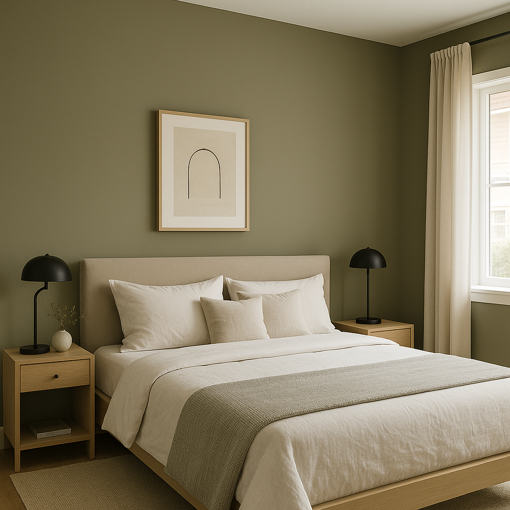
In bedrooms, Provincial's warm undertones contribute to a restful, soothing atmosphere. Layer it with plush textiles in muted shades like blush, sage, or cream for a serene retreat.
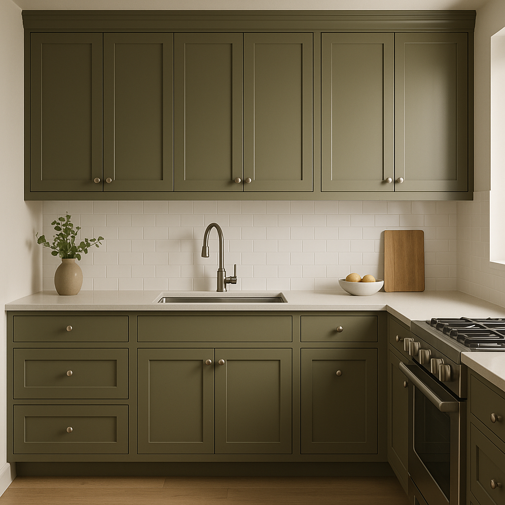
For kitchens and dining rooms, this color works beautifully as a backdrop for both traditional and modern cabinetry. It pairs well with stainless steel appliances, marble countertops, and wood accents, enhancing the overall elegance of the space.
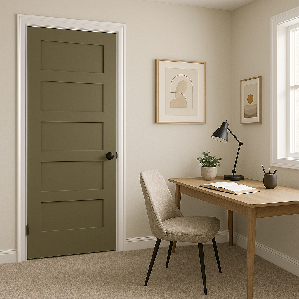
If you're designing a home office, Provincial CC-664 can provide a professional yet inviting backdrop. Pair it with darker wood furniture and metallic accents for a polished and productive environment.
Consider using Provincial as an accent wall color to add depth and dimension to a space. It works wonderfully when paired with lighter neutrals or whites, creating a subtle yet impactful contrast.
Provincial CC-664 is a go-to neutral for designers and homeowners alike because of its timeless appeal, adaptability, and warmth.
View Colors Only by Brand (No Imagery):
Sherwin-Williams
|
Benjamin-Moore
|
Behr
|
Valspar
Live on the Eastern Slope of Colorado and looking for a local painting professional, check out all our painting services and reach out for a free estimate.
Copyright © 2026 : Wild Fox Painting Inc. : 12435 Mead Way, Littleton, CO 80125


