

Benjamin Moore Tapenade (CC-694) is a sophisticated and deeply grounded olive green that evokes a sense of natural elegance. This timeless color exudes warmth and depth, making it an excellent choice for creating cozy yet refined interiors. Whether you’re designing a tranquil retreat or adding a bold statement to your space, Tapenade delivers unparalleled versatility.
Tapenade is characterized by its earthy olive base, which is enriched with subtle brown undertones. These warm undertones soften the green, creating a balanced hue that feels organic and inviting. The brown influence in Tapenade ensures it doesn’t lean too starkly green, making it approachable and easy to pair with a wide range of colors. This depth gives the shade a grounded, vintage charm while remaining modern and sophisticated.
Tapenade pairs beautifully with other nature-inspired hues, neutral tones, and even rich accent colors. Here are some suggestions for complementary colors:
Warm neutrals: Pair Tapenade with soft beige tones like Benjamin Moore’s Edgecomb Gray (HC-173) or Manchester Tan (HC-81) for a harmonious and understated palette. These colors emphasize Tapenade’s earthy qualities while maintaining a sense of spaciousness.
Cool contrasts: To create a striking yet balanced contrast, pair Tapenade with crisp whites like Chantilly Lace (OC-65) or Simply White (OC-117). These cooler tones help brighten the space while letting Tapenade’s richness stand out.
Deep accents: For a moody, dramatic look, coordinate Tapenade with deep shades like Hale Navy (HC-154) or Black Forest Green (2138-10). These bold pairings work well in modern or transitional spaces, adding depth and intrigue.
Earthy complements: Enhance the natural feel of Tapenade with terracotta tones like Tuscan Red (HC-166) or warm golden hues like Golden Straw (2152-50). These combinations evoke a rustic, Mediterranean aesthetic.
Tapenade’s versatility allows it to shine in a variety of settings and applications. Here are some ways to incorporate this rich olive green into your home design:
Tapenade is an excellent choice for living rooms, especially when paired with cozy textiles and organic materials like wood and linen. Use it on the walls to create a warm, inviting space or as an accent on built-in shelving or cabinetry.
If you’re aiming for a timeless yet modern kitchen, Tapenade works beautifully on cabinetry. Pair it with brass or matte black hardware for a sophisticated finish. Alternatively, use it on an island to anchor the space with a pop of color.
Create a serene retreat by using Tapenade as an accent wall behind your bed. Pair it with soft, textured bedding in neutral tones to maintain a sense of calm and balance.
Tapenade can add a spa-like ambiance to bathrooms, especially when paired with marble or quartz countertops. Use it to frame vanities, or opt for this shade on the walls for a luxurious, enveloping feel.
Tapenade’s richness makes it ideal for dining rooms, where it can create an intimate and elegant atmosphere. Pair it with warm wood furniture and metallic accents for a sophisticated yet approachable look.
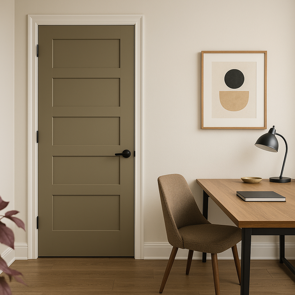
If you’re not ready to commit to Tapenade on your walls, consider using it on furniture pieces, doors, or trim. A painted console table or bookshelf in this hue can serve as a stylish focal point.
Tapenade is a color that bridges the gap between timeless elegance and contemporary design. Its earthy, olive-green tone paired with warm brown undertones makes it a versatile choice for both classic and modern interiors. Whether you’re curating a nature-inspired palette or adding depth to an otherwise neutral space, Tapenade (CC-694) offers the perfect balance of charm and sophistication.
View Colors Only by Brand (No Imagery):
Sherwin-Williams
|
Benjamin-Moore
|
Behr
|
Valspar
Live on the Eastern Slope of Colorado and looking for a local painting professional, check out all our painting services and reach out for a free estimate.
Copyright © 2026 : Wild Fox Painting Inc. : 12435 Mead Way, Littleton, CO 80125


