Benjamin Moore Blue CC-850 is a sophisticated and versatile shade that exudes a sense of calm, elegance, and timelessness. This balanced blue is neither too bright nor too muted, making it a perfect choice for a variety of interior and exterior design applications. Its ability to adapt to different spaces and lighting conditions makes it a favorite among homeowners and designers alike.
One of the defining qualities of Benjamin Moore Blue CC-850 is its subtle undertones. This hue leans slightly toward a gray-blue, giving it a soft and refined appearance. The gray undertone tempers the vibrancy of the blue, resulting in a color that feels grounded and sophisticated. Depending on the lighting, you may also notice a faint hint of green, which adds to its depth and versatility. This complexity ensures that CC-850 remains dynamic and never feels flat or one-dimensional.
Benjamin Moore Blue CC-850 pairs beautifully with a wide range of colors, allowing for endless design possibilities. Here are some standout coordinating colors:
Whites and Off-Whites: To create a clean and crisp look, pair CC-850 with whites like Benjamin Moore Chantilly Lace (OC-65) or Simply White (OC-117). These bright whites enhance the blue's clarity and make it pop.
Neutrals: Complement the grounded undertones of Blue CC-850 with warm neutrals like Revere Pewter (HC-172) or Edgecomb Gray (HC-173). This pairing creates a harmonious and serene palette.
Earthy Tones: For a cozy, nature-inspired look, consider coordinating with colors like Kendall Charcoal (HC-166) or Wythe Blue (HC-143). These hues bring out the subtle green undertone in CC-850.
Accent Colors: Add a touch of drama or vibrancy by incorporating accents in deep navy, mustard yellow, or burnt orange. These bold choices create eye-catching contrast and visual interest.
The versatility of Benjamin Moore Blue CC-850 makes it suitable for a variety of design applications. Its soothing yet sophisticated presence can elevate any room or exterior area:
Living Rooms: Use CC-850 on the walls of a living room to create a serene and inviting atmosphere. Pair it with soft furnishings in neutral tones and metallic accents for a polished look.
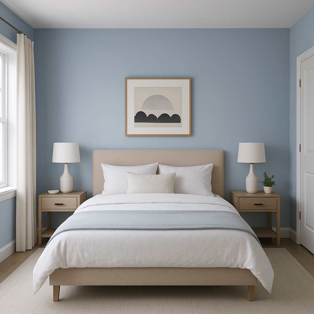
Bedrooms: The calming effect of this shade makes it an excellent choice for bedrooms. Combine it with plush bedding and layered textures for a relaxing retreat.
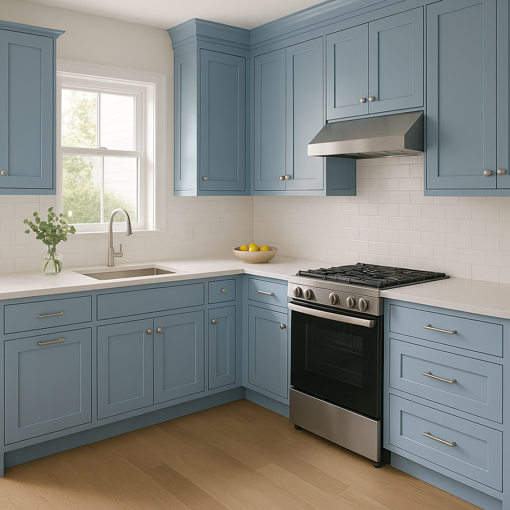
Kitchens and Dining Rooms: Use CC-850 on cabinetry or accent walls to add depth and character. Pair it with brass or gold fixtures for a modern yet timeless aesthetic.
Bathrooms: Bring a spa-like feel to bathrooms by using CC-850 on the walls or vanity. Complement it with crisp white tiles and natural wood elements for a fresh and clean design.
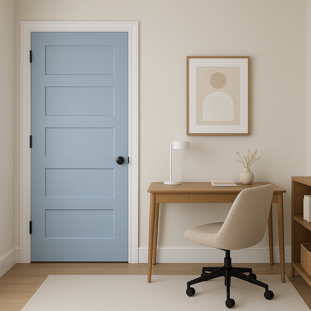
Exteriors: Benjamin Moore Blue CC-850 is equally stunning for exterior applications. Use it for siding, shutters, or front doors to create a classic and welcoming curb appeal. It pairs beautifully with white trim and natural stone finishes.
Lighting plays a crucial role in how Benjamin Moore Blue CC-850 appears in your space. In rooms with ample natural light, the blue will appear brighter and more vibrant, while in low-light settings, the gray undertones will become more pronounced, lending a cozy and moody effect. Be sure to test the color in your space under different lighting conditions to ensure it achieves the desired look.
Benjamin Moore Blue CC-850 is the epitome of timeless design. Its versatility,
View Colors Only by Brand (No Imagery):
Sherwin-Williams
|
Benjamin-Moore
|
Behr
|
Valspar
Live on the Eastern Slope of Colorado and looking for a local painting professional, check out all our painting services and reach out for a free estimate.
Copyright © 2026 : Wild Fox Painting Inc. : 12435 Mead Way, Littleton, CO 80125


