Benjamin Moore Whirlpool (CC-910) is a refined neutral that effortlessly balances warmth and coolness, making it a versatile choice for a range of interior design styles. This soft taupe-gray offers an understated elegance that transforms spaces, creating a look that is both timeless and contemporary. Whether used as a main wall color, an accent shade, or a backdrop for bold décor, Whirlpool adapts seamlessly to its surroundings while adding depth and character.
What makes Whirlpool truly stand out is its subtle undertones. It carries gentle beige notes, which lend it warmth, and delicate gray hues that keep it grounded and sophisticated. These undertones shift slightly depending on the lighting conditions, offering a dynamic quality that makes the color feel alive in your space. In rooms with natural light, Whirlpool leans toward a soft greige, while in dimmer settings, its taupe undertones become more pronounced, creating a cozy and inviting atmosphere.
To achieve a harmonious palette, pair Benjamin Moore Whirlpool with complementary colors that enhance its versatility:
Off-White Pairings: Shades like Benjamin Moore Simply White (OC-117) or White Dove (OC-17) provide crisp contrast and make Whirlpool feel fresh and modern. Use these for trim, ceilings, or cabinetry to highlight the neutral beauty of Whirlpool.
Deep Accent Colors: Rich hues such as Benjamin Moore Hale Navy (HC-154) or Kendall Charcoal (HC-166) create stunning contrasts and bring out Whirlpool's subtle undertones. These darker shades work beautifully for furniture, accent walls, or décor elements.
Muted Earthy Tones: Colors like Benjamin Moore Revere Pewter (HC-172) or Shaker Beige (HC-45) complement Whirlpool’s warmth and help create a serene, cohesive look. These combinations are perfect for layering neutrals in transitional or rustic-inspired spaces.
Soft Blues and Greens: Gentle tones like Benjamin Moore Healing Aloe (1562) or Palladian Blue (HC-144) add a touch of color without overwhelming the subtle elegance of Whirlpool. This pairing works well for bedrooms, bathrooms, or spaces designed to evoke tranquility.
Whirlpool’s adaptability makes it suitable for a variety of applications throughout the home. Here are some creative ways to use this sophisticated neutral:
Living Rooms: Create an inviting yet chic space by using Whirlpool as the main wall color. Pair it with textured fabrics, wooden furniture, and metallic accents for a balanced look that feels cozy yet polished.
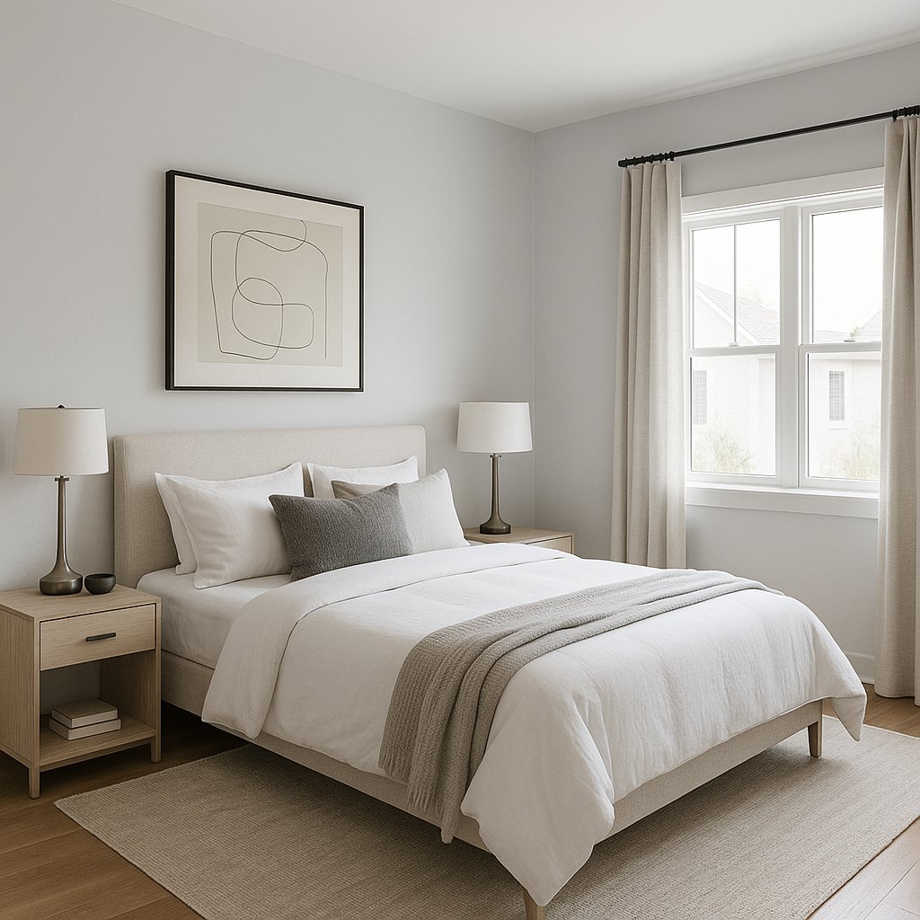
Bedrooms: Whirlpool’s soft taupe-gray tones are ideal for crafting a serene retreat. Pair it with plush bedding, soft area rugs, and layered lighting to foster relaxation and comfort.
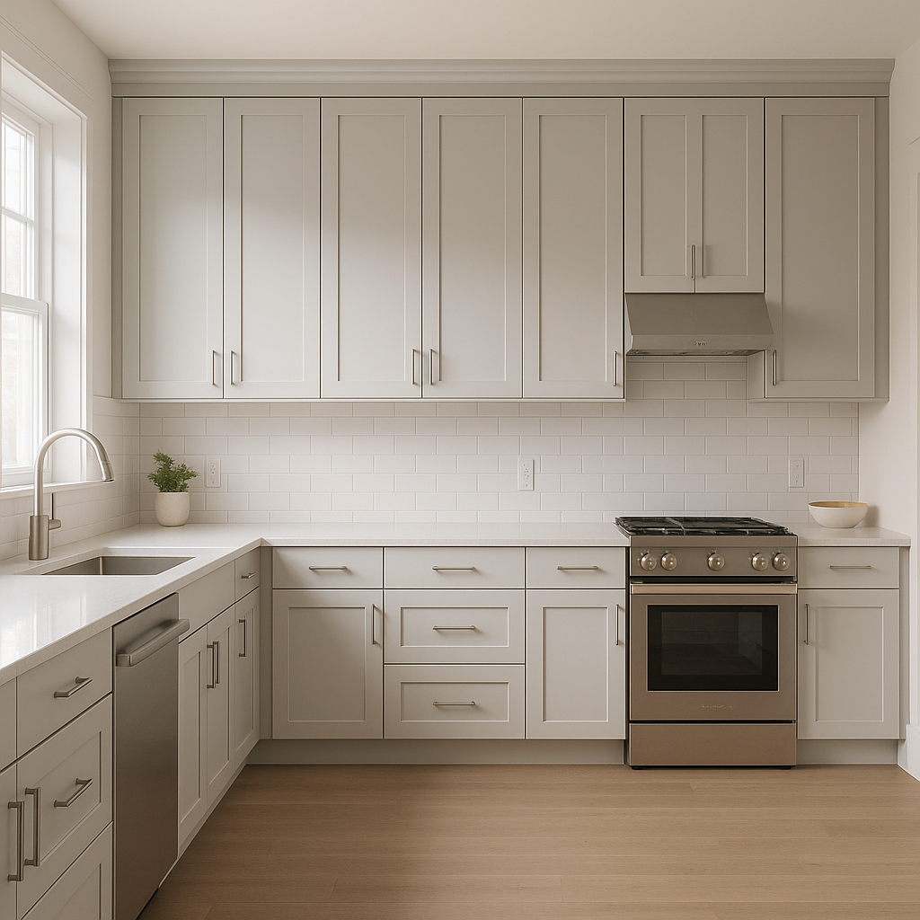
Kitchens and Dining Areas: As a backdrop for cabinets or walls, Whirlpool enhances spaces with its clean and versatile style. Pair it with white subway tiles or natural wood finishes to create a timeless and welcoming environment.
Bathrooms: Whirlpool works beautifully in bathrooms, especially when paired with crisp whites and soft blues. Its neutral tones add a spa-like ambiance while ensuring the space feels fresh and sophisticated.
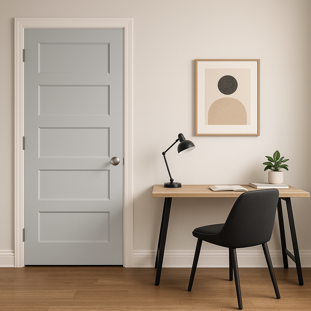
Office Spaces: For home offices or study areas, Whirlpool fosters focus and creativity without feeling stark. Pair it with rich wood tones, leather furniture, or pops of color for a professional yet stylish atmosphere.
Benjamin Moore Whirlpool (CC-910) is the epitome of versatility, offering a neutral base with just enough personality to elevate your interiors. Its balanced undertones and ability to pair with a wide range of colors make it a go-to choice for homeowners and designers alike. Whether your style leans traditional, modern, or somewhere in between, Whirlpool’s timeless appeal ensures it will remain a favorite for years to come.
View Colors Only by Brand (No Imagery):
Sherwin-Williams
|
Benjamin-Moore
|
Behr
|
Valspar
Live on the Eastern Slope of Colorado and looking for a local painting professional, check out all our painting services and reach out for a free estimate.
Copyright © 2026 : Wild Fox Painting Inc. : 12435 Mead Way, Littleton, CO 80125


