Benjamin Moore Prairie (CC-98) is a sophisticated neutral paint color that exudes warmth and versatility. Beloved by interior designers for its ability to complement a wide range of design styles, Prairie is a soft beige hue with subtle undertones that make it a classic choice for creating serene, inviting interiors. Whether you're refreshing a traditional home or adding warmth to a modern space, Prairie provides the perfect backdrop for endless design possibilities.
Prairie leans toward a warm beige spectrum, with gentle yellow and tan undertones. These undertones imbue the color with a cozy, grounded feel while maintaining an air of elegance. Because of its warm base, Prairie avoids appearing too stark or cold, making it an excellent choice for spaces that need a touch of softness and comfort.
This color interacts beautifully with natural light, appearing slightly lighter during the day and richer in dimmer evening settings. The undertones ensure that Prairie pairs seamlessly with warm wood tones, brass accents, and earthy textures while remaining neutral enough to complement cooler elements like gray or blue.
Benjamin Moore Prairie shines when paired with complementary and contrasting shades. Its versatility allows it to work beautifully with other neutrals, bold accents, and muted tones.
Prairie's adaptable nature makes it an excellent choice for various applications throughout your home. It works beautifully in both residential and commercial spaces, lending a sense of comfort and understated refinement.
As a wall color in living rooms, Prairie creates a cozy yet elegant atmosphere. Pair it with textured area rugs, warm wood furniture, and metallic accents for a balanced, inviting look.
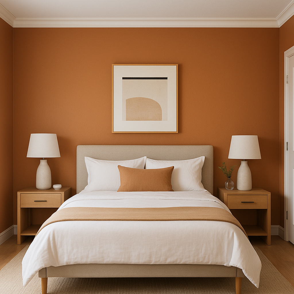
Prairie is a calming choice for bedrooms, especially when paired with soft linens in muted tones like taupe or pastel blue. Add layered lighting to enhance its warmth and create a tranquil retreat.
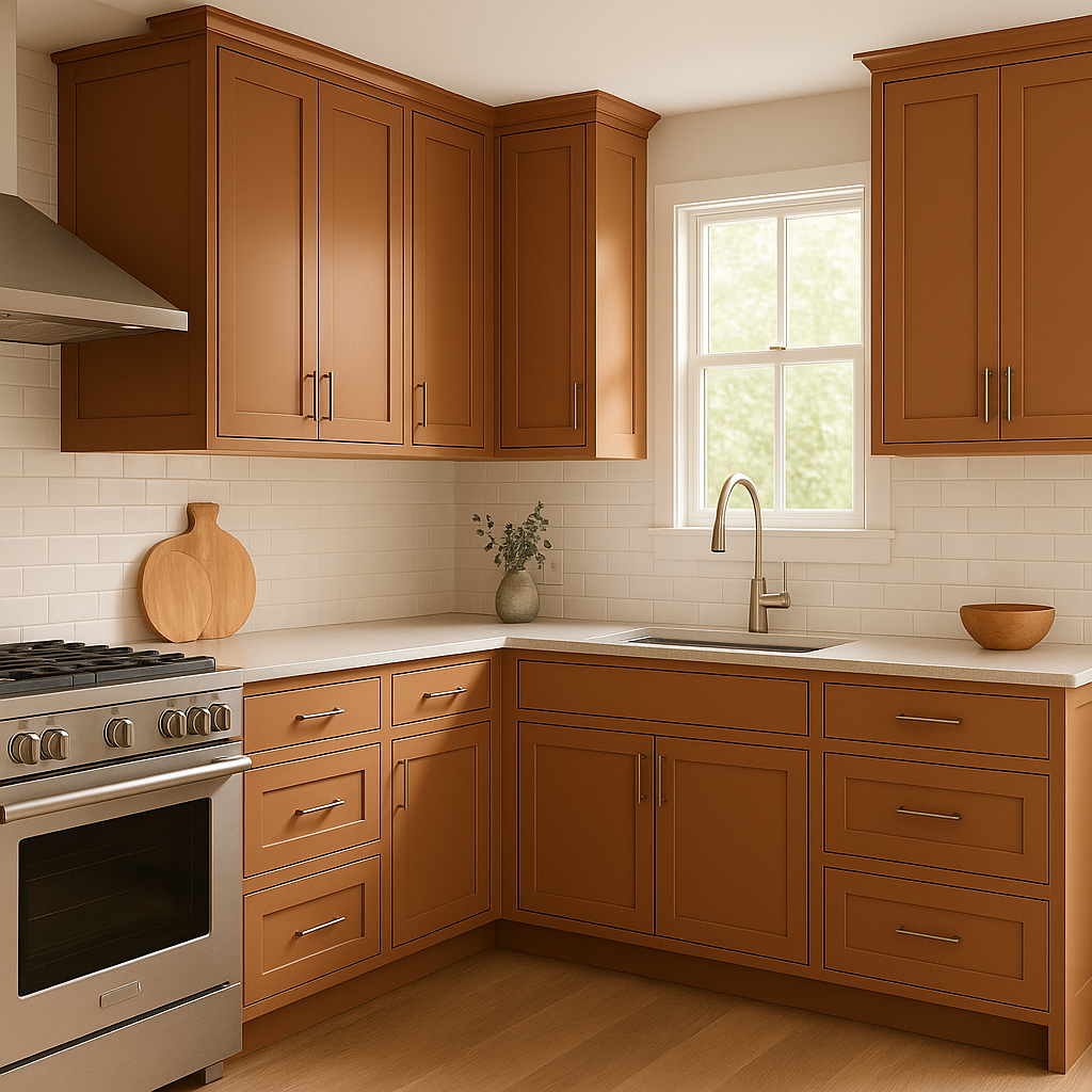
Its warm beige tone makes Prairie an excellent choice for kitchens, especially when used alongside white cabinetry or butcher block countertops. It works well as a wall color or even on kitchen islands for a hint of subtle contrast.
Prairie adds a spa-like warmth to bathrooms, especially when paired with marble countertops, natural stone tiles, or brushed gold hardware.
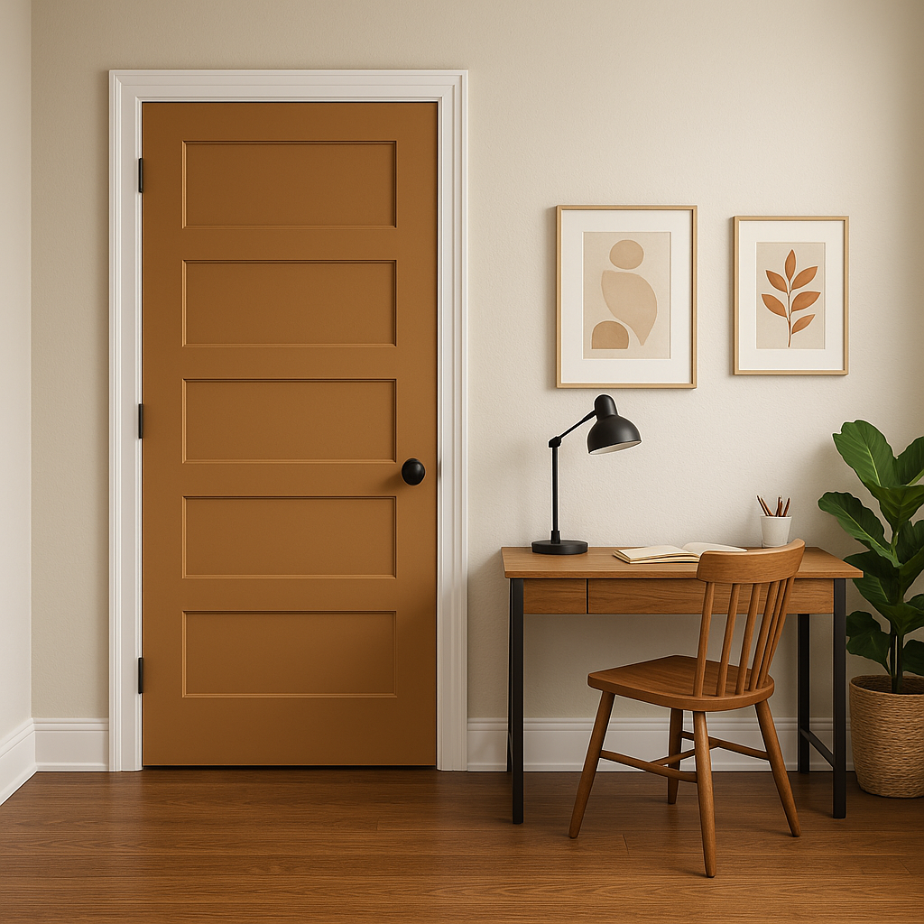
Being a neutral shade, Prairie helps brighten and unify transitional spaces such as hallways and entryways. Its understated elegance ensures a welcoming ambiance for guests while seamlessly connecting adjoining rooms.
Benjamin Moore Prairie is a timeless neutral that strikes the perfect balance between warmth and sophistication. Its gentle undertones, compatibility with a wide range of coordinating colors, and versatility for various spaces make it a standout option for homeowners and designers alike. Whether you're looking to create a cozy family room, a serene bedroom, or an inviting entryway, Prairie delivers understated elegance with ease.
Transform your home with Benjamin Moore Prairie (CC-98)—a color that truly stands the test of time.
View Colors Only by Brand (No Imagery):
Sherwin-Williams
|
Benjamin-Moore
|
Behr
|
Valspar
Live on the Eastern Slope of Colorado and looking for a local painting professional, check out all our painting services and reach out for a free estimate.
Copyright © 2026 : Wild Fox Painting Inc. : 12435 Mead Way, Littleton, CO 80125


