Benjamin Moore Super (CC-990) is a sophisticated warm neutral that effortlessly bridges the gap between beige and taupe. Its understated elegance makes it a versatile choice for both modern and traditional spaces, offering a refined backdrop that complements a wide range of design styles. With its muted warmth and balanced tone, Super is a favorite among interior designers looking to create harmonious interiors that exude comfort and timelessness.
Super (CC-990) carries gentle beige undertones, softened by a whisper of gray. These undertones give it a neutral quality that prevents it from feeling overly yellow or overly cool, striking the perfect balance for interiors seeking warmth without heaviness. This restrained warmth makes it adaptable to different lighting conditions, appearing warmer in rooms with incandescent bulbs and slightly cooler in spaces with natural daylight.
Its neutral undertones also make it a chameleon color that pairs beautifully with a variety of palettes. Whether you’re aiming for a monochromatic look or introducing bold accent colors, Super provides a seamless foundation.
Benjamin Moore Super (CC-990) pairs beautifully with other shades to create cohesive and inviting interiors. Here are some coordinating colors that enhance its versatility:
Benjamin Moore Cloud White (OC-130)
A crisp, warm white that highlights Super’s subtle depth without overpowering it. Use Cloud White for trim, ceilings, or cabinetry to maintain a clean and classic aesthetic.
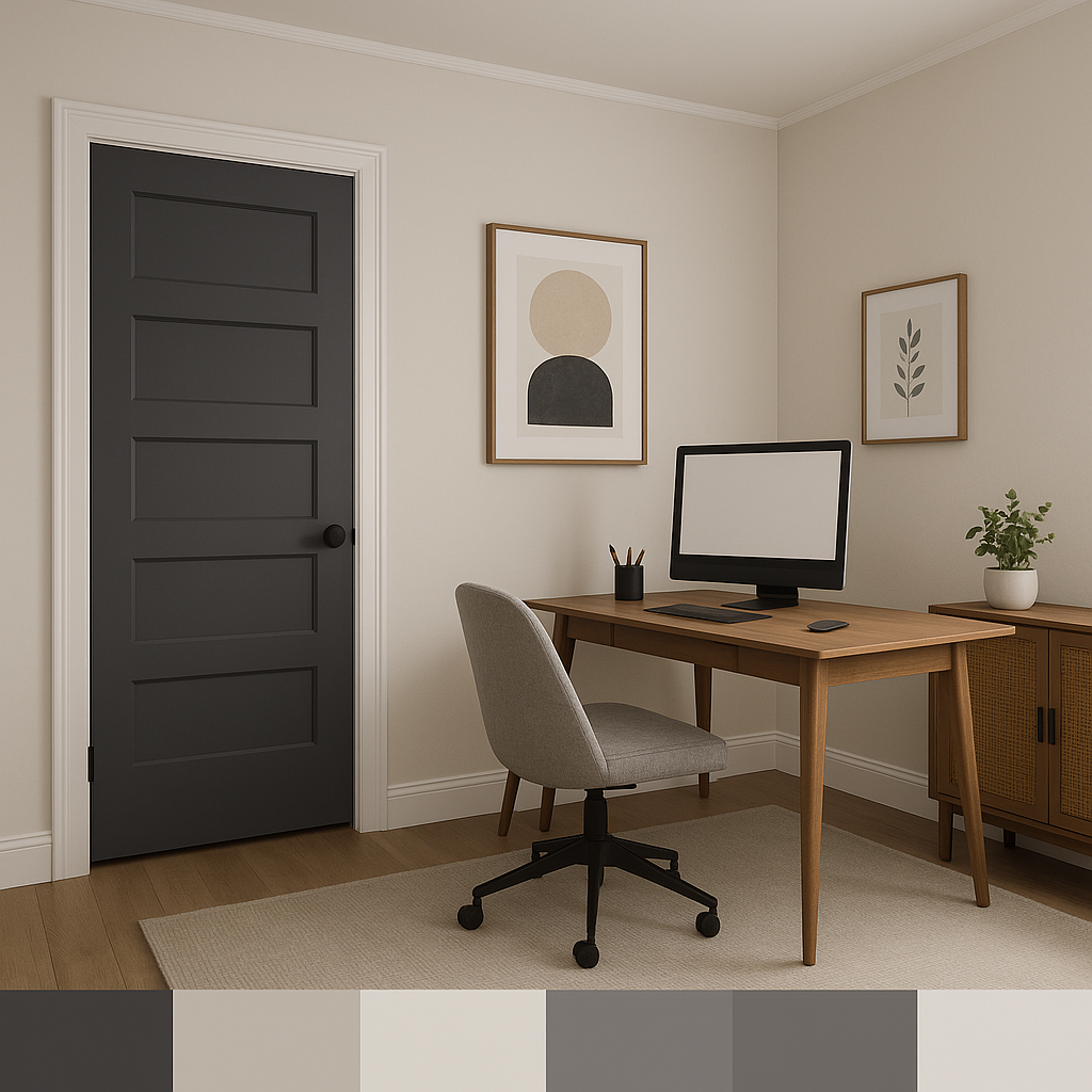
Benjamin Moore Kendall Charcoal (HC-166)
A rich, moody charcoal that creates bold contrast when paired with Super. Perfect for accent walls, furniture, or built-ins to add dramatic flair.
Benjamin Moore Edgecomb Gray (HC-173)
A lighter greige with similar undertones, Edgecomb Gray offers a soft complement that works well in adjacent rooms or as a secondary neutral in open-concept layouts.
Benjamin Moore Revere Pewter (HC-172)
A perennial favorite, Revere Pewter mirrors Super’s balanced warmth and can be used as a coordinating wall color in spaces where you want subtle variation.
Benjamin Moore Hale Navy (HC-154)
For a pop of color, Hale Navy creates a striking contrast, bringing depth and sophistication to rooms painted in Super.
Super (CC-990) is a versatile neutral that thrives in a variety of spaces. Its warm and balanced tone makes it an ideal choice for areas where you want to evoke a sense of calm and understated elegance. Here are some of the best uses for this timeless hue:
Living Rooms and Family Rooms
Super’s warmth makes it perfect for living spaces where comfort and relaxation are key. Pair it with plush fabrics, natural wood tones, and soft lighting to create an inviting atmosphere.
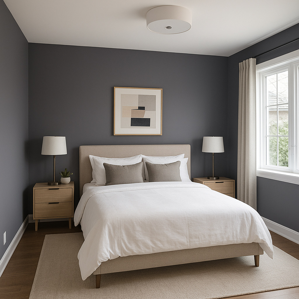
Bedrooms
The soft neutrality of Super creates a serene backdrop for bedrooms. Layer it with textured bedding, calming blues, or earthy greens for a tranquil retreat.
Dining Rooms
Super’s subtle sophistication elevates dining spaces, especially when paired with rich wood furniture and metallic accents like brass or gold.
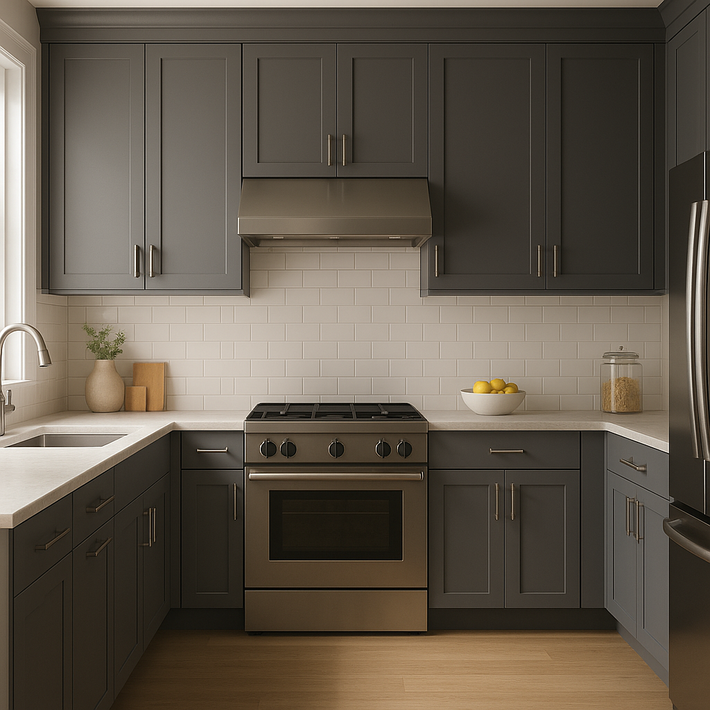
Kitchens
Use Super for walls in kitchens to complement white or cream cabinetry, or pair it with darker countertops and backsplashes for a balanced look.
Open-Concept Layouts
Super acts as a unifying neutral in open spaces, tying together various zones while allowing for flexibility in accent colors and decor.
Benjamin Moore Super (CC-990) is more than just a neutral paint color—it's a canvas that allows your design vision to shine. Its warm undertones and adaptability make it an enduring choice for both residential and commercial interiors. Whether you’re updating a single room or overhauling an entire space, Super offers a timeless elegance that resonates with a wide range of aesthetics.
View Colors Only by Brand (No Imagery):
Sherwin-Williams
|
Benjamin-Moore
|
Behr
|
Valspar
Live on the Eastern Slope of Colorado and looking for a local painting professional, check out all our painting services and reach out for a free estimate.
Copyright © 2026 : Wild Fox Painting Inc. : 12435 Mead Way, Littleton, CO 80125


