
Benjamin Moore Make (CSP-1035) is a refined and versatile neutral paint color that exudes understated elegance. Part of Benjamin Moore's Color Stories® Collection, this shade strikes the perfect balance between warm and cool tones, making it an adaptable choice for a variety of interior spaces. With its nuanced undertones and sophisticated depth, Make is a go-to color for creating serene yet modern environments.
Make (CSP-1035) is a soft, muted greige that leans slightly toward the warmer side of the spectrum. It features subtle beige undertones with whispers of gray, giving it a timeless and grounded appeal. The delicate interplay between warmth and coolness ensures that it never feels too stark or overly creamy, making it a harmonious choice for both contemporary and traditional spaces. Depending on the lighting, Make can exhibit different personalities:
This ability to shift with lighting conditions makes Make a highly versatile paint color that adapts beautifully to various settings.
Benjamin Moore Make (CSP-1035) pairs seamlessly with a wide range of coordinating colors, offering endless opportunities for creativity. Whether you're designing a monochromatic palette or aiming for dynamic contrast, here are a few complementary options to consider:
Make (CSP-1035) is a highly adaptable color that works well in a variety of interior applications. Its neutral nature allows it to serve as a backdrop or a feature color, depending on your design goals. Here are some spaces where Make truly shines:
As a soft and welcoming neutral, Make is an excellent choice for living rooms. Its subtle warmth creates a cozy environment, while its gray undertones lend a polished and modern aesthetic. Pair it with plush furnishings and natural textures, such as wood or linen, for added depth and character.
For a calming and restful retreat, consider using Make in bedrooms. Its muted tone fosters relaxation and pairs beautifully with soft pastels, crisp whites, or deeper accent colors for a layered look.
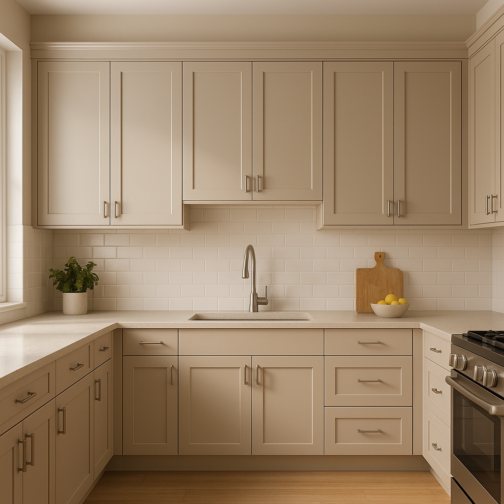
Make’s versatility makes it a perfect candidate for kitchen and dining spaces. It pairs beautifully with white or wood cabinetry, while its understated elegance ensures that it won’t overpower other design elements.
In bathrooms, Make creates a spa-like ambiance. Its neutral tone works well with marble, porcelain, or other natural materials, allowing for a timeless and sophisticated design.
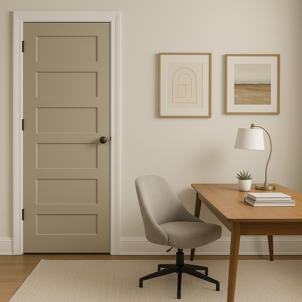
As a transitional color, Make is ideal for hallways and entryways. Its ability to coordinate with different palettes ensures a seamless flow between rooms, making it a practical yet stylish option for high-traffic areas.
Benjamin Moore Make is more than just a neutral paint color; it’s a design chameleon that adapts to your style and space. Whether you’re seeking a warm and inviting atmosphere or a modern and minimalist backdrop, Make delivers versatility with a touch of sophistication. Its balanced undertones and compatibility with a wide range of colors make it an excellent choice for creating timeless, cohesive interiors.
View Colors Only by Brand (No Imagery):
Sherwin-Williams
|
Benjamin-Moore
|
Behr
|
Valspar
Live on the Eastern Slope of Colorado and looking for a local painting professional, check out all our painting services and reach out for a free estimate.
Copyright © 2026 : Wild Fox Painting Inc. : 12435 Mead Way, Littleton, CO 80125


