Benjamin Moore Cappuccino (CSP-1055) is a sophisticated and timeless warm neutral that evokes comfort and elegance. This shade is part of Benjamin Moore’s Color Stories collection, designed to provide extraordinary depth and complexity. Cappuccino is a medium-toned brown with rich, creamy undertones that make it feel indulgent yet approachable, like the beverage it’s named after. Its versatility and warmth make it a favorite among interior designers for both residential and commercial spaces.
Cappuccino is characterized by its warm undertones of cocoa and caramel, which create a natural richness without feeling overly heavy. There’s a subtle golden undertone that adds a gentle glow, especially in spaces with ample natural light. Unlike cooler browns, Cappuccino leans toward a soft, earthy warmth that complements a wide array of interior design styles, from traditional to modern. Its balanced undertones ensure that it doesn’t feel stark or overly saturated, making it a perfect choice for creating inviting spaces.
Benjamin Moore Cappuccino pairs beautifully with a variety of hues, making it a versatile choice for color palettes. Here are some great coordinating options:
Cappuccino’s versatility makes it suitable for a wide range of applications, from cozy residential interiors to upscale commercial spaces. Here are some ideas for incorporating this color into your designs:
Cappuccino creates a warm and inviting ambiance, making it ideal for living rooms or family spaces. Use it on the walls to set a cozy backdrop for neutral-toned furniture, plush textiles, and wooden accents. Pair it with creamy whites and soft grays to create a relaxed yet refined atmosphere.
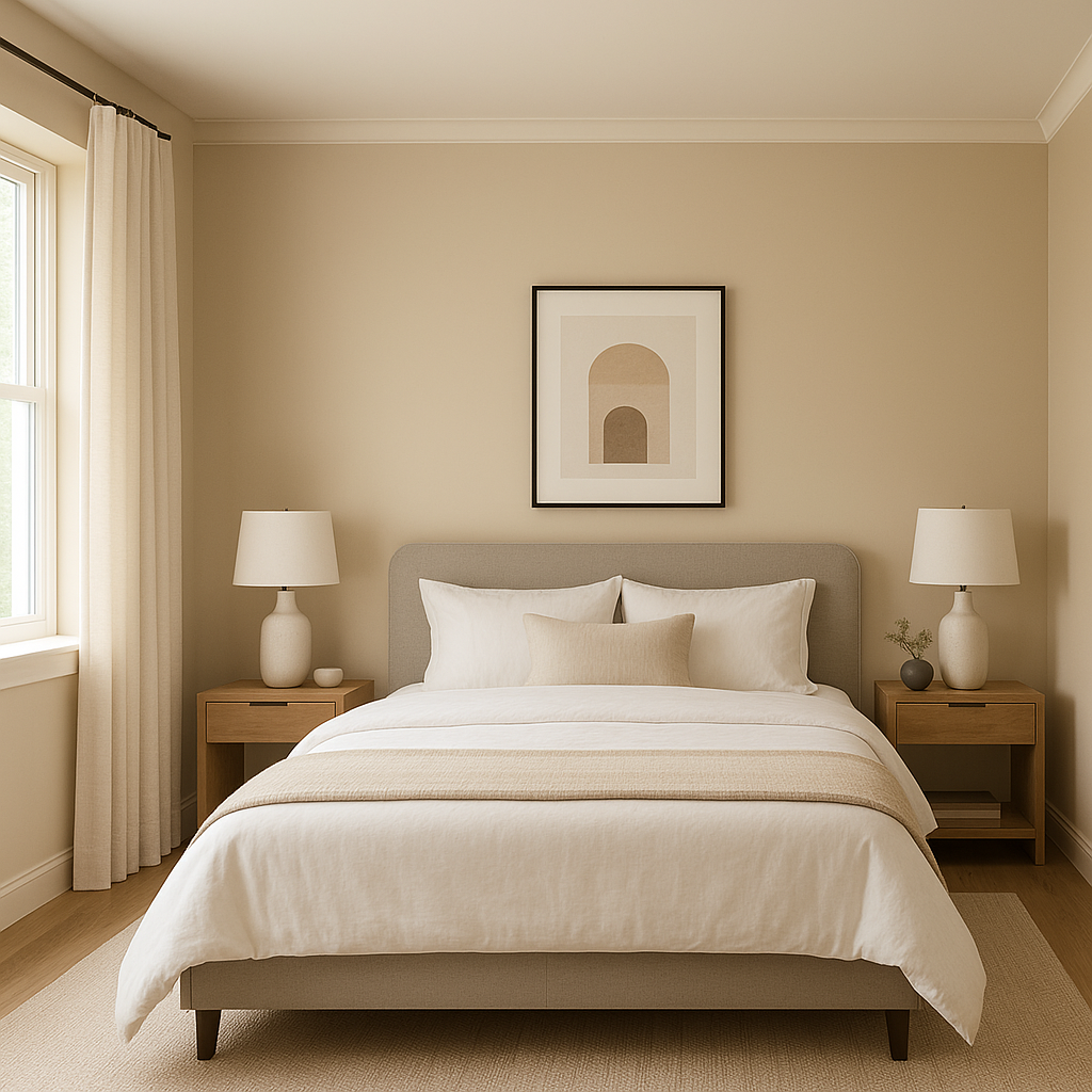
In bedrooms, Cappuccino provides a soothing and cocoon-like effect that promotes relaxation. Combine it with lighter neutrals, such as White Dove or Edgecomb Gray, for an airy feel, or layer it with deeper hues like Iron Mountain for a dramatic and romantic look.
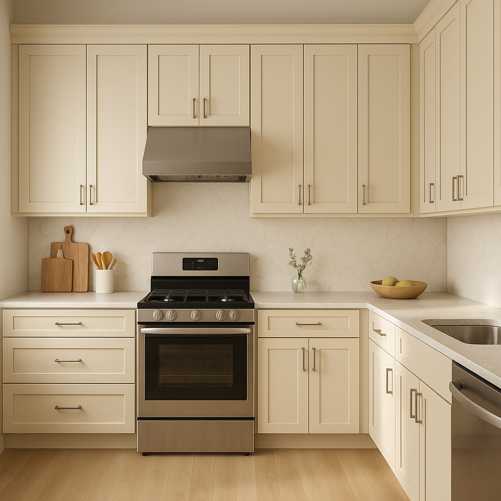
For dining spaces, Cappuccino adds richness and elegance. Consider using it on all walls for a monochromatic effect that feels luxurious, or use it as an accent color alongside white wainscoting for a classic aesthetic. Add metallic accents like brass or gold for a glamorous touch.
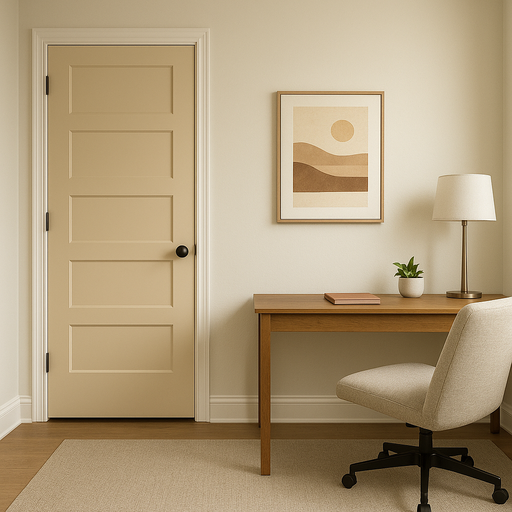
Cappuccino is perfect for creating a focused yet inviting workspace. Pair it with deep navy blues or charcoals for a sophisticated palette that inspires productivity. Wooden desks and leather chairs will coordinate beautifully with its earthy undertones.
In transitional areas such as hallways or entryways, Cappuccino makes a striking first impression. Its warm undertones create an inviting atmosphere for guests. Pair it with lighter or darker neutrals to achieve balance and dimension.
Cappuccino’s polished and professional look makes it an excellent choice for commercial environments like offices, boutique shops, or coffee houses. Its comforting warmth creates a welcoming and approachable vibe that resonates with clients and customers.
Lighting can dramatically affect how Benjamin Moore Cappuccino appears in a space. In rooms with abundant natural light, the subtle golden undertones shine through, giving the color a warm and radiant quality. In spaces with artificial lighting, particularly warmer bulbs, the cocoa and caramel tones are emphasized, creating a rich and cozy atmosphere. If your room lacks natural light, pairing Cappuccino with lighter accents can help balance its depth.
Benjamin Moore Cappuccino (CSP-1055) is a versatile and inviting neutral that brings warmth and sophistication to any space. Its rich undertones of cocoa and caramel make it a timeless choice for creating cozy and elegant environments. Whether you use it as a main wall color, an accent shade, or as part of a layered palette, Cappuccino is sure to elevate your interior design project. Its ability to coordinate with a wide range of colors, combined with its adaptability to various lighting conditions, makes it a go-to option for homeowners and designers alike.
View Colors Only by Brand (No Imagery):
Sherwin-Williams
|
Benjamin-Moore
|
Behr
|
Valspar
Live on the Eastern Slope of Colorado and looking for a local painting professional, check out all our painting services and reach out for a free estimate.
Copyright © 2026 : Wild Fox Painting Inc. : 12435 Mead Way, Littleton, CO 80125


