Benjamin Moore Worn (CSP-135) is a sophisticated and versatile paint color that exudes timeless charm. This neutral hue features a subtle combination of warmth and softness, making it an ideal choice for interiors that aim to feel inviting, balanced, and effortlessly chic. Whether used as a backdrop or a foundation for more vibrant accents, Worn is a truly dynamic shade that works in a variety of design styles, from modern minimalism to rustic farmhouse.
Worn carries gentle warm beige undertones that lean slightly toward taupe, creating a delicate balance between earthy and airy. These undertones give the color its approachable yet refined character, making it versatile enough to pair with a wide range of palettes. While it has a cozy warmth, its subdued nature prevents it from feeling overly yellow or golden, ensuring it works beautifully in both natural and artificial lighting conditions.
The undertones also make Worn a fantastic option for spaces where you want to create a calm and grounded atmosphere. Its warm neutrality allows it to act as both a supporting color and a centerpiece in your design.
Worn is a master of complementing other colors, whether you’re working with bold tones or subtle shades. Here are a few coordinating color options to consider:
Pair Worn with fresh whites like Benjamin Moore Chantilly Lace (OC-65) or Simply White (OC-117) for a clean, modern contrast. The brightness of crisp whites enhances Worn’s warmth and creates an elegant yet understated palette.
For a dramatic pairing, opt for deep greys like Benjamin Moore Kendall Charcoal (HC-166) or Amherst Gray (HC-167). The cooler tones of these darker shades provide a striking balance to Worn’s warm beige undertones, perfect for creating depth and sophistication.
Worn harmonizes beautifully with muted greens like Benjamin Moore Saybrook Sage (HC-114) or October Mist (1495). These earthy hues complement Worn’s warmth and bring a fresh, organic feel to the space.
For a serene, coastal-inspired look, consider soft blues such as Benjamin Moore Smoke (2122-40) or Pale Oak (OC-20). The gentle coolness of these shades pairs well with Worn’s neutral warmth, creating a calming and balanced aesthetic.
Worn is a fantastic choice for living rooms, where its warm undertones create a welcoming and cozy ambiance. Pair it with plush furniture and soft textiles to amplify its inviting nature, or introduce metallic accents for a modern twist.
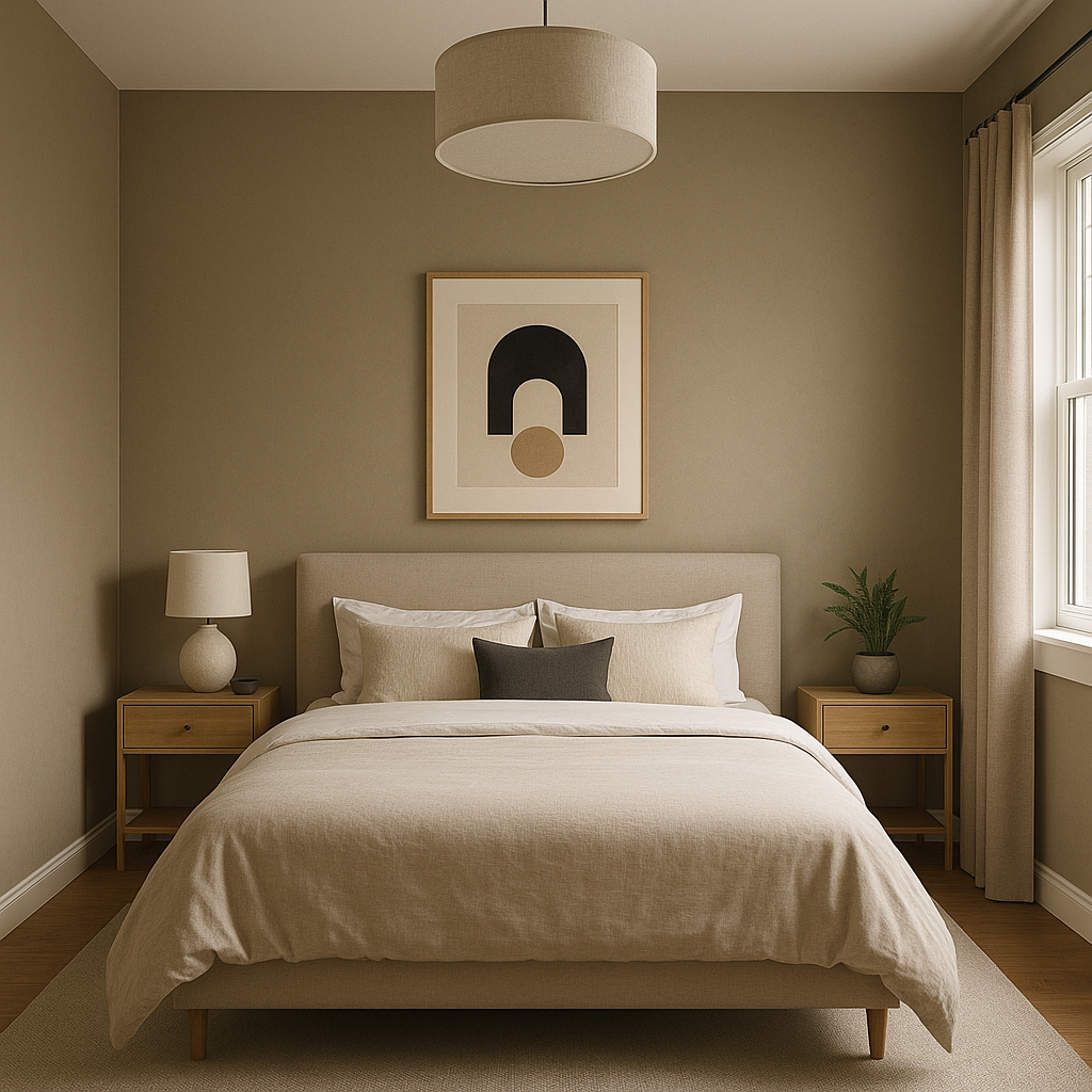
In bedrooms, Worn’s soothing qualities make it perfect for cultivating a restful environment. Combine it with soft linens, neutral bedding, and natural wood furniture for a calming retreat.
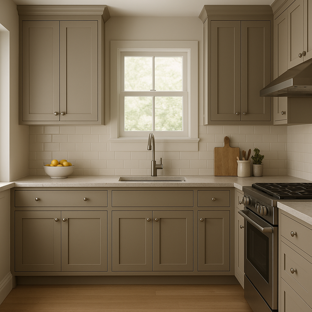
For kitchens, Worn works seamlessly with white cabinetry and marble countertops. Add brass or copper hardware to complement its warmth and give the space a polished, sophisticated look.
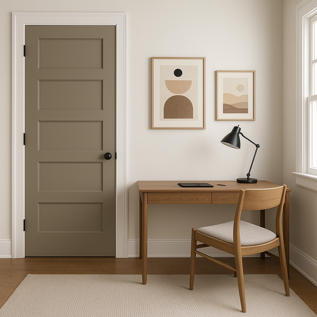
Transform transitional spaces with Worn’s timeless appeal. Use it in hallways or entryways to create a cohesive flow between rooms, especially when paired with other warm neutrals, wood accents, or light fixtures.
In home offices, Worn fosters a grounded and productive atmosphere. Pair it with darker furniture for contrast or lighter accents for a bright, energizing workspace.
Worn adapts beautifully to different lighting conditions. In spaces with ample natural light, it appears slightly brighter and airier, while in dimmer settings, its warm undertones shine through, adding depth and coziness. Be sure to test the color in your space to see how it interacts with your specific lighting environment.
Benjamin Moore Worn (CSP-135) is a classic neutral that effortlessly enhances interiors with its warm undertones and versatile nature. Whether you’re designing a serene bedroom or a polished kitchen, this shade proves to be an enduring favorite for homeowners and designers alike. Its ability to coordinate with a wide range of colors and styles makes it a go-to choice for creating spaces that feel timeless yet tailored to your unique aesthetic.
View Colors Only by Brand (No Imagery):
Sherwin-Williams
|
Benjamin-Moore
|
Behr
|
Valspar
Live on the Eastern Slope of Colorado and looking for a local painting professional, check out all our painting services and reach out for a free estimate.
Copyright © 2026 : Wild Fox Painting Inc. : 12435 Mead Way, Littleton, CO 80125


