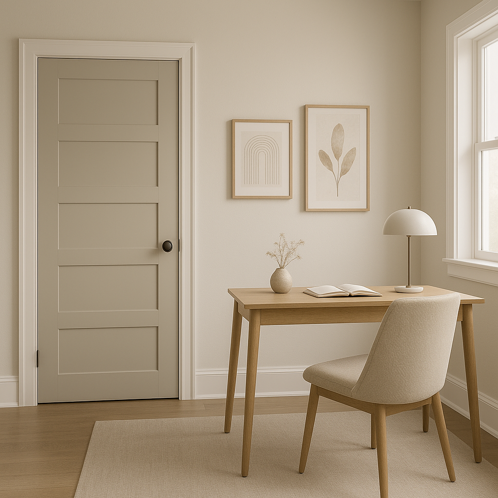
Benjamin Moore Skipping CSP-155 is a sophisticated and versatile neutral that brings a sense of calm and understated elegance to any space. Part of the exclusive Color Stories collection, this hue is celebrated for its remarkable depth and complexity, making it an exceptional choice for both modern and classic interiors. Whether you're designing a serene bedroom retreat, a welcoming living room, or an airy open-concept space, Skipping CSP-155 is sure to elevate your design with its subtle charm.
The beauty of Skipping CSP-155 lies in its nuanced undertones. This soft, warm greige strikes the perfect balance between gray and beige, making it a highly adaptable shade. It features a gentle warmth that leans slightly taupe, with faint hints of lavender undertones that emerge in certain lighting conditions. These undertones give the color a refined softness, making it neither too cool nor too warm—ideal for creating a soothing and harmonious atmosphere.
To create a cohesive and polished look, Skipping CSP-155 pairs beautifully with a range of coordinating colors. Here are some complementary shades to consider for your design palette:
Soft Whites and Creams: Pair Skipping CSP-155 with warm whites like Benjamin Moore "Simply White" (OC-117) or "White Dove" (OC-17) for a clean, fresh aesthetic. These shades enhance the warmth of Skipping CSP-155 while maintaining a light and airy feel.
Earthy Greens: For a natural and grounding effect, consider coordinating it with soothing greens such as "Saybrook Sage" (HC-114) or "October Mist" (1495). These organic tones add depth to the space and create a tranquil ambiance.
Deep Charcoals and Navy Blues: For contrast and drama, pair Skipping CSP-155 with rich, moody hues like "Kendall Charcoal" (HC-166) or "Hale Navy" (HC-154). These colors provide a stunning backdrop that highlights the subtle elegance of Skipping CSP-155.
Blush and Dusty Pinks: If you're looking to add a touch of softness and romance, try pairing it with rosy shades like "First Light" (2102-70) or "Head Over Heels" (AF-250). These delicate hues bring out the lavender undertones in Skipping CSP-155, creating a harmonious and inviting blend.
The versatility of Skipping CSP-155 makes it a favorite among designers and homeowners alike. Here are some ways to incorporate this timeless neutral into your interiors:
Skipping CSP-155 is an excellent choice for creating a warm and welcoming living room. Its adaptable nature allows it to work seamlessly with various furniture styles, from contemporary to traditional. Pair it with textured fabrics, natural wood finishes, and metallic accents for a balanced and inviting look.
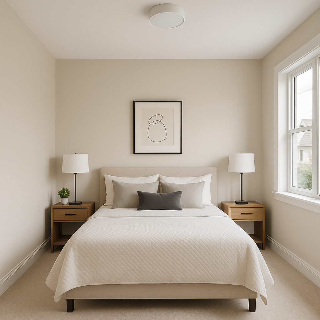
The soothing undertones of Skipping CSP-155 make it ideal for bedrooms. Use it as a wall color to establish a serene and relaxing environment. Layer with cozy textiles in soft whites or muted pastels to enhance the tranquil vibe.
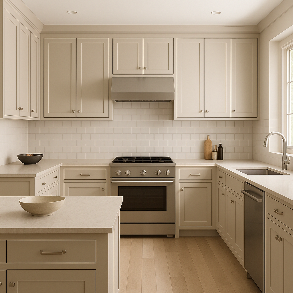
For a fresh and modern kitchen, consider using Skipping CSP-155 on cabinetry or walls. It pairs beautifully with marble countertops, brushed nickel hardware, and backsplashes in white or light gray. In dining areas, it provides a neutral backdrop that complements both casual and formal settings.
In bathrooms, Skipping CSP-155 contributes to a spa-like feel. Pair it with crisp white tiles, polished chrome fixtures, and soft gray accents for a clean and serene aesthetic.
View Colors Only by Brand (No Imagery):
Sherwin-Williams
|
Benjamin-Moore
|
Behr
|
Valspar
Live on the Eastern Slope of Colorado and looking for a local painting professional, check out all our painting services and reach out for a free estimate.
Copyright © 2026 : Wild Fox Painting Inc. : 12435 Mead Way, Littleton, CO 80125


