Benjamin Moore's Quietude (CSP-230) is a refined and tranquil neutral that exudes calm and versatility. This soft beige hue is part of the Benjamin Moore Color Stories collection, a premium palette that offers complex and dynamic shades. Quietude is ideal for creating serene spaces while offering the flexibility to complement a wide array of design styles, from classic to contemporary.
Quietude is a warm beige with subtle gray undertones, giving it a modern edge while maintaining its timeless appeal. The gray undertones soften the warmth, making it neither too yellow nor overly cool. This balanced nuance allows Quietude to adapt beautifully to different lighting conditions, whether in natural sunlight or artificial illumination.
In spaces with abundant natural light, Quietude leans slightly warmer, evoking a cozy yet open ambiance. Under artificial lighting, the gray undertones become more pronounced, offering a sophisticated and subdued look. This duality makes Quietude an exceptional choice for rooms where lighting shifts throughout the day.
Quietude’s versatility shines when paired with complementary colors. Its warm neutrality allows it to harmonize with both earthy tones and cooler palettes, making it a perfect backdrop or accent color. Here are some suggestions for coordinating colors:
Quietude is incredibly versatile and can be used throughout the home in various ways. Its understated elegance makes it suitable for both large and small spaces. Here are some design ideas to inspire you:
Use Quietude on the walls to create a soothing and welcoming atmosphere. Pair it with light-colored furniture and textured fabrics like linen or wool for an airy yet grounded aesthetic. Incorporate metallic or wood accents to add warmth and character.
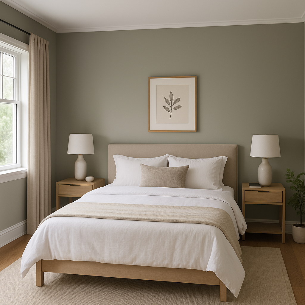
Quietude is an excellent choice for bedrooms due to its calming nature. Combine it with soft whites, muted blues, or blush tones for a tranquil retreat. Layer cozy throws and plush bedding to enhance the sense of comfort.
For a spa-like bathroom, Quietude serves as an ideal wall color. Pair it with crisp white tiles, brushed nickel fixtures, and natural wood accents to create a serene and polished look.
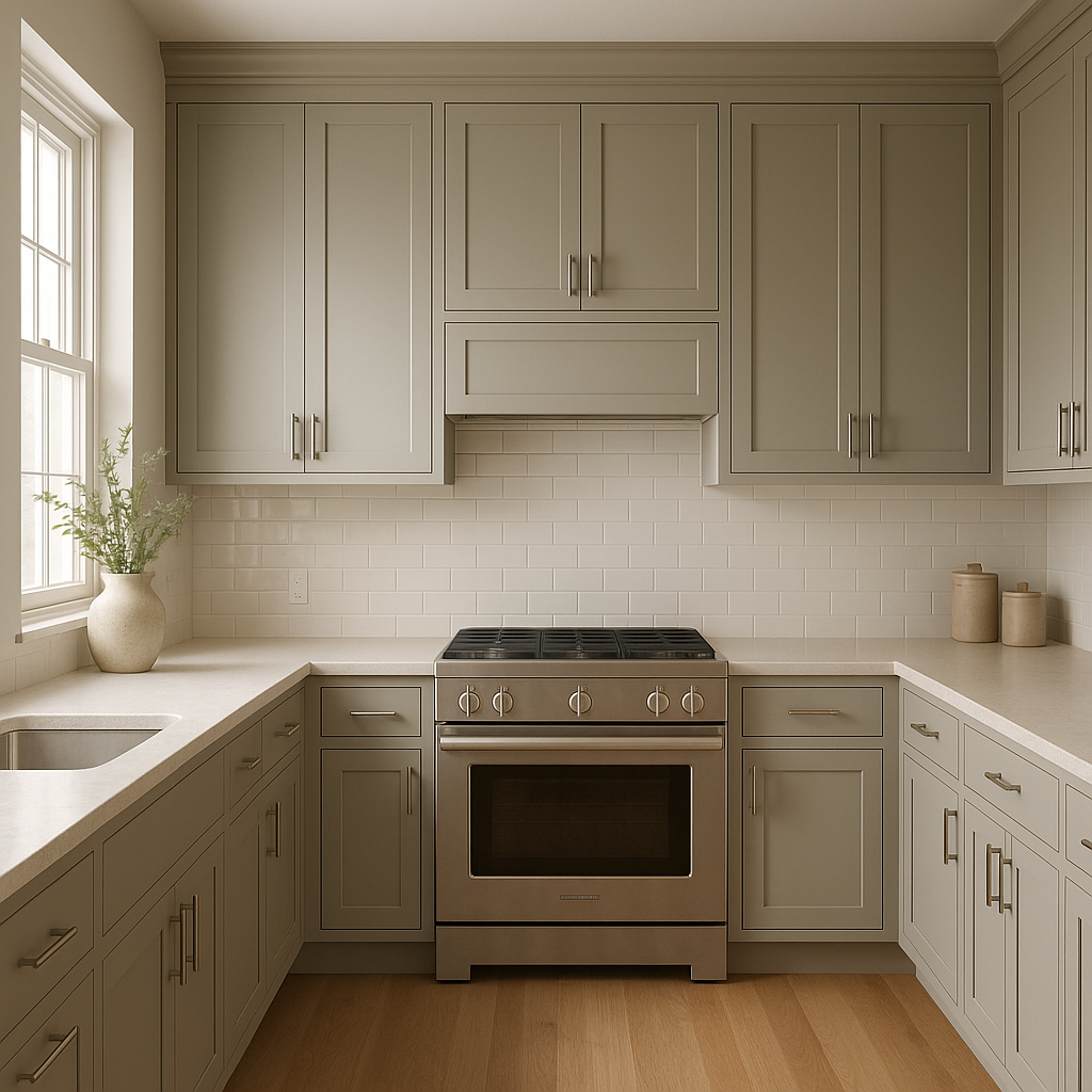
Quietude works beautifully in kitchens, whether as a wall color or cabinetry finish. Pair it with marble countertops, matte black or brass hardware, and warm wood tones for a balanced and timeless design.
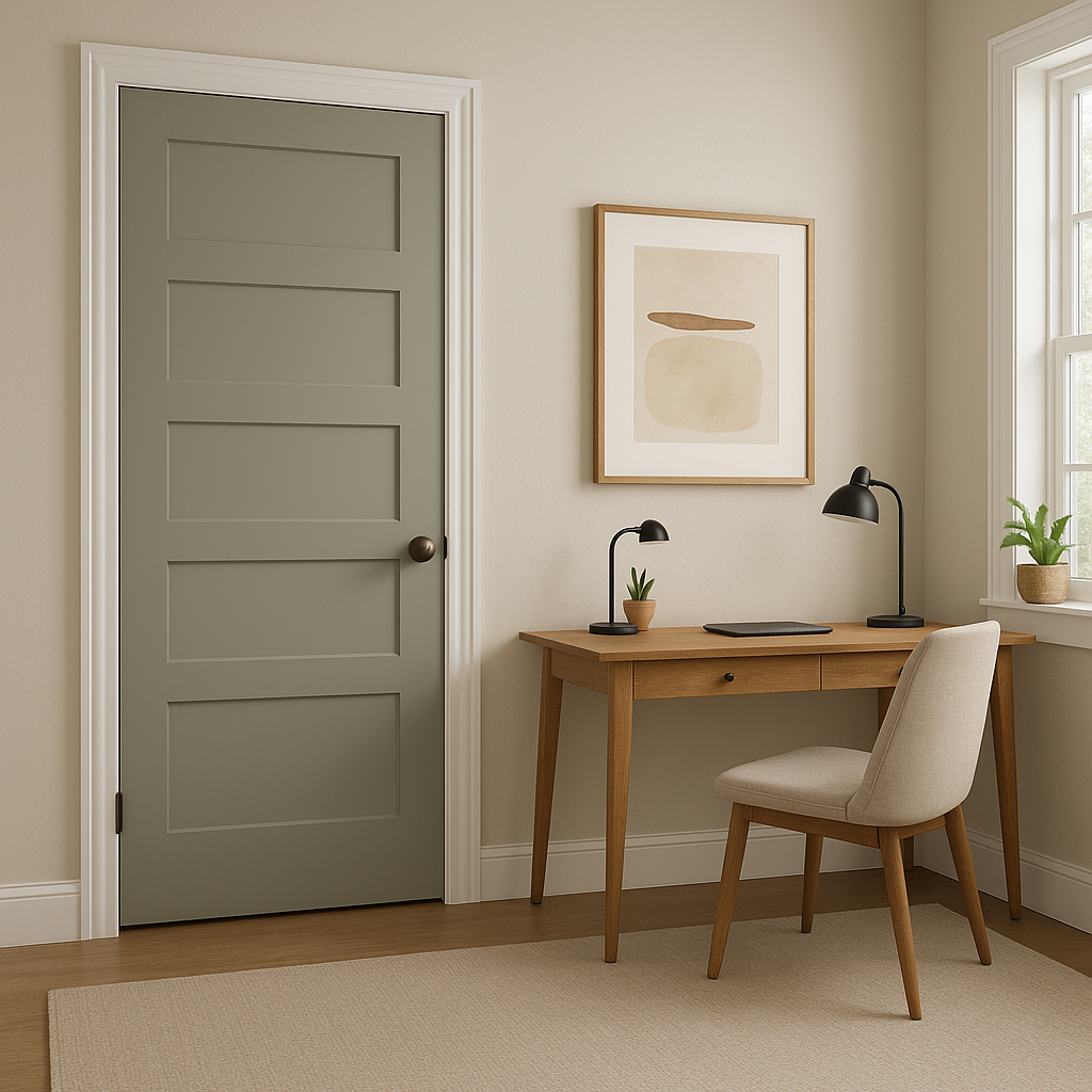
In a home office, Quietude fosters focus and calm. Combine it with dark furniture and pops of greenery to create a productive yet soothing environment.
Quietude (CSP-230) stands out as a neutral that is anything but plain. Its ability to adapt to different lighting and coordinate with diverse color palettes makes it an interior designer’s dream. Whether you're looking to refresh a single room or create a cohesive look throughout your home, Quietude offers a sophisticated foundation for your space.
With its subtle undertones, complementary pairings, and versatility across design styles, Benjamin Moore Quietude is a timeless choice that brings elegance and harmony to any interior.
View Colors Only by Brand (No Imagery):
Sherwin-Williams
|
Benjamin-Moore
|
Behr
|
Valspar
Live on the Eastern Slope of Colorado and looking for a local painting professional, check out all our painting services and reach out for a free estimate.
Copyright © 2026 : Wild Fox Painting Inc. : 12435 Mead Way, Littleton, CO 80125


