Benjamin Moore Dulce (CSP-250) is a soft, luxurious neutral that effortlessly blends warmth and sophistication into any space. Part of Benjamin Moore’s exclusive Color Stories collection, Dulce offers a velvety cream base infused with subtle undertones that make it a versatile choice for both traditional and contemporary interiors. Its balanced profile allows it to adapt beautifully to a variety of lighting conditions, making it an outstanding option for creating a welcoming and refined atmosphere.
Dulce is a warm, creamy beige with delicate golden undertones that lend it a subtle glow. These undertones imbue the color with a natural richness, making it feel cozy without becoming overly yellow or muddy. The golden hints help Dulce pair seamlessly with wood tones, metallic finishes, and other warm hues. Its undertones also harmonize wonderfully with natural light, giving spaces a soft, inviting radiance throughout the day.
In cooler lighting, Dulce may reveal a faint gray undertone, adding depth and sophistication while maintaining its warm character. This duality makes it an excellent chameleon color, capable of complementing a variety of design styles and palettes.
Benjamin Moore Dulce (CSP-250) shines brightest when paired with shades that emphasize its subtle elegance. Here are some suggested coordinating colors:
Complementary Neutrals: Pair Dulce with soft whites like Benjamin Moore White Dove (OC-17) or Cloud White (OC-130) for a clean, timeless look. These shades balance the warmth of Dulce while creating a crisp and airy ambiance.
Earthy Tones: Bring out Dulce’s golden undertones by pairing it with earthy hues like Benjamin Moore Grant Beige (HC-83) or Rustic Taupe (CSP-25). These combinations offer a grounded, natural aesthetic that feels serene and sophisticated.
Rich Accents: For a more dramatic contrast, consider deep browns or charcoals like Benjamin Moore Kendall Charcoal (HC-166) or French Roast (2090-10). These darker tones highlight Dulce’s warmth while adding depth and richness to the overall palette.
Soft Pastels: Dulce also works beautifully with muted pastels such as Benjamin Moore Gray Cashmere (2138-60) or Woodlawn Blue (HC-147) for a subtle yet uplifting pairing that feels fresh and tranquil.
Dulce’s versatility makes it an exceptional choice for a wide range of spaces and design applications. Whether you’re looking to create a cozy retreat or a polished backdrop, this warm neutral can bring balance, sophistication, and comfort to your home.
Dulce is ideal for living rooms where you want to create a welcoming yet refined atmosphere. Its warm undertones complement wood furniture, textured fabrics, and metallic finishes, making it the perfect canvas for layering colors and textures. Pair it with a plush cream-colored rug and gold or bronze accents for added elegance.
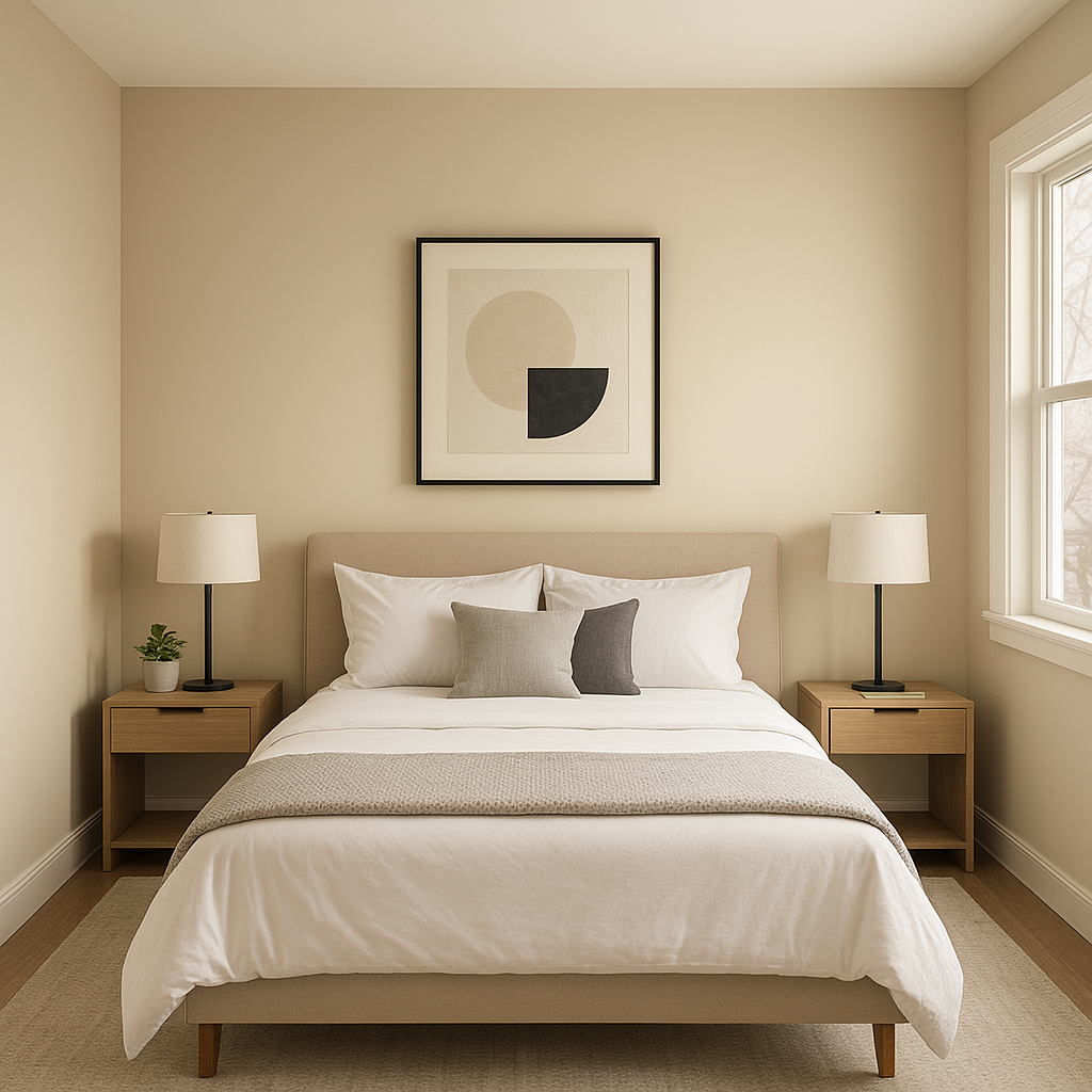
Transform your bedroom into a soothing sanctuary with Dulce. Its soft, creamy hue creates a peaceful environment conducive to rest and relaxation. Add crisp white linens, muted beige or taupe throw pillows, and soft lighting to amplify Dulce’s calming effect. For a romantic flair, consider pairing it with blush pink or dusty lavender accents.
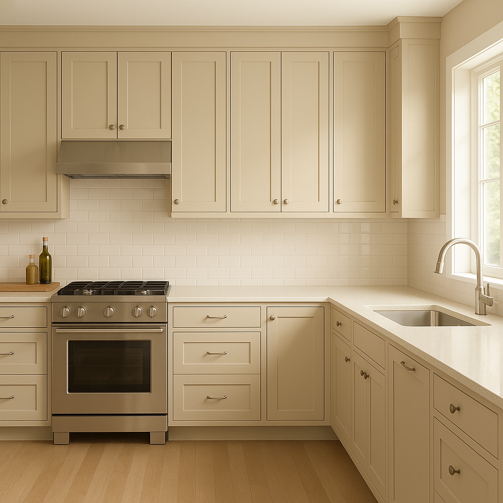
Dulce works beautifully in kitchens, especially when paired with white cabinetry and natural stone countertops. Its golden undertones add warmth to the space, making it feel inviting and timeless. Consider using Dulce on walls or as an accent color for an island or pantry door.
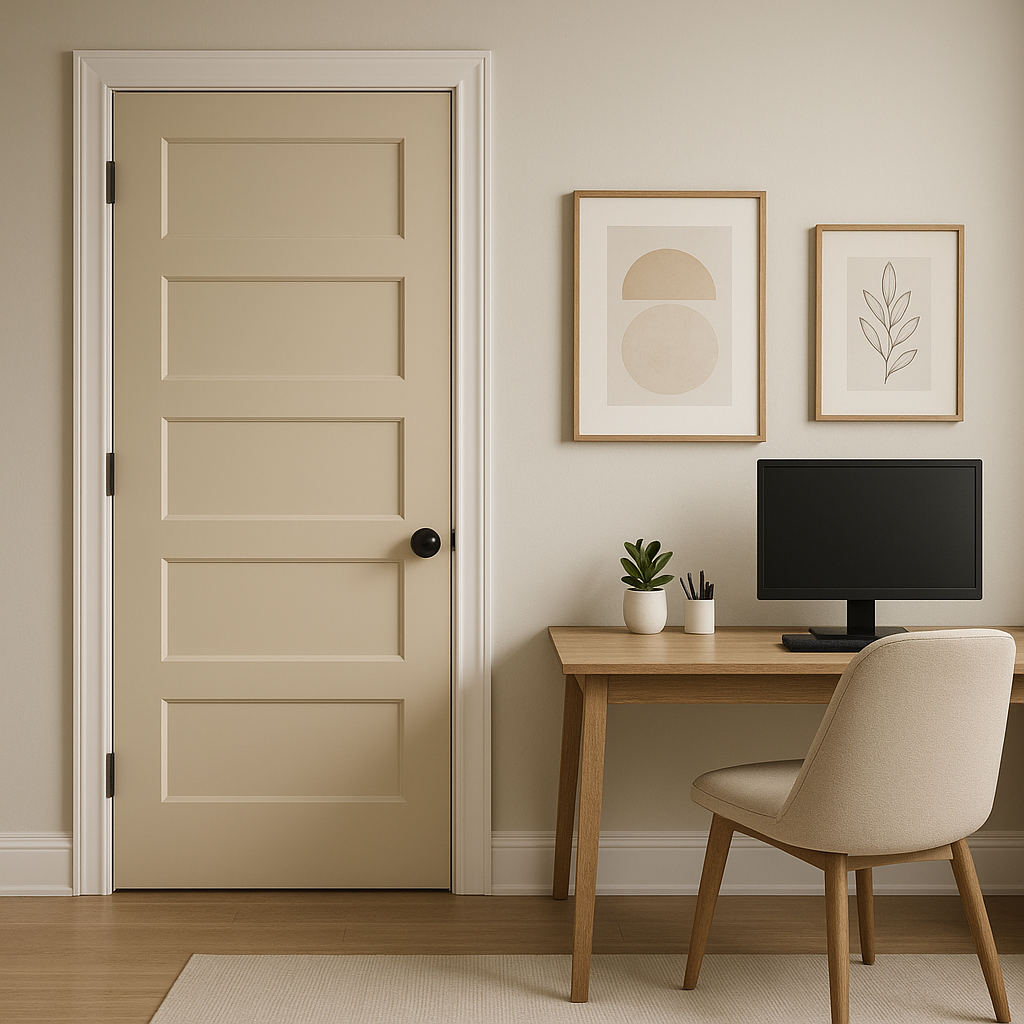
Create a seamless flow throughout your home by using Dulce in hallways and entryways. Its neutral palette acts as an elegant transition between spaces, perfect for connecting rooms with varying color schemes. Add a statement mirror or a console table with metallic accents to elevate the space further.
Dulce can bring a spa-like ambiance to bathrooms, particularly when paired with soft whites and natural textures like marble or wood. Its understated elegance creates a serene and inviting environment, perfect for unwinding after a long day.
Benjamin Moore Dulce is more than just a paint color—it’s a design tool that can transform your space into a haven of warmth and sophistication. Its creamy base, enriched with golden undertones, creates an atmosphere that feels both timeless and effortlessly chic. Whether used as a main wall color, an accent, or part of a larger palette, Dulce brings a sense of harmony and elegance to any room.
By thoughtfully pairing Dulce with complementary colors and incorporating it into spaces where warmth and versatility are paramount, you can achieve a look that is both inviting and polished. Its ability to adapt to various design styles and lighting conditions makes it an invaluable choice for homeowners and designers alike.
View Colors Only by Brand (No Imagery):
Sherwin-Williams
|
Benjamin-Moore
|
Behr
|
Valspar
Live on the Eastern Slope of Colorado and looking for a local painting professional, check out all our painting services and reach out for a free estimate.
Copyright © 2026 : Wild Fox Painting Inc. : 12435 Mead Way, Littleton, CO 80125


