
Benjamin Moore Camel CSP-285 is a rich and versatile neutral that brings warmth, sophistication, and timeless appeal to any interior space. This shade, which sits in the Color Stories palette, is aptly named for its resemblance to the soft, golden-brown tones of camel hair. With its ability to radiate both coziness and elegance, Camel CSP-285 is an exceptional choice when you're looking to create a welcoming atmosphere that feels grounded and balanced.
Camel CSP-285 has warm undertones that lean towards golden beige, giving it a softer and more approachable feel compared to cooler neutrals. The golden undertones imbue the color with a subtle glow, allowing it to play beautifully in both natural and artificial light. This warmth ensures that the color doesn’t feel flat or stark, making it a great choice for spaces where comfort is key. Depending on the lighting, you may notice hints of a creamy caramel hue, which adds depth and complexity to the shade.
One of the reasons Camel CSP-285 is so beloved is its incredible versatility when it comes to pairing with other colors. Whether you're designing a space with a modern, traditional, or eclectic style, this neutral can serve as a perfect backdrop or a complementary accent. Here are some ideas for coordinating colors:
Soft Whites: Pair Camel CSP-285 with warm whites like Benjamin Moore Simply White (OC-117) or White Dove (OC-17) to create a clean and refined look. These shades highlight the golden undertones of Camel and keep the space feeling light and airy.
Earthy Greens: For a nature-inspired palette, consider pairing it with muted greens like Saybrook Sage (HC-114) or October Mist (1495). This combination evokes a sense of calm and organic tranquility.
Rich Blues: Deep navy tones like Hale Navy (HC-154) or Newburyport Blue (HC-155) create a striking contrast with Camel CSP-285, perfect for making a statement in living rooms, dining rooms, or studies.
Neutral Grays: For a modern and understated look, pair Camel CSP-285 with soft greige tones like Revere Pewter (HC-172) or Edgecomb Gray (HC-173). This pairing works beautifully in open-concept spaces.
Warm Accents: Add depth and energy to your space by incorporating warm accent colors such as terracotta, rust, or burnt orange. These hues complement the golden undertones of Camel CSP-285 and enhance its cozy vibe.
Camel CSP-285 is a truly adaptable color that suits a variety of design styles and room types. Its warm, grounding qualities make it an excellent choice for spaces where you want to create a relaxed yet upscale feel. Here are some ideas for incorporating it into your home:
Living Rooms: Use Camel CSP-285 on the walls to establish a warm and inviting foundation. Pair it with plush furniture and metallic accents for a sophisticated and cozy aesthetic.
Bedrooms: As a soothing neutral, this color works beautifully in bedrooms. Pair it with soft bedding and layered textures to create a restful retreat.
Dining Rooms: Camel CSP-285 brings a sense of refinement to dining areas. Combine it with rich wood tones and elegant lighting to set the stage for memorable meals.
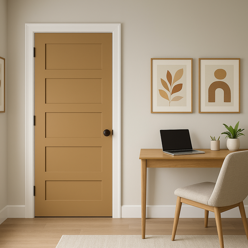
Home Offices: Its neutral yet impactful tone makes it a fantastic option for home offices. It provides a level of sophistication while maintaining a comfortable work environment.
Hallways & Entryways: Use Camel CSP-285 in transitional spaces to create a seamless flow throughout your home. Its warmth ensures a welcoming first impression.
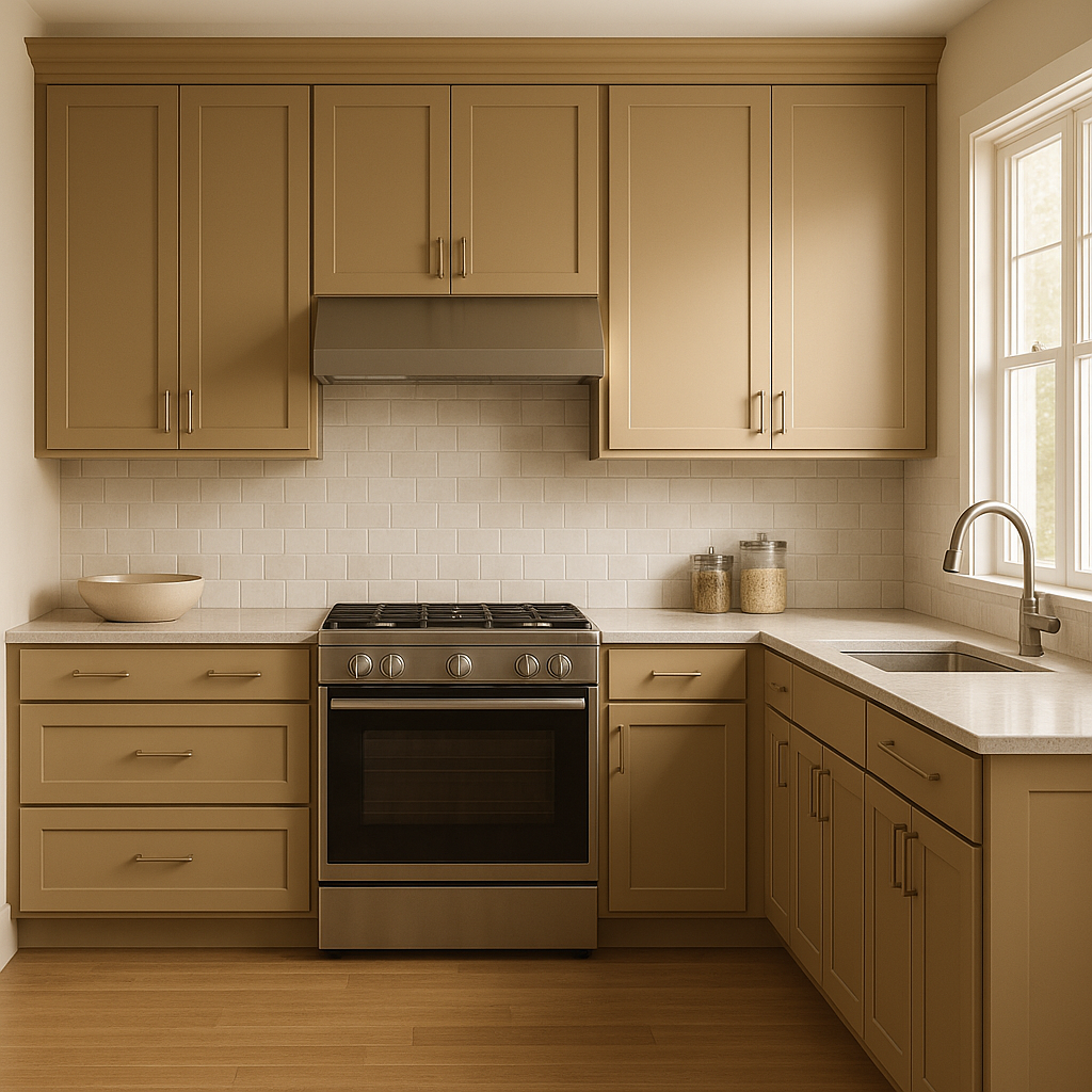
Kitchens: For a modern take on a classic kitchen, incorporate Camel CSP-
View Colors Only by Brand (No Imagery):
Sherwin-Williams
|
Benjamin-Moore
|
Behr
|
Valspar
Live on the Eastern Slope of Colorado and looking for a local painting professional, check out all our painting services and reach out for a free estimate.
Copyright © 2026 : Wild Fox Painting Inc. : 12435 Mead Way, Littleton, CO 80125


