Benjamin Moore Cashmere (CSP-345) is a sophisticated, warm neutral that exudes understated luxury and effortless charm. Part of the Benjamin Moore Color Stories collection, this velvety hue is celebrated for its ability to transform spaces into a haven of comfort and style. Whether you're designing a cozy living room, a serene bedroom, or a welcoming entryway, Cashmere provides a versatile foundation that enhances both traditional and contemporary interiors.
Cashmere (CSP-345) is a soft, warm beige that leans slightly toward taupe, balancing creamy richness with subtle sophistication. Its undertones include gentle hints of gray and faint whispers of pink, which give the shade a multidimensional depth. These undertones make Cashmere an adaptable choice, as it complements a wide range of color palettes without overpowering the room. The pink undertones add warmth, while the gray nuances ensure the paint remains grounded and refined, making it an excellent choice for spaces where you want a harmonious and inviting atmosphere.
One of the standout features of Benjamin Moore Cashmere is its ability to pair seamlessly with other colors, creating cohesive and visually appealing designs. Here are a few coordinating color suggestions:
These coordinating shades allow you to play with contrast, texture, and depth, whether you're designing a monochromatic scheme or adding pops of color for visual interest.
Cashmere (CSP-345) is incredibly versatile, making it suitable for a wide range of applications throughout the home. Here are some creative ways to use this elegant neutral:
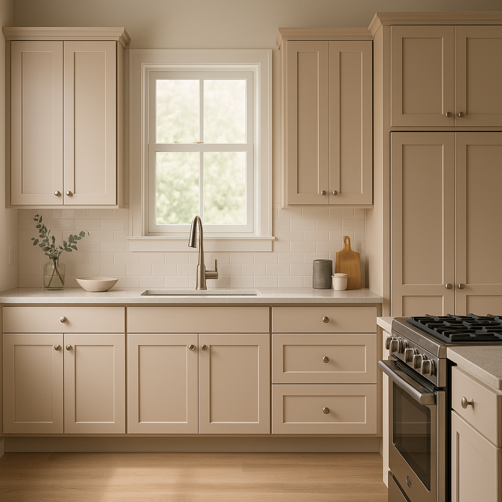
Cashmere is a perfect choice for living rooms, creating an inviting and relaxing environment. Pair it with plush fabrics, warm wood tones, and metallic accents like brass or gold to elevate the space's sophistication. Add pops of color through throw pillows, rugs, or artwork to personalize the room without detracting from the neutral base.
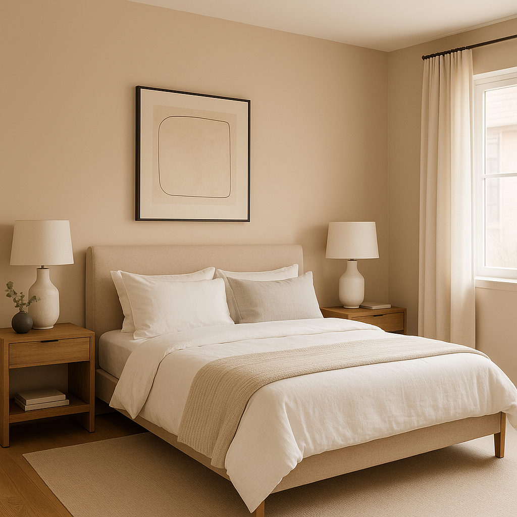
For bedrooms, Cashmere offers a calming backdrop that encourages rest and tranquility. Layer it with soft linens in cream or blush tones to amplify its warmth, or introduce deeper hues like navy or charcoal for a more dramatic look. Its subtle undertones ensure it adapts beautifully to both minimalist and maximalist aesthetics.
Cashmere brings a spa-like serenity to bathrooms, especially when paired with crisp whites and natural materials like marble or wood. Use it on walls for a soothing effect, and complement it with chrome or matte black fixtures for a modern edge.
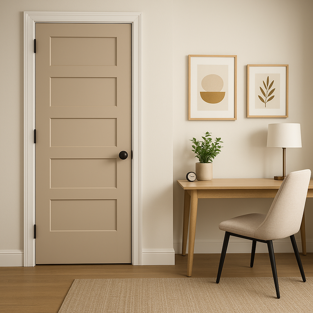
In transitional spaces like hallways and entryways, Cashmere provides a neutral canvas that feels welcoming and timeless. Combine it with darker shades for doors or trim to add depth, or keep the look light and airy with pale coordinating colors.
For open-concept layouts, Cashmere serves as an ideal unifying color, seamlessly connecting different areas of the home. Its warm undertones allow it to work well with both light and dark furniture, ensuring a balanced and cohesive design.
Benjamin Moore Cashmere (CSP-345) is more than just a paint color—it's a design element that encapsulates warmth, elegance, and versatility. Its ability to adapt to diverse styles and spaces makes it a go-to choice for homeowners and designers seeking a timeless neutral that feels luxurious yet approachable. Whether you’re refreshing a single room or reimagining your entire home, Cashmere is a dependable option that will elevate your interiors with its subtle sophistication.
This refined beige shade is ideal for those who appreciate classic design with a modern twist, and its ability to harmonize with a variety of colors ensures your creative vision can be effortlessly brought to life.
View Colors Only by Brand (No Imagery):
Sherwin-Williams
|
Benjamin-Moore
|
Behr
|
Valspar
Live on the Eastern Slope of Colorado and looking for a local painting professional, check out all our painting services and reach out for a free estimate.
Copyright © 2026 : Wild Fox Painting Inc. : 12435 Mead Way, Littleton, CO 80125


