Benjamin Moore's Kept CSP-425 is a stunning mid-tone neutral that seamlessly combines understated elegance with versatility. This hue is part of the esteemed Color Stories® collection, known for its complex, nuanced shades created without the use of black or gray tints. Kept CSP-425 is a color that feels both familiar and fresh, making it a timeless choice for a variety of interior design styles.
Kept CSP-425 is a warm, earthy taupe with subtle red and violet undertones. These undertones give the color a unique depth, ensuring it never feels flat or one-dimensional. The red undertones introduce a gentle warmth, while the violet adds a whisper of sophistication and modernity. This combination allows Kept to adapt beautifully to different lighting conditions, appearing richer and more saturated in warm light and more muted in cooler, natural light.
Kept CSP-425 is exceptionally versatile and pairs well with a variety of complementary shades. Whether you're looking to create contrast or achieve a monochromatic palette, here are some expert recommendations for coordinating colors:
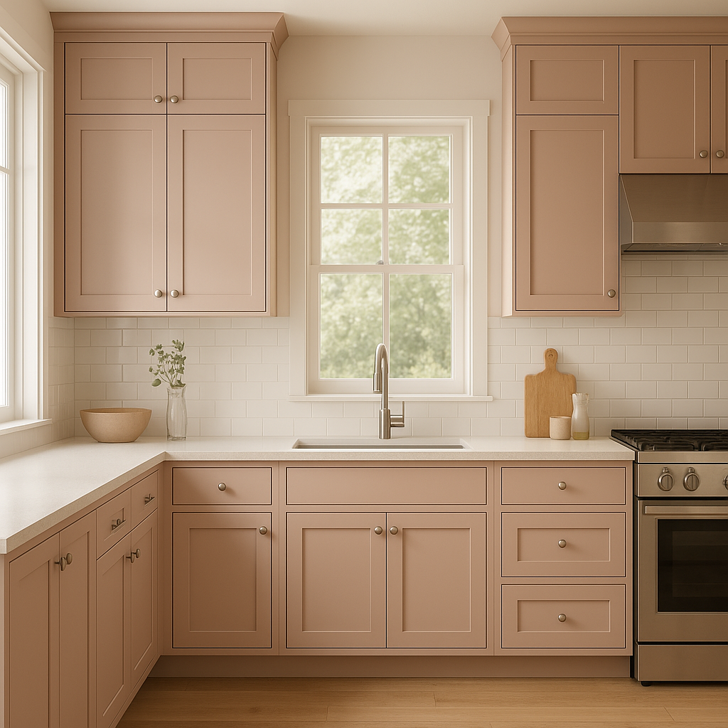
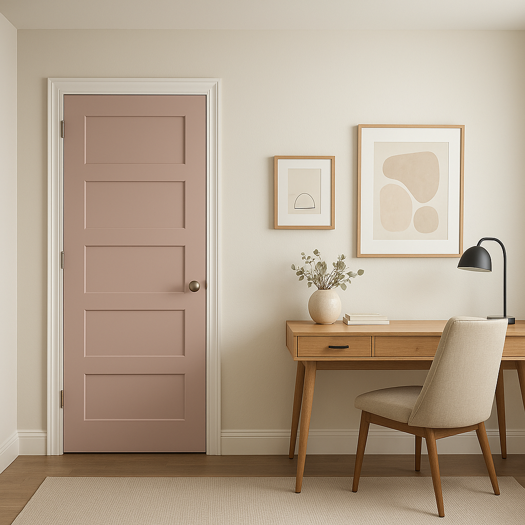
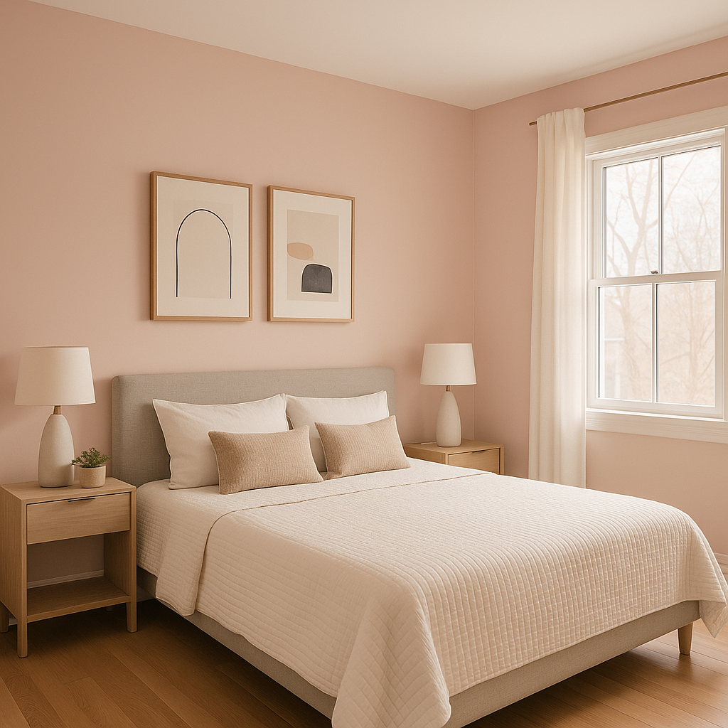
Kept CSP-425 is a multifunctional color that works beautifully in a variety of spaces. Its warm-yet-neutral profile makes it a favored choice for homeowners and designers alike. Here are some of the best ways to incorporate this color into your interior design:
Kept CSP-425 provides a cozy, inviting backdrop for living spaces. Pair it with plush textiles and warm woods for a comfortable, layered aesthetic. Add metallic finishes, such as brass or bronze, to elevate the look and bring out the subtle violet undertones.
This color’s calming and sophisticated vibe makes it ideal for bedrooms. Pair it with soft whites for a serene retreat or incorporate jewel tones like deep emerald green or sapphire blue for a more dramatic, luxurious feel.
Kept CSP-425 adds a sense of intimacy to dining rooms, making it perfect for spaces where you entertain guests. Use it alongside rich, dark woods and elegant lighting to create a formal yet welcoming atmosphere.
In a bathroom, Kept CSP-425 can create a spa-like ambiance when combined with marble finishes and crisp white accents. Add soft, pastel-colored towels and accessories for a cohesive, serene look.
If you’re looking for a warm neutral to inspire focus and creativity, Kept CSP-425 is an excellent choice for a home office. Pair it with bold accent colors, such as Hale Navy or Black Panther, for a sophisticated, professional feel.
View Colors Only by Brand (No Imagery):
Sherwin-Williams
|
Benjamin-Moore
|
Behr
|
Valspar
Live on the Eastern Slope of Colorado and looking for a local painting professional, check out all our painting services and reach out for a free estimate.
Copyright © 2026 : Wild Fox Painting Inc. : 12435 Mead Way, Littleton, CO 80125


