Benjamin Moore Purplicious (CSP-465) is a captivating shade that blends sophistication with a sense of whimsy. This rich, medium purple is part of Benjamin Moore's Color Stories collection, which features complex, multi-pigmented hues designed to offer unparalleled depth and vibrancy. Purplicious is a color that feels both luxurious and inviting, making it an excellent choice for a variety of interior design applications.
Purplicious is a well-balanced purple with subtle undertones that lend it versatility and charm. It carries cool blue undertones, which give it a modern edge, while faint hints of red add warmth and richness. This duality allows Purplicious to work beautifully in spaces that need either a cool or warm touch, depending on the surrounding decor and lighting.
When paired with natural or artificial light, the undertones of Purplicious can shift slightly, creating a dynamic and intriguing effect. In brighter spaces, the blue undertones may become more pronounced, while in dimmer areas, the red tones emerge, giving the color a cozy and intimate feel.
Benjamin Moore Purplicious pairs effortlessly with a variety of complementary and contrasting shades, allowing you to create a cohesive and visually stunning palette. Here are some coordinating color recommendations:
Neutrals:
Accent Colors:
Earthy Tones:
Purplicious is a versatile shade that can be used in both residential and commercial interiors to create a variety of moods and design aesthetics:
1. Feature Walls:
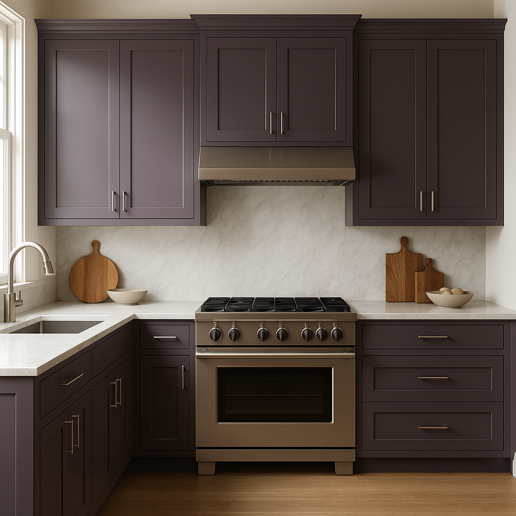
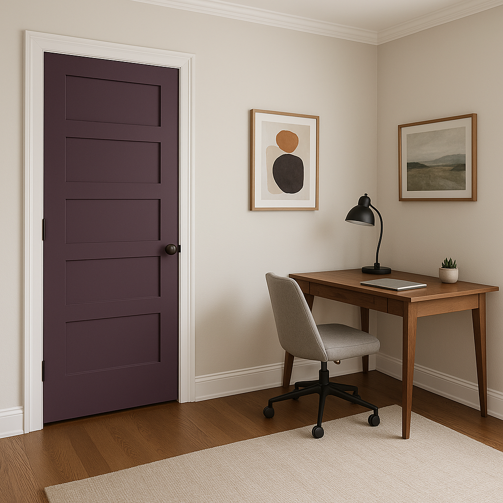
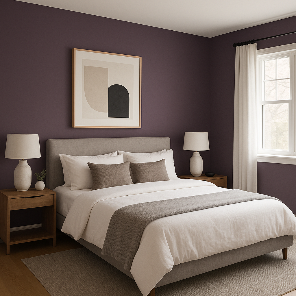
Use Purplicious to create a striking feature wall in living rooms, bedrooms, or home offices. Its rich pigmentation adds depth and character, making it ideal for accentuating architectural details or artwork.
2. Playful Bedrooms:
This shade is perfect for children’s or teenagers’ bedrooms, where its vibrant energy can inspire creativity and playfulness. Pair it with lighter shades like soft pinks or whites to keep the space airy and balanced.
3. Sophisticated Dining Rooms:
Purplicious brings a sense of elegance and drama to dining spaces. Pair it with metallic finishes like gold or brass for a touch of luxury.
4. Creative Workspaces:
In home offices or studios, Purplicious can stimulate creativity and focus. Combine it with neutrals and natural wood tones for a balanced and inspiring environment.
5. Boutique and Retail Spaces:
For commercial interiors, Purplicious exudes personality and charm, making it a great choice for boutiques, salons, or creative studios. Its unique hue can help create a memorable impression on customers.
The way Purplicious appears in a space can vary significantly depending on lighting conditions. In rooms with ample natural light, the cool blue undertones will dominate, giving the color a fresh and modern feel. In spaces with warm artificial lighting, the red undertones will shine through, creating a cozy and inviting atmosphere. To fully appreciate its complexity, sample Purplicious on your walls under different lighting conditions before committing to the shade.
Benjamin Moore Purplicious (CSP-465) is more than just a paint color; it’s an opportunity to infuse your space with personality, elegance, and creativity. Its ability to shift between warm and cool undertones makes it adaptable to various design styles, whether you’re aiming for playful vibrancy or understated sophistication.
Whether you’re looking to make a bold statement or add a subtle touch of color, Purplicious is a timeless choice that can transform any room into a masterpiece.
View Colors Only by Brand (No Imagery):
Sherwin-Williams
|
Benjamin-Moore
|
Behr
|
Valspar
Live on the Eastern Slope of Colorado and looking for a local painting professional, check out all our painting services and reach out for a free estimate.
Copyright © 2026 : Wild Fox Painting Inc. : 12435 Mead Way, Littleton, CO 80125


