Benjamin Moore Paper (CSP-485) is a beautifully soft and refined neutral that serves as a versatile foundation for any interior design project. Part of Benjamin Moore's esteemed Color Stories collection, Paper offers a depth and complexity that goes beyond traditional whites and off-whites. Its understated elegance and adaptability make it a favored choice for homeowners and designers alike.
The magic of Paper lies in its delicate undertones. This shade carries a gentle warmth, which prevents it from feeling too sterile, while a whisper of gray adds depth and sophistication. Together, these undertones create a balanced hue that adapts seamlessly to various lighting conditions. In spaces with ample natural light, Paper appears fresh and airy, while in dimmer environments, it takes on a cozier, more enveloping quality. These subtle shifts make it a chameleon-like color that complements a range of design styles, from modern minimalism to classical elegance.
Benjamin Moore Paper (CSP-485) works effortlessly with other colors, making it an ideal choice for both monochromatic palettes and bold contrasts. Below are some recommended coordinating colors to enhance its beauty:
By thoughtfully incorporating these coordinating colors, you can create a cohesive and polished interior that reflects your personal style.
Paper is an incredibly versatile color that can be used in a variety of ways to transform your interiors:
Its neutral tone creates a calming ambiance, making it perfect for living rooms where relaxation and socialization take center stage. Pair it with soft furnishings in natural textures like linen or wool to enhance its understated charm.
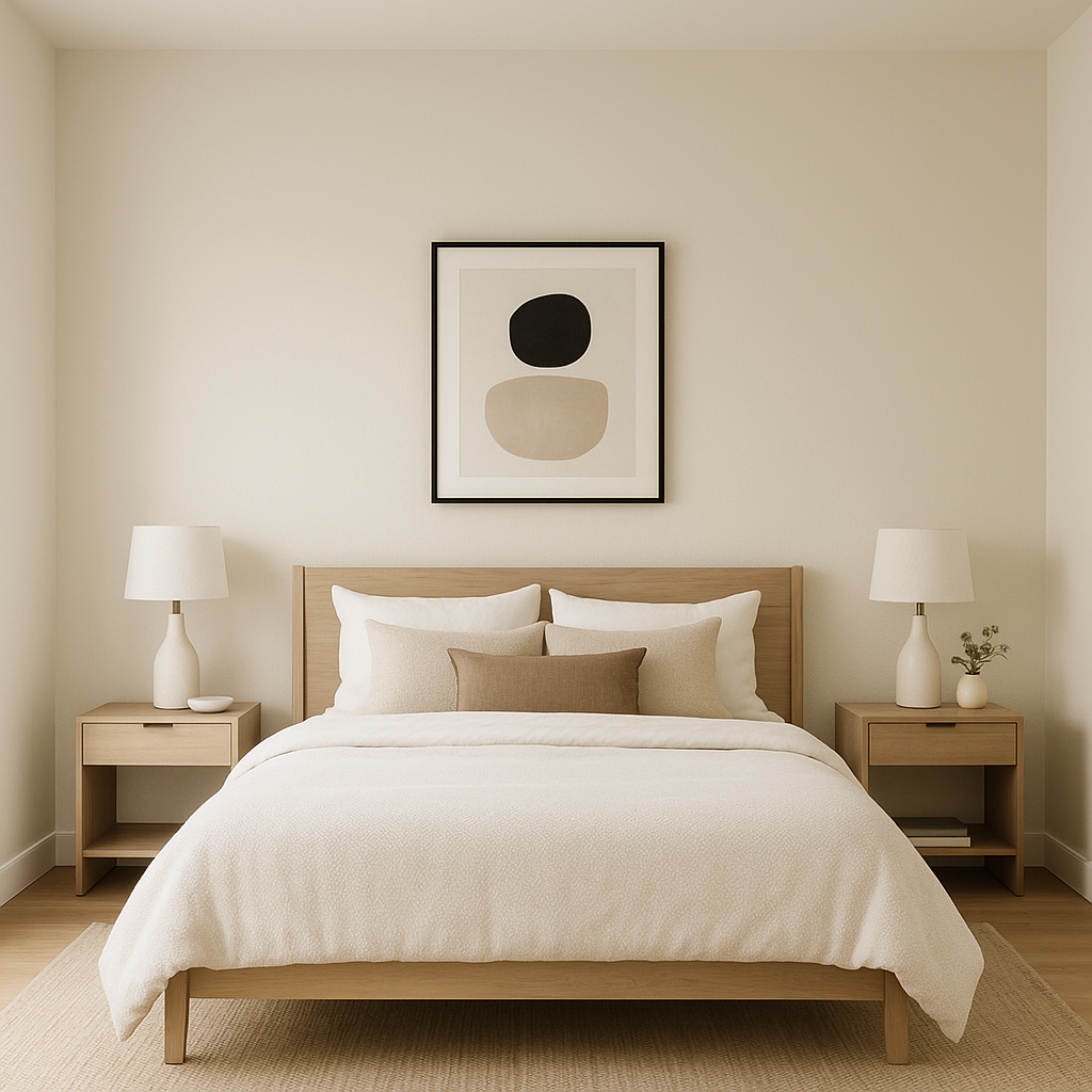
For a serene and restful retreat, use Paper on the walls alongside coordinating bedding in muted tones. Add depth with darker accent furniture or accessories in charcoal or navy.
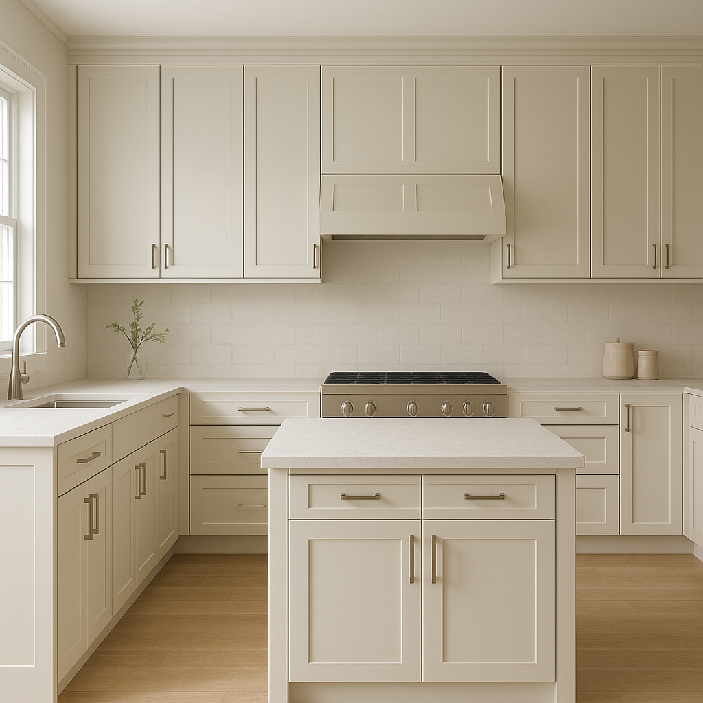
Paper is an excellent choice for kitchens, especially when paired with white cabinets or brushed nickel hardware. It brings a sense of cleanliness without feeling cold, making it ideal for spaces where functionality meets style.
The subtle warmth of Paper makes it a fantastic backdrop for spa-like bathrooms. Pair it with marble tiles and polished chrome fixtures for a timeless and luxurious look.
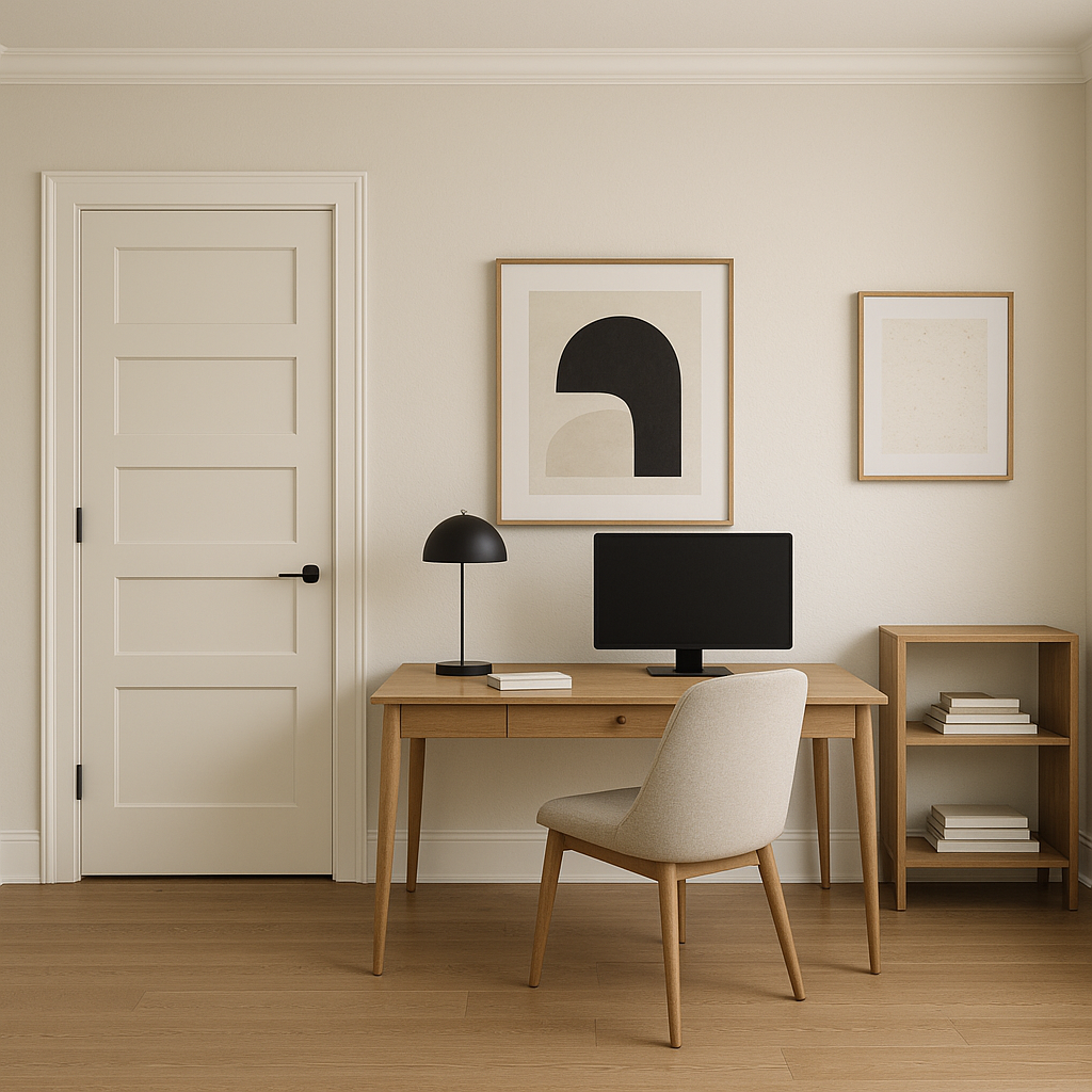
A neutral like Paper fosters focus and creativity. Pair it with darker furniture and pops of color in artwork or accessories to create an inspiring workspace.
Paper can also be used for trim and ceilings. Its delicate undertones ensure it works harmoniously with other wall colors, creating seamless transitions throughout your home.
Benjamin Moore Paper (CSP-485) is more than just a neutral paint color—it’s a design tool that allows you to create spaces that feel effortlessly elegant and inviting. Its ability to adapt to different lighting, pair beautifully with a wide array of colors, and suit various design aesthetics makes it a standout choice for any room. Whether you're looking to create a serene sanctuary or a sophisticated entertaining space, Paper provides the perfect canvas for your vision.
With its timeless appeal and versatility, Benjamin Moore Paper (CSP-485) is a must-consider hue for anyone seeking a neutral paint color that transcends the ordinary. Let its subtle warmth and refined undertones elevate your home to new heights of style and comfort.
View Colors Only by Brand (No Imagery):
Sherwin-Williams
|
Benjamin-Moore
|
Behr
|
Valspar
Live on the Eastern Slope of Colorado and looking for a local painting professional, check out all our painting services and reach out for a free estimate.
Copyright © 2026 : Wild Fox Painting Inc. : 12435 Mead Way, Littleton, CO 80125


