Benjamin Moore Pressed (CSP-520) is a sophisticated neutral that blends softness and warmth, making it a versatile choice for a wide array of interior spaces. This creamy hue falls within the off-white and warm beige family, offering a subtle yet elegant backdrop that effortlessly complements various design styles, from modern minimalism to traditional decor. Its understated charm and adaptability make it a favorite among interior designers seeking to create tranquil and inviting atmospheres.
Pressed carries gentle warm undertones that lean toward beige with hints of golden cream. These undertones prevent the color from feeling stark or flat, infusing rooms with a cozy, sunlit glow. Unlike cooler neutrals, which can sometimes feel austere, the warmth in Pressed makes it ideal for spaces where comfort and softness are key. Its delicate balance of warmth ensures it pairs equally well with cool and warm palettes, making it a true chameleon in the world of neutrals.
To fully enhance the beauty of Benjamin Moore Pressed, consider these coordinating colors:
These pairings allow you to customize your design approach, whether you’re aiming for a serene monochromatic palette or a more dynamic blend of contrasting tones.
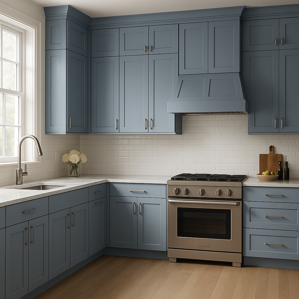
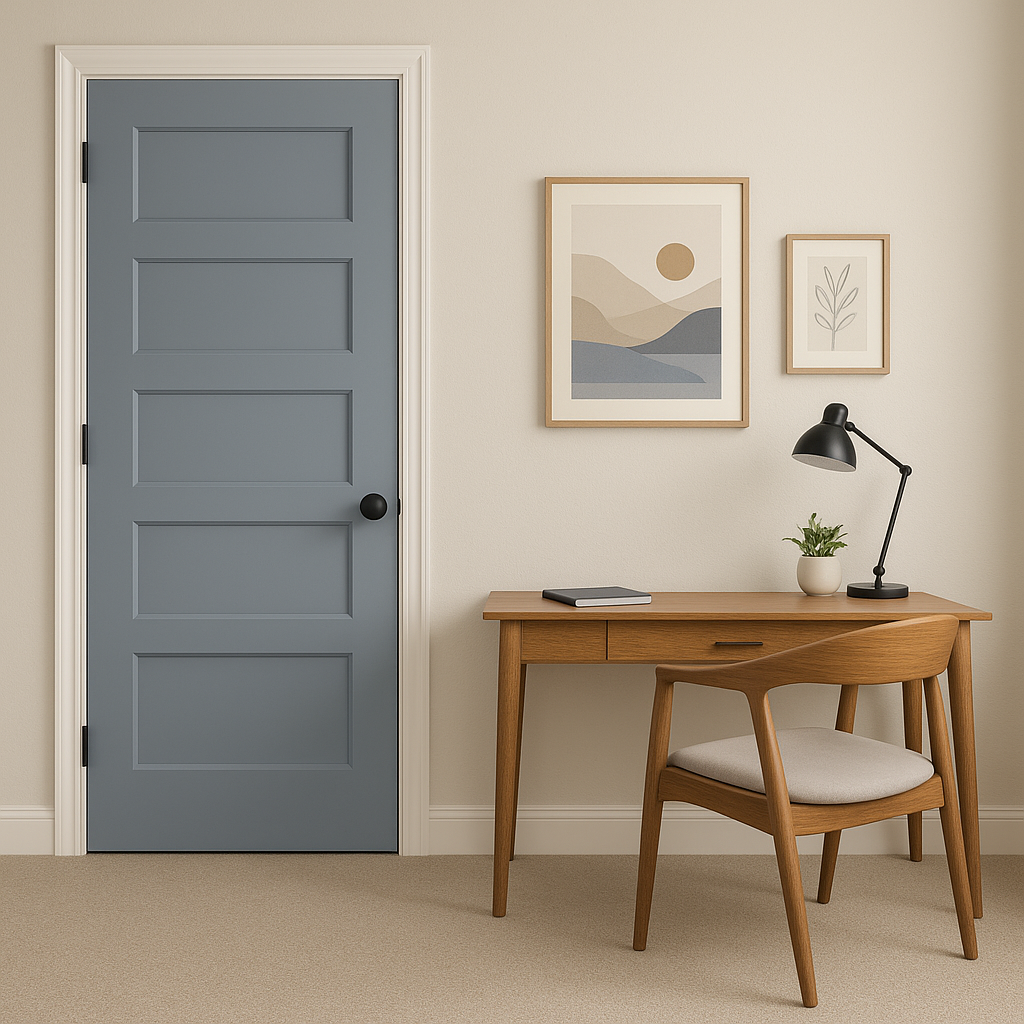
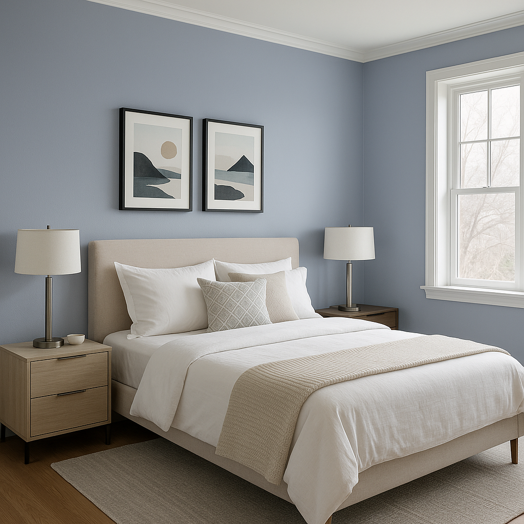
Pressed is one of those go-to neutrals that can be used in virtually any space, thanks to its timeless appeal and ability to adapt to different lighting conditions. Here are some of the best ways to incorporate this versatile color into your home:
Benjamin Moore Pressed (CSP-520) performs well in both natural and artificial lighting. In rooms with ample sunlight, its warm undertones are enhanced, offering a soft golden glow. In dimmer spaces or under cool artificial lighting, Pressed maintains its creamy neutrality without appearing yellow or overly warm. This adaptability makes it an ideal choice for spaces with varying light sources.
Benjamin Moore Pressed (CSP-520) is more than just a paint color—it's a versatile design tool that can transform any space into an inviting haven. Its warm undertones, compatibility with a wide range of coordinating colors, and adaptability to different lighting conditions make it a must-have in any designer’s palette. Whether you're refreshing a single room or planning a whole-home color scheme, Pressed brings a sense of understated elegance and comfort that is bound to endure for years to come.
View Colors Only by Brand (No Imagery):
Sherwin-Williams
|
Benjamin-Moore
|
Behr
|
Valspar
Live on the Eastern Slope of Colorado and looking for a local painting professional, check out all our painting services and reach out for a free estimate.
Copyright © 2026 : Wild Fox Painting Inc. : 12435 Mead Way, Littleton, CO 80125


