Benjamin Moore Intuition (CSP-610) is a soft, sophisticated color that effortlessly bridges the gap between cool and warm tones, making it a versatile choice for a variety of interior design styles. This captivating shade exists in the realm between gray and lavender, imbued with a gentle whisper of blue undertones. Its understated elegance brings a tranquil, calming atmosphere to any space while remaining modern and timeless.
The subtle complexity of Intuition reveals a blend of cool blue and faint purple undertones, with a hint of gray that prevents it from feeling overly saturated or bold. These undertones give the color its serene quality, making it an excellent option for creating soothing environments in bedrooms, bathrooms, or living areas. The gray influence ensures that it pairs beautifully with both warm and cool palettes, adding versatility to its appeal.
Intuition’s adaptable nature shines when paired with complementary colors. Here are some coordinating shades to consider for a harmonious palette:
By combining Intuition with these colors, you can create a cohesive and layered design that feels both balanced and refined.
Intuition’s soothing and versatile qualities make it a standout choice for a variety of applications. Here are some ideas for incorporating it into your home:
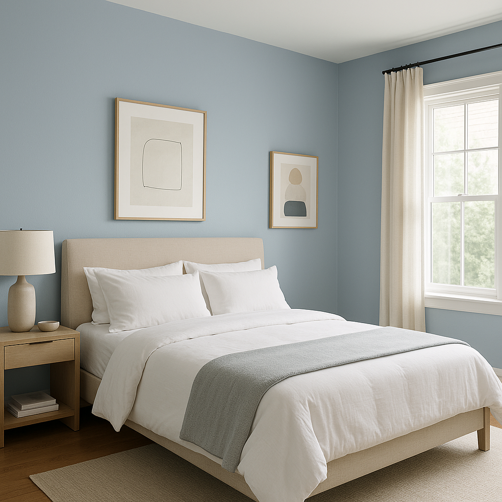
The calming undertones of Intuition make it an ideal color for bedrooms, where relaxation is key. Pair it with soft linens in complementary shades like crisp white or muted grays, and consider adding textures like woven throws or plush rugs for added coziness.
Intuition’s cool undertones evoke a spa-like atmosphere, making it perfect for bathrooms. Pair it with polished chrome or brushed nickel fixtures, and incorporate natural elements like marble or light wood for a fresh and serene look.
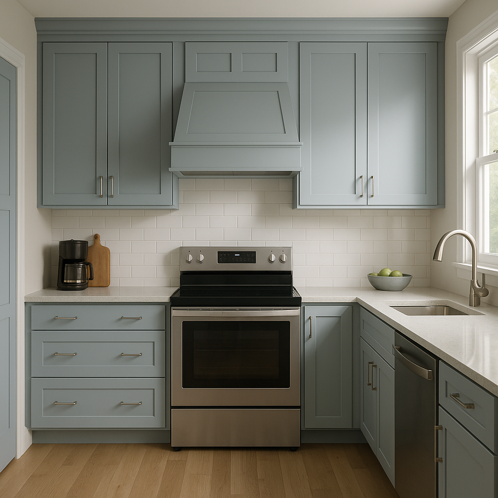
Create a sophisticated yet inviting living room by using Intuition on the walls. Balance it with warm wood furniture, metallic accents, and rich textures like velvet or leather. Add pops of navy blue or deep gray for visual interest.
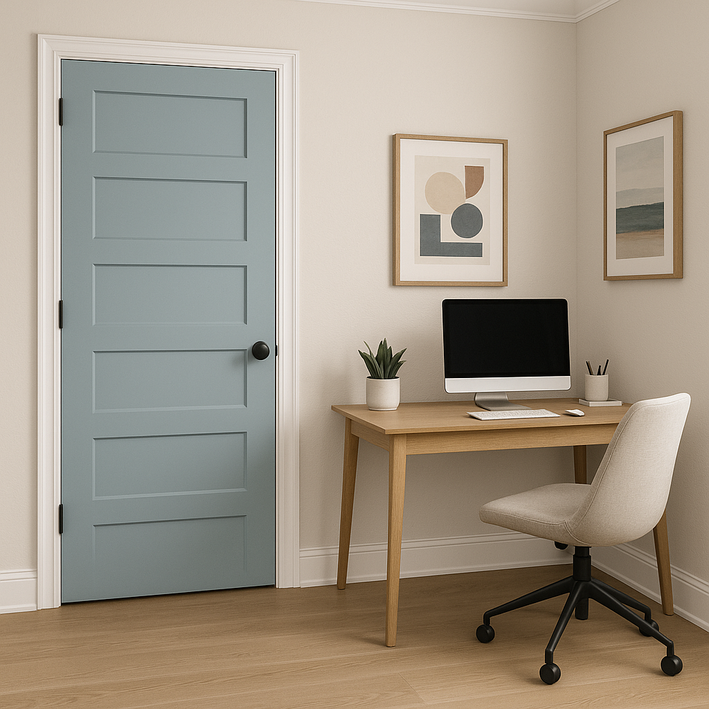
Set a productive and focused tone in your home office with Intuition. Its understated elegance promotes concentration while maintaining a tranquil vibe. Pair it with sleek modern furniture and clean lines for a polished aesthetic.
If you want to use Intuition more sparingly, it works beautifully as an accent wall. Pair it with lighter neutrals to let the color shine, or contrast it with deeper hues for a bold yet balanced statement.
Benjamin Moore Intuition (CSP-610) is a designer’s dream because of its ability to adapt to different lighting conditions and its versatility across various design styles. In bright natural light, its blue undertones become more pronounced, lending a crisp freshness to the space. In dim lighting or at night, the gray and lavender tones take center stage, creating a cozy, enveloping ambiance.
Whether you're designing a modern minimalist sanctuary or a cozy traditional retreat, Intuition is a color that elevates the mood and enhances the overall aesthetic of your space. Its timeless appeal ensures it will remain a favorite for years to come.
View Colors Only by Brand (No Imagery):
Sherwin-Williams
|
Benjamin-Moore
|
Behr
|
Valspar
Live on the Eastern Slope of Colorado and looking for a local painting professional, check out all our painting services and reach out for a free estimate.
Copyright © 2026 : Wild Fox Painting Inc. : 12435 Mead Way, Littleton, CO 80125


