Benjamin Moore CSP-640, also known as Perspective, is a stunning and versatile neutral that perfectly balances softness and sophistication. Part of the Benjamin Moore Color Stories Collection, this shade offers a refined, contemporary edge while maintaining a timeless appeal. Its adaptable nature and subtle undertones make it a favorite choice for interior designers looking to create calm, harmonious spaces.
At its core, CSP-640 is a soft gray with delicate hints of blue and green undertones. These undertones give the color an airy, tranquil quality, making it an excellent option for creating serene environments. The blue undertones lend a cool, refreshing vibe, while the green adds just enough warmth to keep the shade grounded and approachable.
The undertones are subtle enough to avoid looking overly cold or clinical, but they bring just the right amount of complexity to make CSP-640 feel sophisticated and modern. This balance allows it to adapt effortlessly to various lighting conditions, appearing cooler in rooms with abundant natural light and slightly warmer in spaces with softer, artificial lighting.
One of the many strengths of Benjamin Moore CSP-640 is its ability to pair beautifully with a wide range of colors. Its neutral base serves as the perfect backdrop for both bold and subdued palettes. Here are some curated coordinating colors to inspire your next design project:
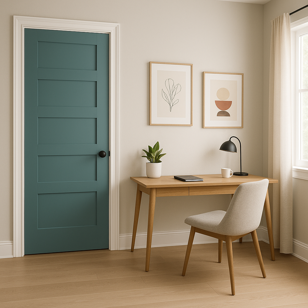
The versatility of CSP-640 makes it a star performer in a variety of spaces. Here are some popular applications for this neutral beauty:
CSP-640’s calming undertones create a soothing environment, making it an excellent choice for living rooms. Pair it with plush textiles and natural wood accents for a cozy yet modern vibe. Add pops of color through accent pillows or artwork for a personalized touch.
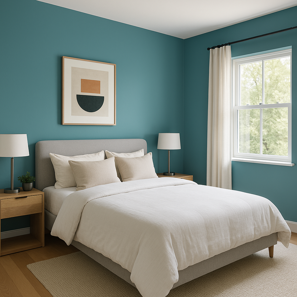
The serene quality of CSP-640 is ideal for bedrooms, where relaxation is key. Its soft gray-blue undertones promote restfulness, while its neutral base allows for flexibility in bedding and decor choices. Add layers of texture with throws, rugs, and curtains in complementary colors.
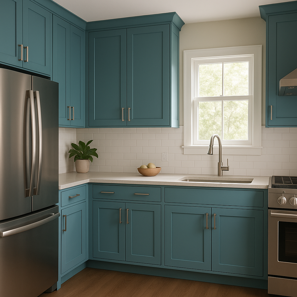
CSP-640 is a sophisticated choice for kitchen walls or cabinetry. Its clean, modern aesthetic pairs beautifully with stainless steel appliances, marble countertops, or subway tile backsplashes. Enhance the look with metallic hardware in brushed nickel or matte black.
The cool, airy feel of CSP-640 makes it a top contender for bathrooms.
View Colors Only by Brand (No Imagery):
Sherwin-Williams
|
Benjamin-Moore
|
Behr
|
Valspar
Live on the Eastern Slope of Colorado and looking for a local painting professional, check out all our painting services and reach out for a free estimate.
Copyright © 2026 : Wild Fox Painting Inc. : 12435 Mead Way, Littleton, CO 80125


