
Benjamin Moore Baltic (CSP-680) is a rich, elegant shade of blue that exudes depth and sophistication. Perfectly blending serenity with boldness, Baltic is part of the Color Stories collection, designed to offer unparalleled richness and complexity. This versatile hue creates a sense of calm while making a statement, making it a favorite among interior designers for both modern and classic spaces.
Baltic is a deeply saturated blue with subtle undertones that add nuance to its character. Beneath its primary deep blue tone lies a whisper of gray, which tempers its vibrancy and lends it a slightly muted, refined quality. This gray undertone makes Baltic adaptable across various lighting conditions, appearing cooler in spaces with natural daylight and slightly cozier under warm artificial light. Additionally, there's a faint hint of green in its complexity, which gives it a touch of softness and versatility, making it equally suitable for coastal-inspired and urban interiors.
Baltic (CSP-680) pairs beautifully with a wide range of colors, offering endless design possibilities. Here are some coordinating shades that complement its richness:
Soft Neutrals: Pair Baltic with warm whites like Benjamin Moore White Dove (OC-17) or cool grays like Benjamin Moore Gray Owl (2137-60). These neutrals balance the depth of Baltic, creating a harmonious contrast while letting the blue shine as the focal point.
Earthy Tones: Bring out Baltic's subtle green undertones by combining it with earthy shades such as Benjamin Moore Hancock Green (HC-117) or Benjamin Moore Revere Pewter (HC-172). These pairings create a grounded, natural aesthetic.
Metallic Accents: Baltic works stunningly well with metallics like gold, brass, or silver. Try incorporating these finishes into your décor through light fixtures, hardware, or decorative accents to add a touch of luxury.
Dramatic Contrasts: For a bold and modern look, pair Baltic with darker hues like Benjamin Moore Black Satin (2131-10) or rich jewel tones such as Benjamin Moore Rapture (CC-66). This combination creates a striking, high-impact palette.
Baltic (CSP-680) is a versatile blue that can be used in a variety of settings to evoke different moods and styles. Whether you’re designing a cozy retreat or a sophisticated, formal space, Baltic is a transformative color that adapts effortlessly to its surroundings.
Baltic adds a sense of grandeur to living rooms, especially when used on accent walls. Pair it with neutral furnishings and metallic accessories for an elevated, luxurious feel. Its depth creates visual interest without overwhelming the space.
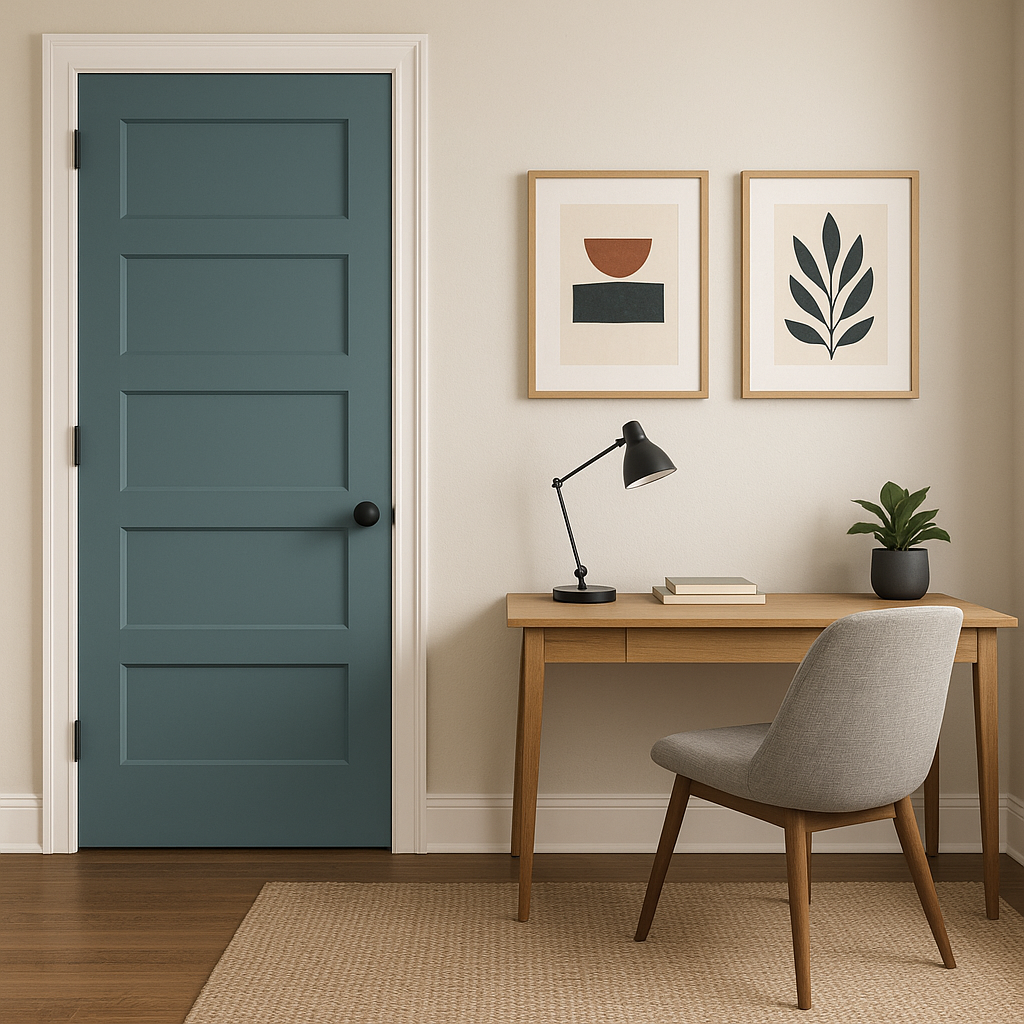
For bedrooms, Baltic offers a calming yet dramatic effect, making it ideal for creating a cozy sanctuary. Use it on walls with crisp white bedding and natural wood furniture to balance its richness with a touch of softness.
In bathrooms, Baltic can evoke a spa-like serenity. Pair it with white subway tiles, marble countertops, and chrome fixtures for a clean and elegant aesthetic.
Baltic is perfect for dining rooms where you want to create a sophisticated and intimate atmosphere. Accent the space with rich wood tones and dramatic lighting to complement its depth.
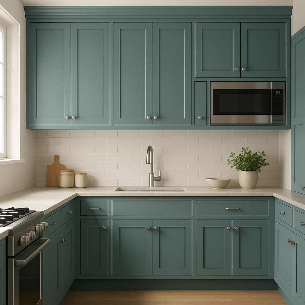
If you’re looking to refresh kitchen cabinetry or custom built-ins, Baltic offers a contemporary edge while maintaining a timeless appeal. It works well in transitional spaces, especially when paired with white countertops or backsplash tiles.
Layering Textures: Baltic’s richness can be enhanced by layering textures in the room. Use plush velvet throw pillows, woven rugs, or linen curtains to add dimension and softness to the space.
Lighting Matters: Because of its gray undertones, Baltic can shift slightly in appearance depending on the lighting. Test it with your light sources to ensure it achieves the desired tone in your space.
Artwork and Décor: Complement Baltic with artwork featuring coastal or abstract themes to bring out its sophisticated blue essence. Gold or brushed brass frames can further elevate the room’s aesthetic.
Benjamin Moore Baltic (CSP-680) is more than just a color—it’s a statement of elegance and timeless design. Whether used as an accent or the main palette, its versatility ensures it will enhance any space with depth, character, and sophistication.
View Colors Only by Brand (No Imagery):
Sherwin-Williams
|
Benjamin-Moore
|
Behr
|
Valspar
Live on the Eastern Slope of Colorado and looking for a local painting professional, check out all our painting services and reach out for a free estimate.
Copyright © 2026 : Wild Fox Painting Inc. : 12435 Mead Way, Littleton, CO 80125


