Benjamin Moore Upper (CSP-70) is an elegant neutral that exudes sophistication and versatility, making it a favorite choice for creating serene and stylish spaces. Part of the Color Stories collection, this shade strikes a perfect balance between warmth and coolness, allowing it to adapt seamlessly to a variety of design aesthetics.
Upper (CSP-70) is a soft taupe-gray with subtle beige undertones that lend a welcoming warmth. Its balanced composition avoids leaning too strongly into either gray or beige, making it a true chameleon in the world of neutrals. The undertones in Upper shift gracefully depending on the surrounding light. In spaces with ample natural daylight, the shade appears lighter and more luminous, while in dimmer environments, it deepens into a richer and grounded hue. This transformative quality ensures that Upper delivers an adaptable yet consistent look throughout the day.
The complexity of its undertones also makes it a fantastic choice for homeowners and designers seeking a neutral that isn’t flat or one-dimensional. Its depth adds character to walls, creating an understated backdrop that enhances the surrounding décor.
Pairing Benjamin Moore Upper with complementary hues helps elevate its charm and refine your overall design. Here are some coordinating colors that work beautifully with Upper:
Upper (CSP-70) is a go-to choice for a wide range of interior applications, thanks to its timeless appeal and versatility. Here are some thoughtful ways to use this shade:
Create a cozy yet polished atmosphere in your living spaces by using Upper on the walls. Its neutral tone allows you to layer textures and colors through furniture, artwork, and accessories. Whether paired with luxurious velvet or rustic wood finishes, Upper acts as an ideal backdrop for your design vision.
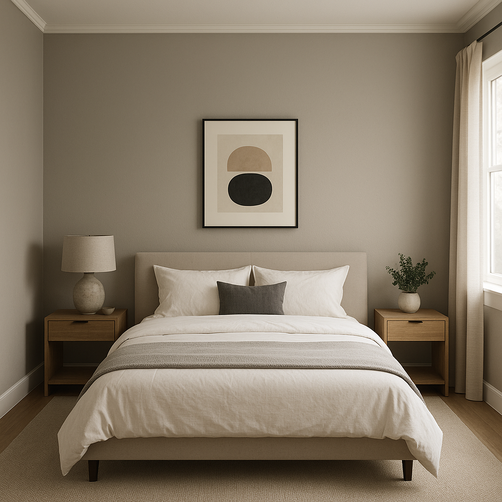
Upper’s soothing qualities make it a perfect choice for bedrooms. The soft taupe-gray fosters relaxation while maintaining a sense of elegance. Pair it with crisp white bedding and metallic accents for a chic and serene retreat.
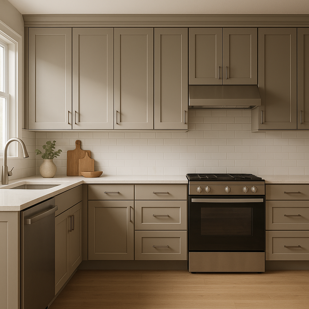
Bring a contemporary yet timeless feel to your kitchen by using Upper on cabinetry or walls. It pairs beautifully with marble countertops, brushed nickel hardware, and subway tile backsplashes. For added depth, consider using Upper alongside darker grays or charcoals for an accent wall.
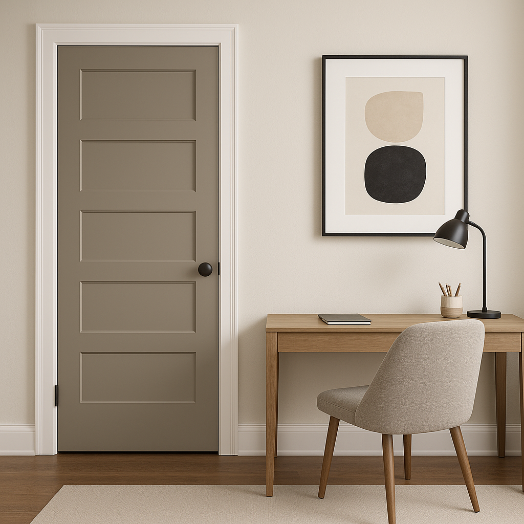
Create an inspiring and productive workspace with Upper. Its neutral tone reduces visual distractions while providing a sophisticated backdrop for built-in shelving, desks, or art.
Upper works wonderfully in bathrooms where you want a spa-like feel. Complement its taupe-gray tone with crisp white trim and chrome fixtures for a clean and refreshing aesthetic.
As with any paint color, lighting plays a crucial role in how Benjamin Moore Upper will appear in your space. In rooms with north-facing windows, Upper may lean slightly cooler, highlighting its gray undertones. In south-facing spaces, its beige warmth becomes more prominent, creating a cozy and inviting feel. To understand how it interacts with your space, test Upper on multiple walls and observe it throughout the day.
Benjamin Moore Upper is a versatile and refined neutral that elevates any room it graces. Its ability to balance warmth and coolness, paired with its transformative undertones, makes it a favorite among interior designers. Whether you're creating a monochromatic palette or introducing vibrant pops of color, Upper serves as the perfect foundation for your design.
For timeless interiors that effortlessly blend style and comfort, Benjamin Moore Upper (CSP-70) is a choice that will never go out of fashion.
View Colors Only by Brand (No Imagery):
Sherwin-Williams
|
Benjamin-Moore
|
Behr
|
Valspar
Live on the Eastern Slope of Colorado and looking for a local painting professional, check out all our painting services and reach out for a free estimate.
Copyright © 2026 : Wild Fox Painting Inc. : 12435 Mead Way, Littleton, CO 80125


