Benjamin Moore Peaceful (CSP-830) is a soft, muted green with a quiet sophistication that evokes tranquility and balance. Perfect for creating serene and welcoming spaces, this color belongs to the Benjamin Moore Color Stories collection, known for its nuanced and complex pigments. Whether you’re designing a restful oasis or looking for a versatile shade to complement your decor, Peaceful (CSP-830) offers an understated charm that harmonizes beautifully with a variety of design styles.
One of the defining characteristics of Peaceful is its gentle gray undertones, which lend the color a neutral and calming quality. These undertones soften the green base, making it less vibrant and more subdued, ideal for spaces where you want to evoke quiet elegance without overwhelming the senses. The gray undertones also provide versatility, allowing the color to shift beautifully depending on the lighting. In natural light, Peaceful leans toward a fresh, earthy green, while in artificial light, its gray notes become more pronounced, creating a cooler and sophisticated effect.
Benjamin Moore Peaceful pairs effortlessly with a range of complementary hues, making it a versatile choice for interiors. Here are some excellent coordinating colors to consider:
These coordinating colors can be used in trim accents, furniture, or decor to enhance the overall palette and create a harmonious design.
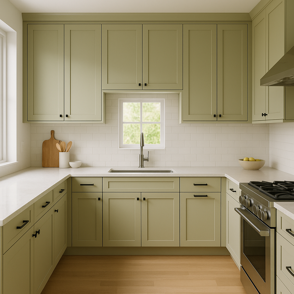
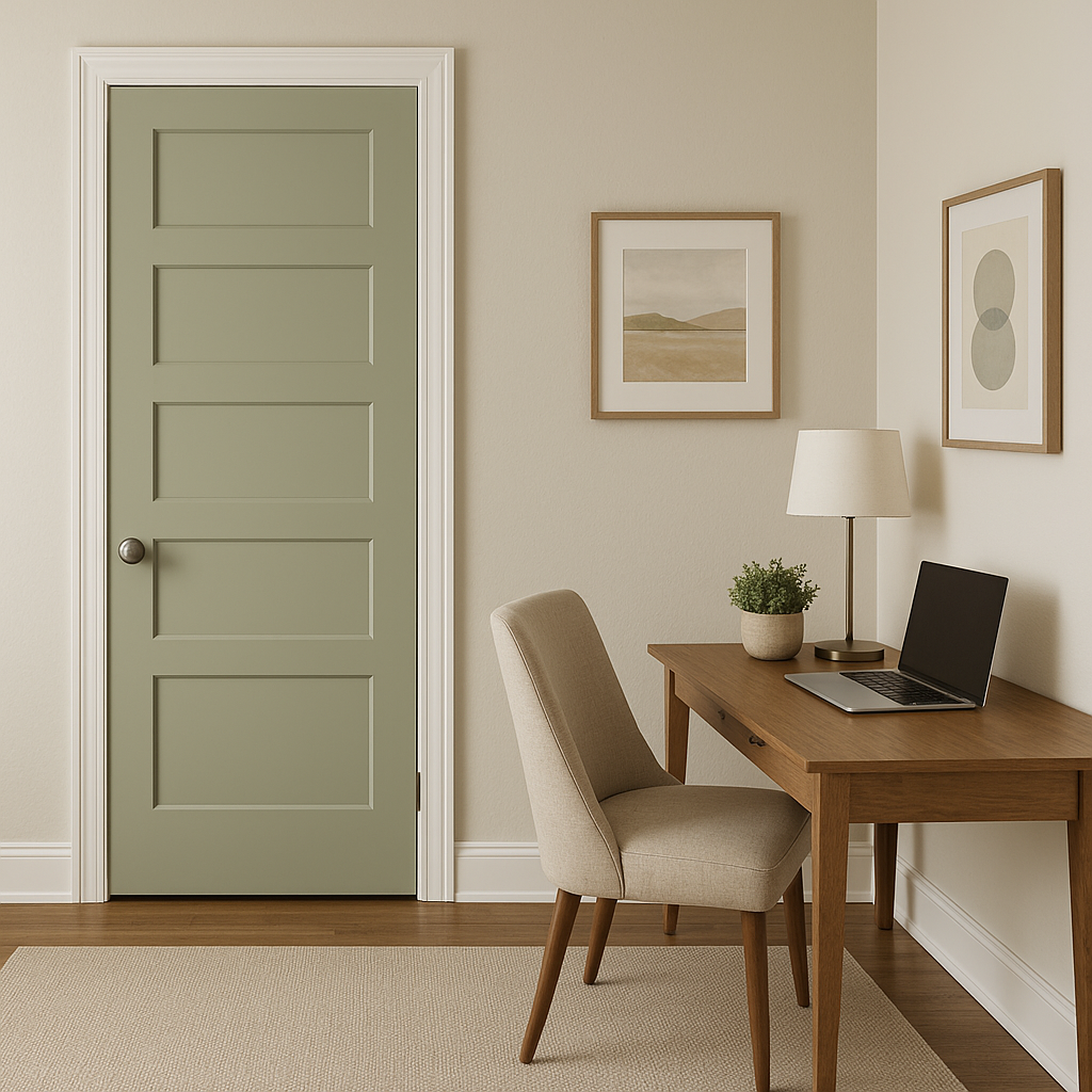
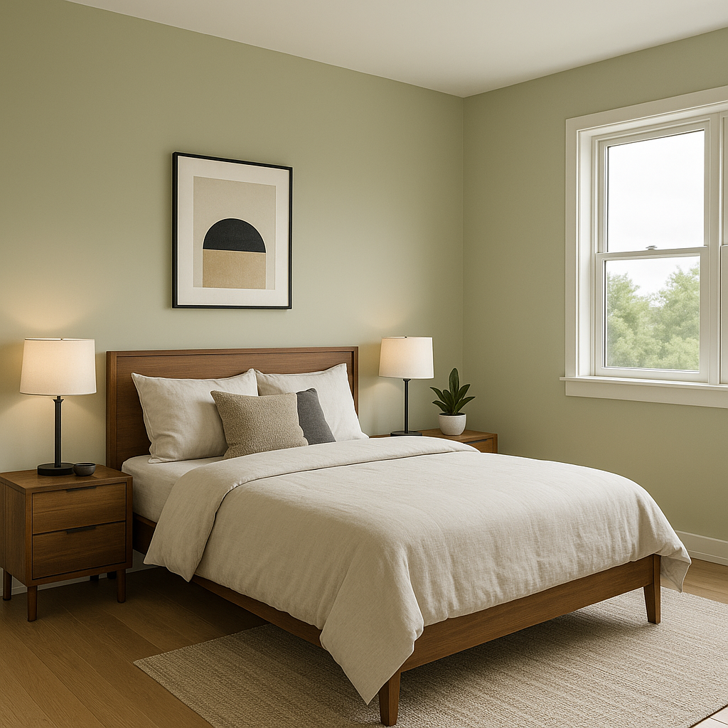
Peaceful is a versatile color that works beautifully in a variety of spaces and design applications. Here are some ideas to inspire its use:
Peaceful is an ideal choice for bedrooms, where its calming green-gray blend fosters relaxation and peace. Pair it with soft linen bedding and natural wood furniture to create a serene retreat perfect for unwinding after a long day.
In living rooms, Peaceful can act as a sophisticated backdrop for neutral or warm-toned furnishings. Incorporate textures like woven baskets, velvet pillows, or natural fiber rugs to enhance its earthy appeal.
Transform your bathroom into a spa-like haven by using Peaceful on the walls or cabinetry. Combine it with marble countertops, brushed nickel hardware, and crisp white towels for a clean and refreshing aesthetic.
Create a focused yet tranquil work environment with Peaceful as your wall color. Its muted green tones encourage concentration while maintaining a sense of calm. Pair it with sleek black or white office furniture for a modern look.
Make a welcoming first impression by using Peaceful in your entryway. Its subtle green hue invites guests into a space that feels grounded and serene. Add accents like a wooden console table and a vase of fresh greenery to tie in natural elements.
Peaceful’s gray undertones allow it to adapt wonderfully to different lighting conditions. In spaces with abundant natural light, the green tones will appear more pronounced and invigorating, while dimmer artificial lighting will emphasize its cooler, gray qualities. To achieve the desired effect, test Peaceful in your space under various lighting conditions before committing to a final design.
Benjamin Moore Peaceful (CSP-830) is a refined and versatile color choice that brings serenity and understated beauty to any room. Its soft green-gray tones, adaptable undertones, and compatibility with a wide range of coordinating colors make it a timeless addition to your home.
View Colors Only by Brand (No Imagery):
Sherwin-Williams
|
Benjamin-Moore
|
Behr
|
Valspar
Live on the Eastern Slope of Colorado and looking for a local painting professional, check out all our painting services and reach out for a free estimate.
Copyright © 2026 : Wild Fox Painting Inc. : 12435 Mead Way, Littleton, CO 80125


