Benjamin Moore Spring (CSP-835) is a captivating shade that exudes a refreshing, uplifting energy. Perfectly embodying the vibrancy of the season it’s named after, this color offers a soft, nature-inspired green that feels both timeless and modern. Its subtle complexity makes it versatile for a variety of spaces, lending an air of tranquility and renewal wherever it’s used.
Spring (CSP-835) is a delicate mid-tone green with warm undertones, giving it a welcoming softness that’s neither too bright nor overly subdued. The warmth in its undertones prevents it from leaning overly cool or stark, making it a balanced choice for interiors that need a touch of life without overwhelming the palette. You’ll notice hints of muted yellow within the green, which helps evoke the feeling of freshly sprouted leaves kissed by sunlight.
This color avoids the sharpness of cooler greens, making it ideal for spaces where you want to foster a sense of calm, comfort, and rejuvenation. It’s a color that feels organic and grounded, yet fresh and invigorating, perfect for creating a harmonious ambiance.
Benjamin Moore Spring pairs beautifully with a variety of complementary shades, allowing for endless possibilities in design. Here are some suggested coordinating colors to enhance its impact:
Spring (CSP-835) is an excellent choice for living rooms, as it evokes a sense of calm while maintaining a lively and welcoming atmosphere. Pair it with natural materials like wood or stone to enhance the organic feel. Add coordinating neutrals like Simply White or Edgecomb Gray for a balanced look, and use darker accents like Chelsea Gray for added sophistication.
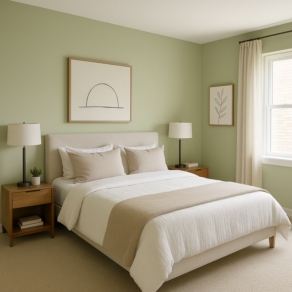
In bedrooms, Spring helps create a restful retreat. Its soft green tones are soothing and conducive to relaxation. Combine it with White Dove for a clean, tranquil vibe, or add earthy accents like Kendall Charcoal for a grounded aesthetic.
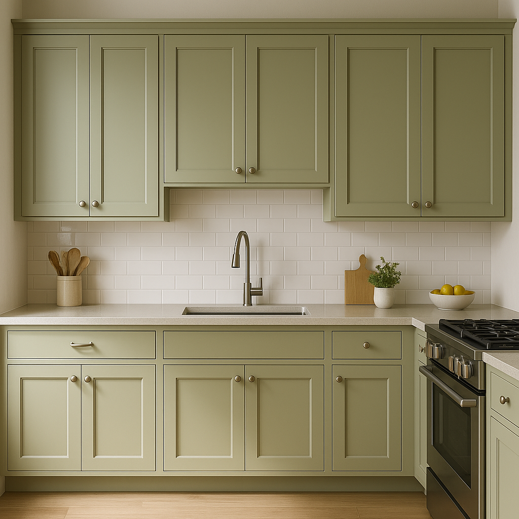
Bring the outdoors inside by using Spring in the kitchen. Pair it with white cabinetry and polished nickel or brass hardware for a fresh, modern farmhouse feel. Coordinating colors like Golden Straw can add warmth and charm to the space.
Spring is a beautiful option for bathrooms, offering a spa-like serenity. Use it on walls and pair it with crisp whites, like Simply White for trim or tile, to create a clean and refreshing look.
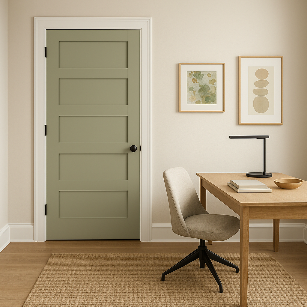
If you’re looking to inspire focus and creativity in your home office, Spring is an ideal choice. Its balanced energy promotes productivity while keeping the space calm and inviting. Pair it with darker accents like Wrought Iron or Chelsea Gray for a sophisticated touch.
Spring also works wonderfully on exterior spaces, such as front doors or shutters. Its natural green hue blends beautifully with outdoor landscapes, creating a seamless transition between your home and its surroundings.
Benjamin Moore Spring (CSP-835) is a perfect choice for anyone looking to bring a sense of renewal and vitality into their spaces. Its versatility, paired with a soothing yet invigorating presence, makes it a standout color that can truly transform your home.
View Colors Only by Brand (No Imagery):
Sherwin-Williams
|
Benjamin-Moore
|
Behr
|
Valspar
Live on the Eastern Slope of Colorado and looking for a local painting professional, check out all our painting services and reach out for a free estimate.
Copyright © 2026 : Wild Fox Painting Inc. : 12435 Mead Way, Littleton, CO 80125


