Benjamin Moore Turkish CSP-885 is a beautifully versatile and understated neutral that brings warmth and elegance into any space. Part of the Benjamin Moore Color Stories® palette, Turkish CSP-885 exudes a balanced blend of beige and gray, making it a stunning greige that complements a variety of design styles, from contemporary to traditional. Its soft, muted tone creates a cozy and inviting atmosphere, perfect for both residential and commercial interiors.
What sets Turkish CSP-885 apart is its harmonious undertones. This shade leans toward the warmer side of greige, with slight taupe and beige undertones that add depth and dimension. Its warmth ensures that it doesn’t feel stark or cold, while its gray influence keeps it modern and grounded. The result is a color that feels luxurious yet approachable, providing the perfect backdrop for a wide range of decor styles.
Depending on the lighting, Turkish CSP-885 can shift subtly in appearance. In bright natural light, its beige undertones become more prominent, adding a touch of warmth to the room. In dimmer, artificial lighting, the gray undertones emerge, creating a softer, more subdued ambiance. This chameleon-like quality makes it a highly adaptable choice for various spaces and lighting conditions.
Turkish CSP-885 is a versatile neutral that pairs beautifully with a wide array of coordinating colors. Whether you’re looking to create a monochromatic scheme or add pops of color for contrast, this shade serves as a perfect anchor. Here are some suggestions for coordinating colors:
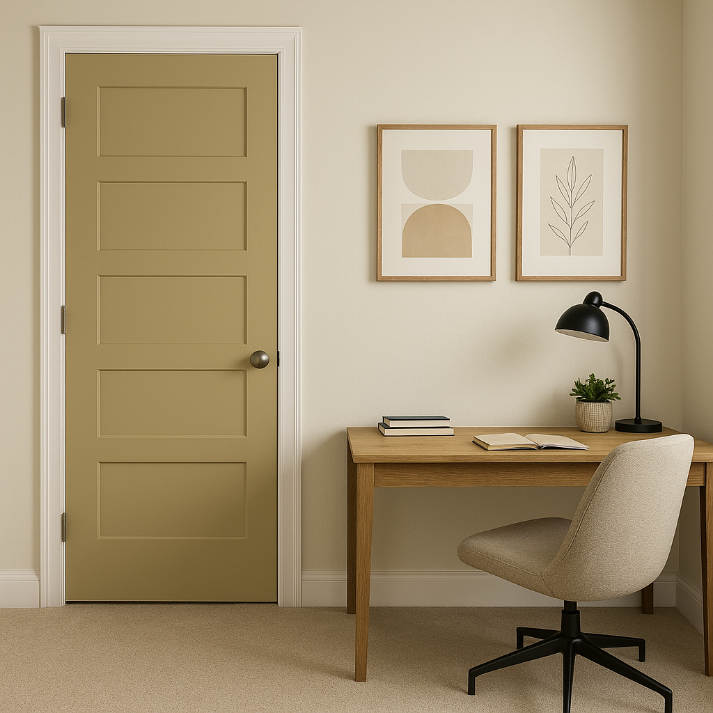
Turkish CSP-885’s adaptability makes it a favorite among homeowners and designers alike. Its ability to seamlessly blend into various design schemes and its subtle elegance allow it to shine in any setting. Here are some of the best ways to use Turkish CSP-885 in your space:
Create a warm and inviting living room by using Turkish CSP-885 as the main wall color. Its neutral tone allows furniture, artwork, and accessories to stand out while maintaining a cohesive and polished look. Pair it with a mix of textures, such as velvet, leather, or natural wood, for added depth.
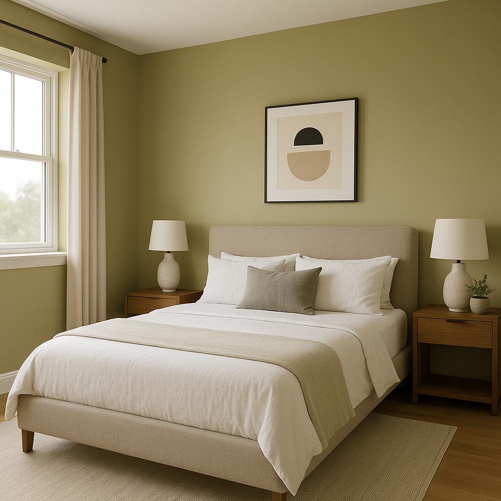
Turkish CSP-885 is an excellent choice for bedrooms, where its soothing undertones create a calming retreat. Pair it with soft, layered textiles in whites and creams for a serene, spa-like feel, or add deeper accent colors for a more dramatic and intimate vibe.
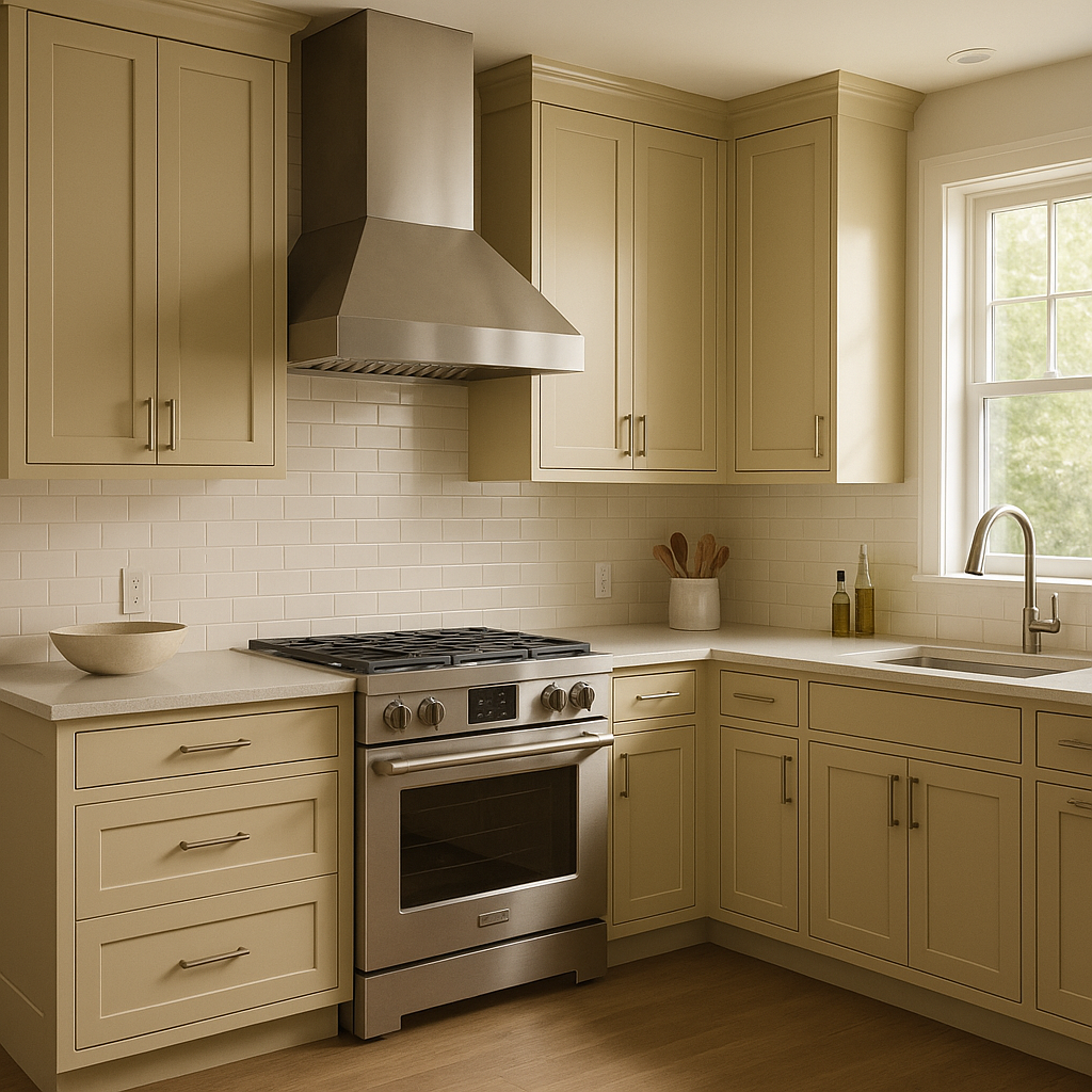
In kitchens, this greige acts as a perfect neutral canvas for cabinetry, countertops, and backsplashes.
View Colors Only by Brand (No Imagery):
Sherwin-Williams
|
Benjamin-Moore
|
Behr
|
Valspar
Live on the Eastern Slope of Colorado and looking for a local painting professional, check out all our painting services and reach out for a free estimate.
Copyright © 2026 : Wild Fox Painting Inc. : 12435 Mead Way, Littleton, CO 80125


