
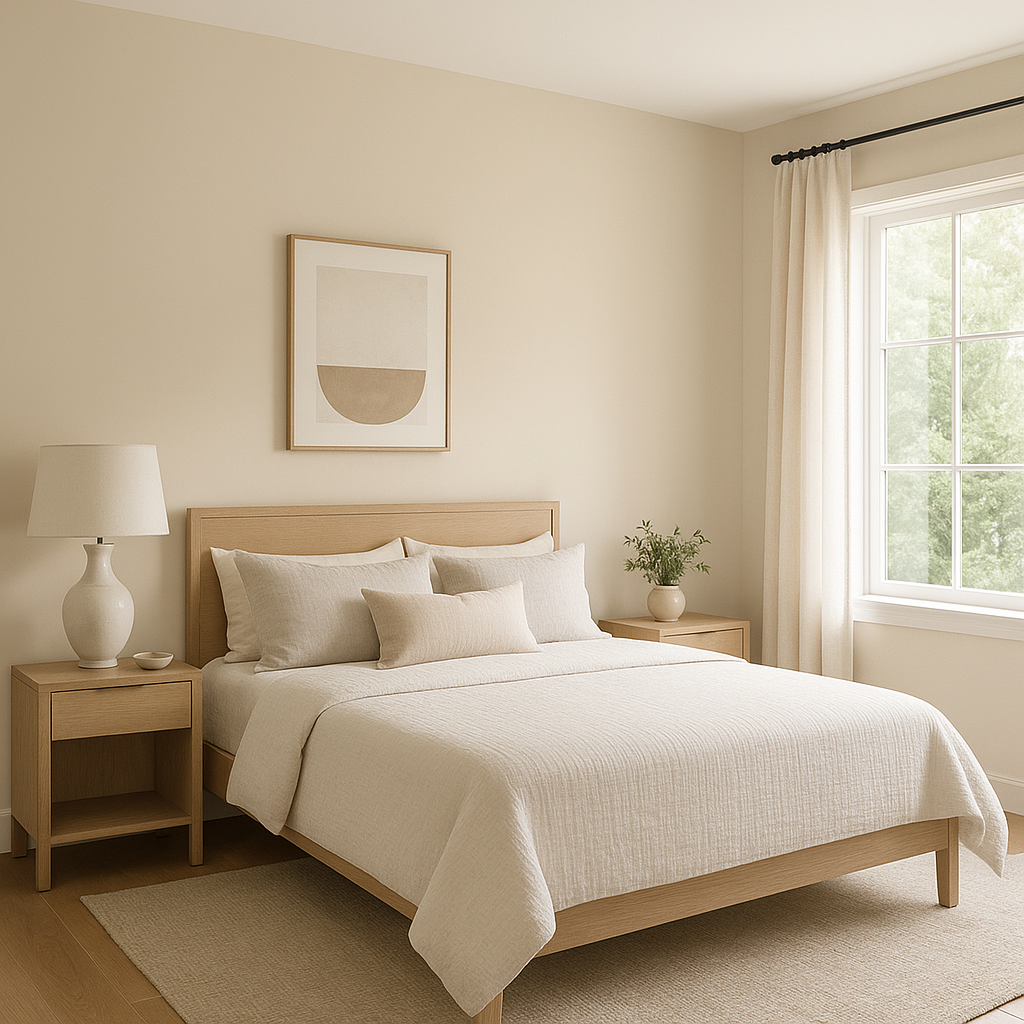
Benjamin Moore Prentis (CW-100) is a sophisticated neutral that exudes warmth and timeless charm. From the Colonial Williamsburg® collection, this color captures the essence of traditional, historical palettes while seamlessly adapting to modern interiors. Its soft beige tone is understated yet versatile, making it a go-to choice for creating serene spaces with a touch of classical beauty.
Prentis features warm beige undertones with a slight hint of muted taupe, giving it a grounded and earthy appearance. This subtle complexity prevents it from leaning too yellow or too gray, offering a balanced neutrality that complements a wide range of color schemes. The warmth in its undertones makes it particularly inviting, perfect for spaces where comfort and coziness are desired.
Prentis (CW-100) pairs beautifully with an array of colors, both bold and subdued. Here are some excellent coordinating options:
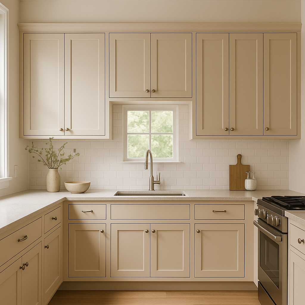
Prentis (CW-100) is an incredibly versatile hue that can be applied in various settings to achieve different effects:
Prentis can subtly shift based on lighting conditions. In spaces with ample natural light, its beige tones will appear warmer and brighter, creating an open and airy feel. In rooms with dim artificial lighting, it takes on a slightly deeper and cozier appearance. To maximize its beauty, consider testing Prentis in different areas of your home to observe how it interacts with your lighting.
Benjamin Moore Prentis (CW-100) is more than just a paint color—it’s a design tool that brings balance and sophistication to any space. Whether you’re curating a modern minimalist aesthetic or paying homage to traditional styles, its versatility and timeless appeal make it a treasured choice for designers and homeowners alike.
View Colors Only by Brand (No Imagery):
Sherwin-Williams
|
Benjamin-Moore
|
Behr
|
Valspar
Live on the Eastern Slope of Colorado and looking for a local painting professional, check out all our painting services and reach out for a free estimate.
Copyright © 2026 : Wild Fox Painting Inc. : 12435 Mead Way, Littleton, CO 80125


