Benjamin Moore Bracken (CW-105) is a beautifully rich and grounded shade of green that evokes the serene allure of nature. Part of Benjamin Moore's Colonial Williamsburg collection, this earthy hue is steeped in historical elegance yet versatile enough to complement modern aesthetics. Its warm, understated presence makes it a perfect choice for creating sophisticated and inviting spaces.
Bracken is a medium-to-dark muted green with deep brown undertones that lend it a natural and organic quality. The subtle brown infusion tempers the vibrancy of the green, giving it a soft, earthy feel. These undertones make Bracken more refined and versatile, enabling it to pair harmoniously with a wide range of colors, from neutrals to accent hues. Its warmth ensures it doesn’t feel too stark or cold, making it ideal for cozy, lived-in spaces.
Benjamin Moore Bracken is perfect for curating a harmonious color scheme. Here are some coordinating colors that complement its timeless charm:
Neutral Pairings: To highlight Bracken’s natural warmth, pair it with shades like Benjamin Moore White Dove (OC-17) or Simply White (OC-117). These soft whites provide a crisp contrast, brightening the space while maintaining a balanced aesthetic.
Earthy Complements: Enhance the organic feel of Bracken with earthy tones like Benjamin Moore Hampshire Gray (CW-45) or Kingsport Gray (HC-86). These grounding hues create a soothing, monochromatic palette ideal for rustic or traditional interiors.
Rich Accents: For a bold and dramatic look, pair Bracken with deeper, saturated tones like Benjamin Moore Hale Navy (HC-154) or Black Forest Green (2040-10). These rich shades amplify Bracken’s depth and create stunning contrast.
Warm Metallics: Add a touch of elegance with metallic accents in warm gold or antique brass finishes. These elements work beautifully with Bracken’s earthy undertones, creating an inviting and upscale atmosphere.
Bracken’s versatility makes it suitable for a variety of spaces and design styles. Here are some creative ways to incorporate this earthy green into your home:
Living Rooms: Use Bracken as the main wall color to create a warm, enveloping atmosphere in living areas. Pair it with neutral fabrics, wood furnishings, and cozy textures like wool or linen for a timeless, comfortable look.
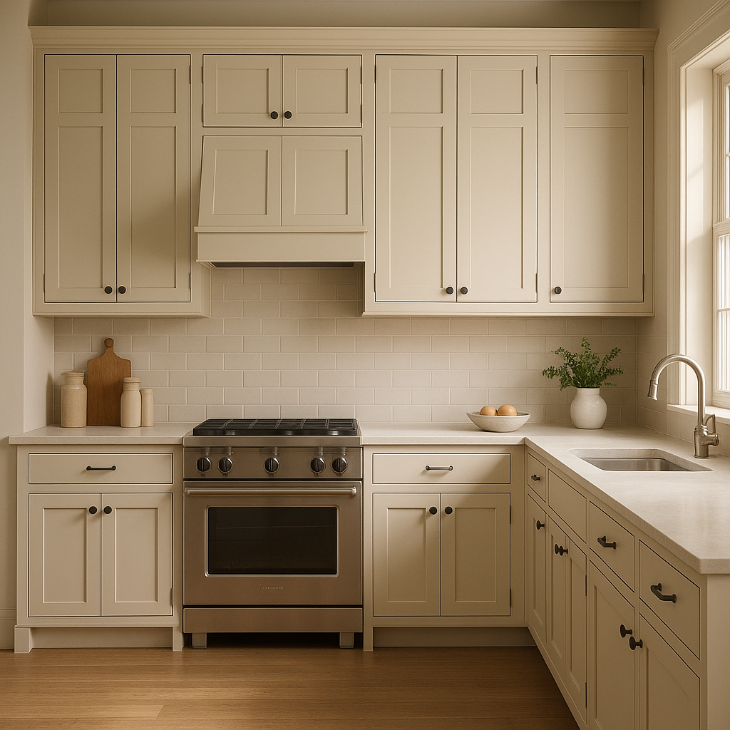
Kitchens: Bracken shines in kitchens, especially when paired with white cabinetry and natural wood finishes. Consider using it on painted cabinets or as an accent wall to bring understated sophistication to the heart of your home.
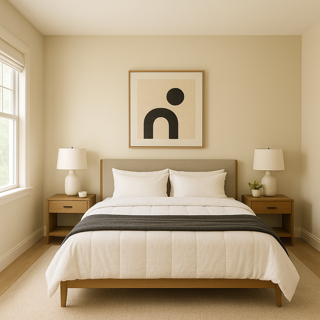
Bedrooms: Its calming qualities make Bracken ideal for bedrooms, where it fosters relaxation and tranquility. Layer it with soft, neutral bedding and muted accent colors to create a serene retreat.
Bathrooms: Add a spa-like feel to bathrooms by using Bracken on the walls or cabinetry. Pair it with marble countertops and brushed brass fixtures for a luxurious yet organic vibe.
Exteriors: Bracken is also a stunning choice for exterior applications. Use it on siding, shutters, or doors to complement natural landscapes and create a home that feels connected to its surroundings.
Benjamin Moore Bracken is more than just a paint color—it’s a design element that effortlessly bridges historical charm and contemporary style. Its earthy green hue, warm undertones, and adaptability make it a standout choice for creating spaces that feel grounded, timeless, and inviting. Whether you're designing a traditional colonial-inspired interior or a modern rustic retreat, Bracken offers endless possibilities for elevating your home’s aesthetic.
View Colors Only by Brand (No Imagery):
Sherwin-Williams
|
Benjamin-Moore
|
Behr
|
Valspar
Live on the Eastern Slope of Colorado and looking for a local painting professional, check out all our painting services and reach out for a free estimate.
Copyright © 2026 : Wild Fox Painting Inc. : 12435 Mead Way, Littleton, CO 80125


