Benjamin Moore Cornice (CW-115) is a sophisticated, understated hue that blends seamlessly into a variety of design styles. Part of the Colonial Williamsburg collection, this medium beige-taupe tone carries an air of historic charm while remaining versatile for modern interiors. Cornice offers a perfect balance between warm and cool notes, making it a highly adaptable choice for spaces where texture and depth are key.
Cornice is characterized by its gentle undertones of gray and brown, which give it a soft, muted quality. The gray undertone lends a cool refinement, while the brown note adds warmth and earthiness, creating a neutral shade that feels grounded yet timeless. These undertones prevent Cornice from veering too cold or overly warm, allowing it to work beautifully in both traditional and contemporary interiors.
Cornice pairs effortlessly with a range of complementary hues, making it a versatile option for color palettes. Here are some excellent coordinating colors to consider:
These coordinating colors provide flexibility whether you're aiming for a monochromatic scheme or bold accents to elevate your space.
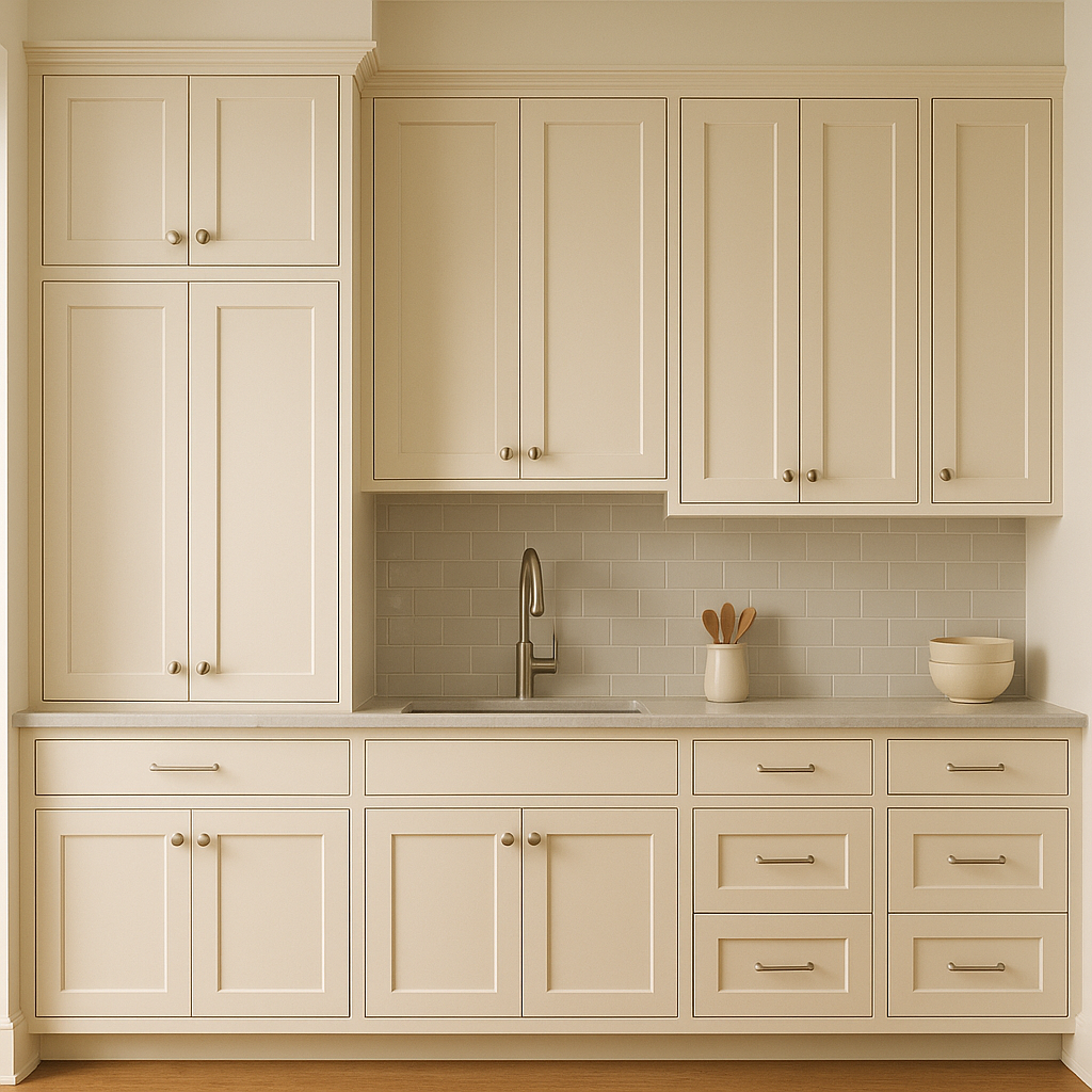
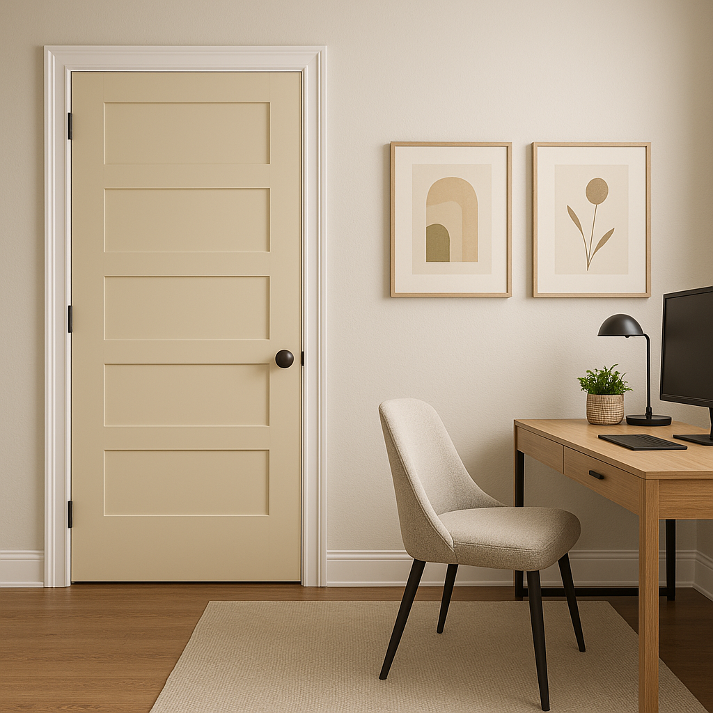
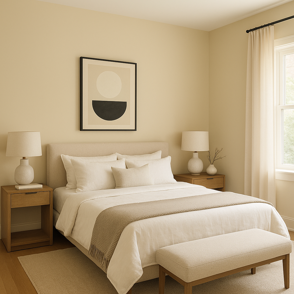
Cornice is a versatile shade that works in a variety of settings, effortlessly bridging the gap between classic and contemporary design. Here are some ideas for incorporating this neutral into your home:
Cornice (CW-115) is more than just a neutral; it’s a statement of refined simplicity. Its balanced undertones make it a perfect candidate for any room where warmth and sophistication are desired. Whether you’re designing a modern minimalist space or a classic colonial-inspired home, Cornice delivers effortless style and timeless appeal.
For those seeking a paint color that harmonizes with a broad range of hues while offering depth and charm, Benjamin Moore Cornice is an excellent choice. Its versatility ensures it remains a favorite among interior designers and homeowners alike.
View Colors Only by Brand (No Imagery):
Sherwin-Williams
|
Benjamin-Moore
|
Behr
|
Valspar
Live on the Eastern Slope of Colorado and looking for a local painting professional, check out all our painting services and reach out for a free estimate.
Copyright © 2026 : Wild Fox Painting Inc. : 12435 Mead Way, Littleton, CO 80125


