Benjamin Moore Timson (CW-140) is a versatile shade that belongs to the Colonial Williamsburg® collection, offering a timeless and sophisticated aesthetic rooted in historical charm. This soft, muted neutral strikes an elegant balance between gray and beige, embodying a subtle greige tone that feels both modern and classic. Its understated warmth and depth make it an ideal choice for creating serene and inviting spaces, whether in a contemporary home or a traditional setting.
Timson features nuanced undertones that set it apart from other neutrals. It leans slightly warm with gentle beige undertones, but its gray base tempers the warmth, ensuring it doesn’t feel overly yellow or creamy. There’s an almost taupe-like quality to Timson, making it a chameleon shade that adapts beautifully to varying lighting conditions.
In bright, natural light, Timson may appear lighter and more airy, while in dim or artificial lighting, its cozy warmth becomes more pronounced. This adaptability makes it a perfect candidate for spaces that transition between day and night use, such as living rooms, bedrooms, or dining areas.
Timson’s versatility opens up endless possibilities for coordinating color palettes. Whether you’re aiming for a monochromatic look or a dynamic contrast, here are some suggestions to pair effortlessly with Timson:
Timson’s adaptable nature makes it an excellent choice for a variety of spaces and purposes. Here are some ways to incorporate this timeless hue into your home:
Timson creates a serene and welcoming backdrop for living areas, especially when paired with plush furniture and warm wood tones. Its neutral base allows for easy layering with colorful accents like throw pillows, rugs, or artwork.
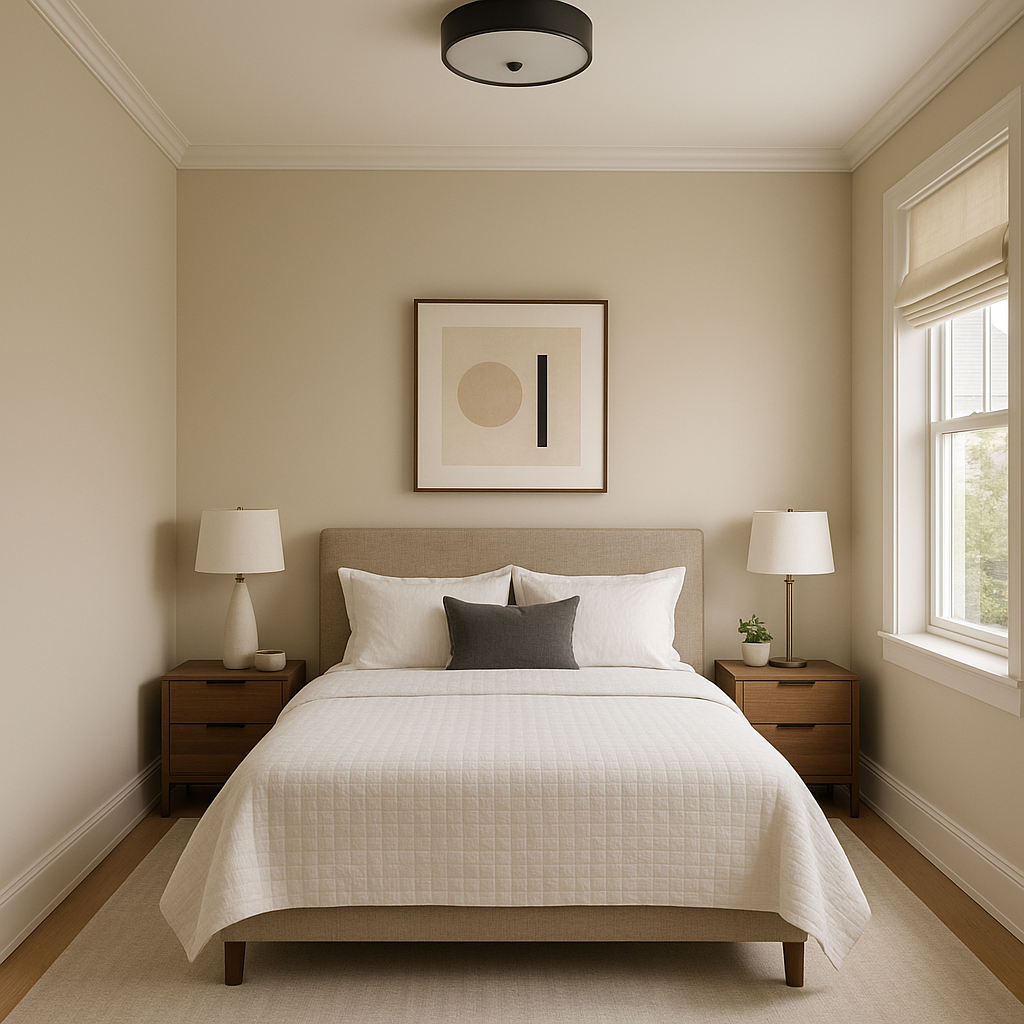
As a soft, restful shade, Timson is ideal for bedrooms. Pair it with crisp white bedding and soft textures for a tranquil retreat, or incorporate deeper tones for a cocoon-like effect.
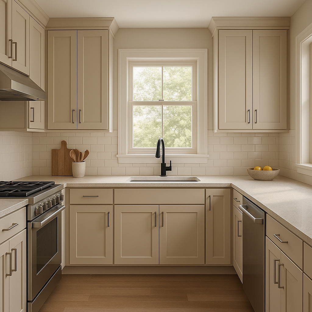
Timson works beautifully on kitchen cabinetry, especially when paired with brass hardware or natural stone countertops. In dining rooms, it provides a neutral yet elegant atmosphere that complements wooden furniture and metallic accents.
Timson’s ability to adapt to changing lighting conditions makes it a great choice for transitional spaces like entryways and hallways. It sets a welcoming tone while seamlessly connecting different rooms within your home.
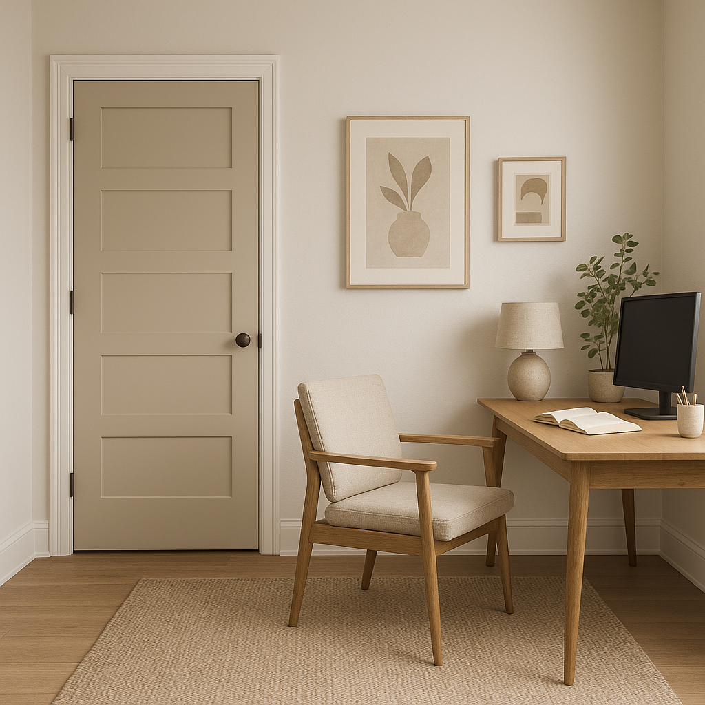
For a productive yet calming workspace, Timson provides the perfect backdrop. It encourages focus without feeling stark or clinical, creating a cozy yet professional environment.
Benjamin Moore Timson (CW-140) is more than just a paint color; it’s a design tool that offers versatility, elegance, and historical charm. Its nuanced undertones and ability to pair effortlessly with a range of colors make it a go-to choice for interior designers and homeowners alike. Whether you’re refreshing a single room or designing an entire home, Timson provides a sophisticated, neutral foundation that will stand the test of time.
View Colors Only by Brand (No Imagery):
Sherwin-Williams
|
Benjamin-Moore
|
Behr
|
Valspar
Live on the Eastern Slope of Colorado and looking for a local painting professional, check out all our painting services and reach out for a free estimate.
Copyright © 2026 : Wild Fox Painting Inc. : 12435 Mead Way, Littleton, CO 80125


