Benjamin Moore Tarpley (CW-170) is a refined and versatile warm neutral that exudes timeless elegance. Part of the Colonial Williamsburg® collection, this paint color is steeped in history, inspired by the rich architectural traditions and design aesthetics of the Colonial period. Its understated yet impactful presence makes it a sophisticated choice for both classic and contemporary interiors.
Tarpley is a warm taupe with subtle gray undertones, giving it a balanced appearance with just the right amount of depth. While it leans toward the warmer side of the spectrum, the gray undertones keep it grounded and prevent it from feeling overly beige or yellow. This nuanced blend makes it a highly adaptable shade that works beautifully in spaces with varying light conditions.
In daylight, Tarpley reveals its warmth and richness, making rooms feel welcoming and cozy. In dimmer lighting or evening settings, the gray undertones become more prominent, lending a sophisticated, muted vibe. This dual personality makes Tarpley ideal for creating a harmonious atmosphere in both residential and commercial spaces.
Benjamin Moore Tarpley pairs effortlessly with a wide range of colors, thanks to its neutral yet complex undertones. Here are some suggestions for coordinating hues to complement Tarpley:
Tarpley is a true chameleon that can adapt to various interior design styles, making it suitable for a wide range of applications:
The warm taupe of Tarpley creates a cozy and inviting backdrop for living spaces. Pair it with plush furniture in complementary shades and textured accessories like woven throws or patterned rugs to enhance its warmth.
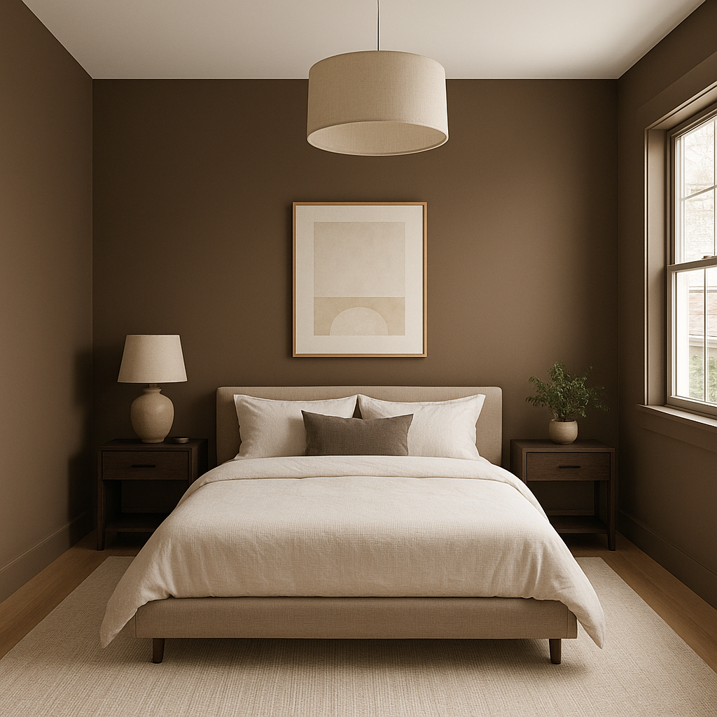
For bedrooms, Tarpley's soothing qualities make it an excellent choice for creating a restful retreat. Pair it with soft linens in muted tones or metallic accents for a touch of understated luxury.
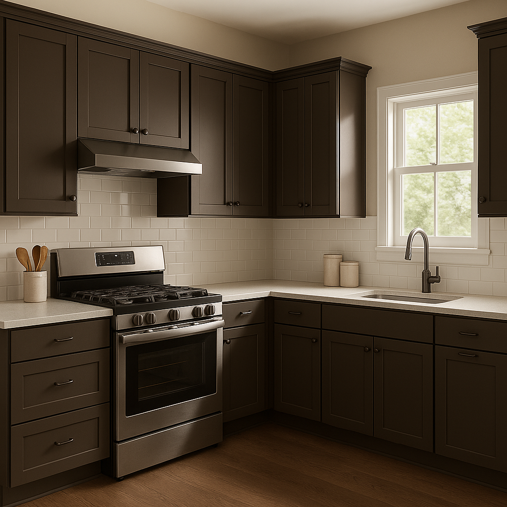
Tarpley's historical roots make it perfect for traditional dining rooms. Combine it with rich wood furniture and coordinating Colonial-inspired colors for a timeless, elegant look.
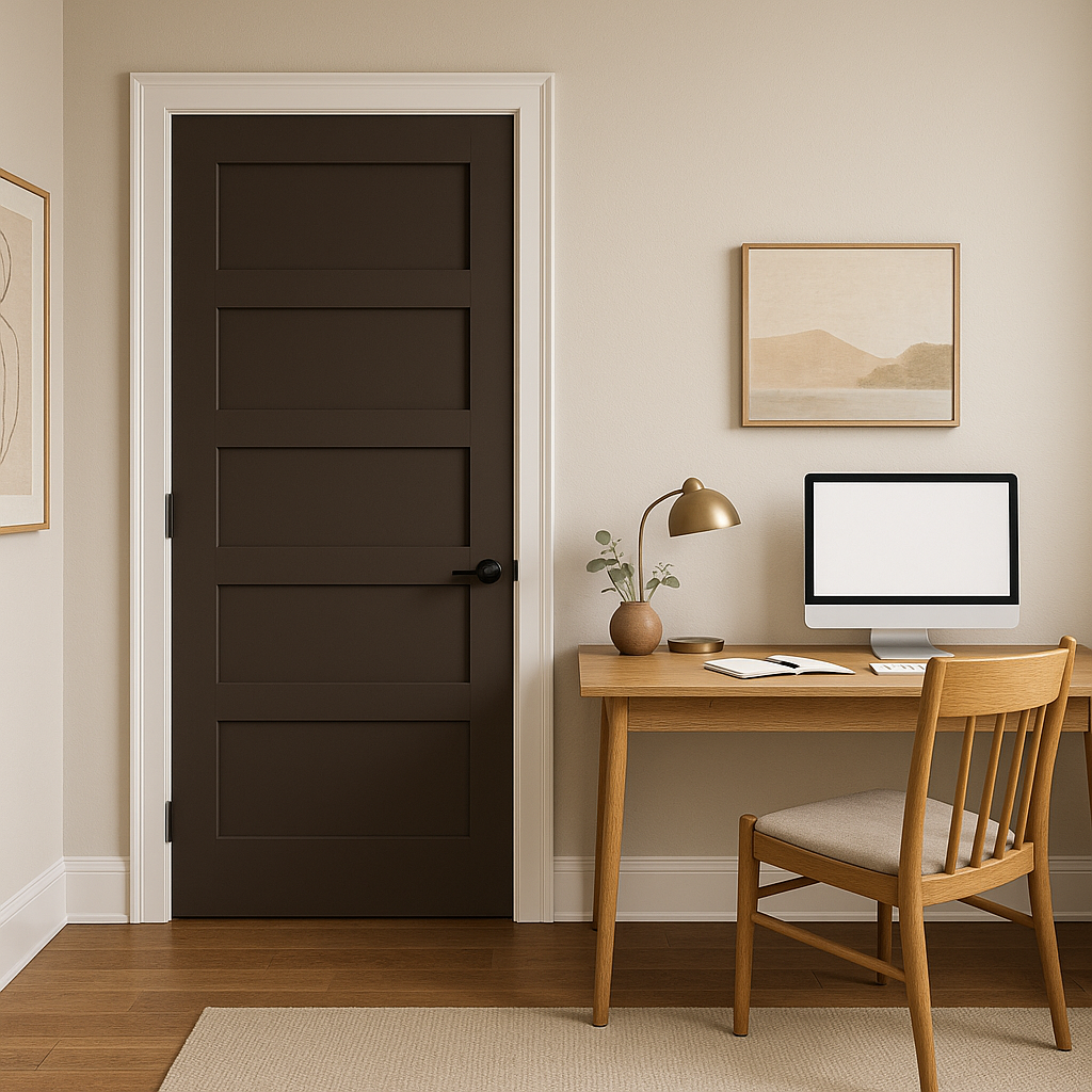
As a neutral with depth, Tarpley provides a calming yet sophisticated environment ideal for focus and productivity. Pair it with minimalist decor and sleek furniture for a modern edge.
If you're looking to make a subtle statement, Tarpley can be used as an accent wall color. Its warm undertones make it a perfect partner for lighter neutrals or contrasting darker hues.
Benjamin Moore Tarpley is more than just a paint color—it's a celebration of history and design sophistication. Its warm taupe base, balanced by gray undertones, makes it a versatile and timeless choice for interiors. Whether you're aiming to evoke classic charm or create modern serenity, Tarpley adapts seamlessly to your vision, offering a rich palette of possibilities.
Bring understated elegance into your space with Benjamin Moore Tarpley, and let its warmth and character transform your home into a haven of style and comfort.
View Colors Only by Brand (No Imagery):
Sherwin-Williams
|
Benjamin-Moore
|
Behr
|
Valspar
Live on the Eastern Slope of Colorado and looking for a local painting professional, check out all our painting services and reach out for a free estimate.
Copyright © 2026 : Wild Fox Painting Inc. : 12435 Mead Way, Littleton, CO 80125


