Benjamin Moore Carter (CW-230) is a sophisticated, warm neutral from the esteemed Colonial Williamsburg collection. This versatile shade embodies classic refinement and modern adaptability, making it ideal for a wide array of interior and exterior applications. With its understated charm, Carter strikes a balance between tradition and contemporary design, offering a welcoming and timeless backdrop for any space.
Carter is a muted beige with gray undertones that lend it a soft, harmonious quality. Unlike stark neutrals, its warmth creates a cozy and inviting atmosphere, while the gray undertones prevent it from feeling overly yellow or golden. This balance makes Carter a perfect choice for interiors that call for subtle elegance without overwhelming the senses.
The shade's earthy foundation also has faint hints of taupe, which enhance its versatility and make it adaptable to different lighting conditions. In brighter spaces, Carter leans toward a lighter, airier beige, while in dimmer settings, its gray undertones emerge more prominently, creating depth and sophistication.
Benjamin Moore Carter pairs beautifully with a curated palette of coordinating colors that emphasize its neutral warmth. Below are some complementary shades to consider:
Whites and Off-Whites: Pair Carter with crisp whites like Benjamin Moore White Dove (OC-17) or warm off-whites like Benjamin Moore Swiss Coffee (OC-45) for contrast and a clean, refined look. These combinations work particularly well in traditional settings or spaces with architectural details.
Rich Blues: For a striking yet balanced contrast, coordinate Carter with deep blues like Hale Navy (HC-154) or Van Deusen Blue (HC-156). These colors add depth and drama while maintaining a timeless aesthetic.
Soft Greens: Shades like Sage Mountain (1488) or Prescott Green (HC-140) complement Carter’s earthy undertones, creating a soothing and nature-inspired palette.
Charcoal Grays and Browns: For a more grounded, modern look, pair Carter with darker neutrals like Kendall Charcoal (HC-166) or Branchport Brown (HC-72). These deeper tones enhance Carter’s subtle elegance and create a cohesive, layered design.
Carter’s versatility and neutral sophistication make it an excellent choice for a variety of spaces and design styles. Here are some ideas for incorporating this timeless hue into your home:
Carter is perfect for living rooms and family rooms, where its warm undertones create a welcoming atmosphere that encourages relaxation. Pair it with natural wood furniture, textured fabrics, and metallic accents for a cozy yet elevated look.
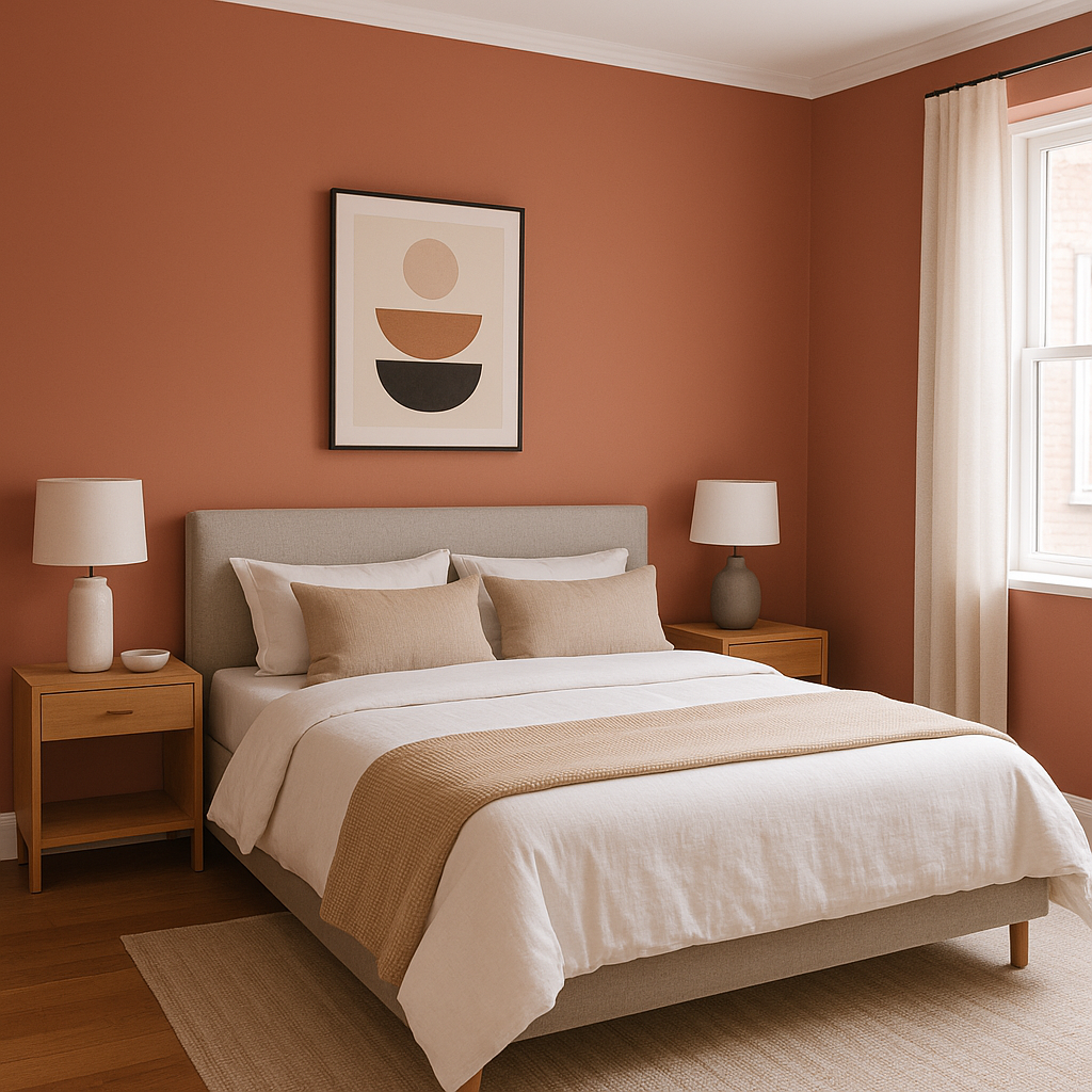
In bedrooms, Carter provides a calming and neutral backdrop that works well with soft linens and accent colors like blush pink or dusty blue. Its understated elegance fosters a restful environment that feels serene and inviting.
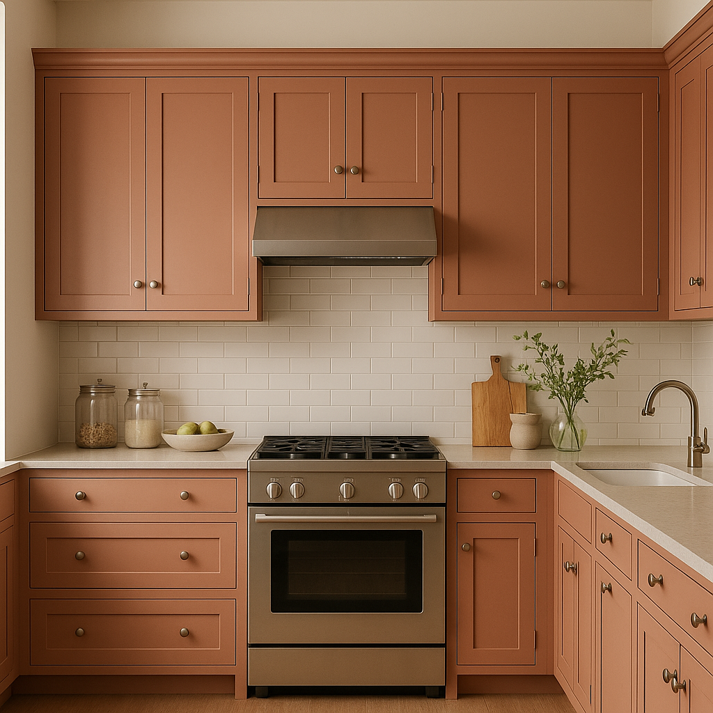
Carter shines in kitchens, especially when paired with white cabinetry, brushed nickel hardware, and marble countertops. Its earthy undertones add warmth to the space while maintaining a clean, timeless aesthetic.
For bathrooms, Carter delivers a spa-like feel when combined with crisp white tiles, soft greenery, and polished chrome fixtures. Its adaptability to both natural and artificial lighting ensures a balanced appearance.
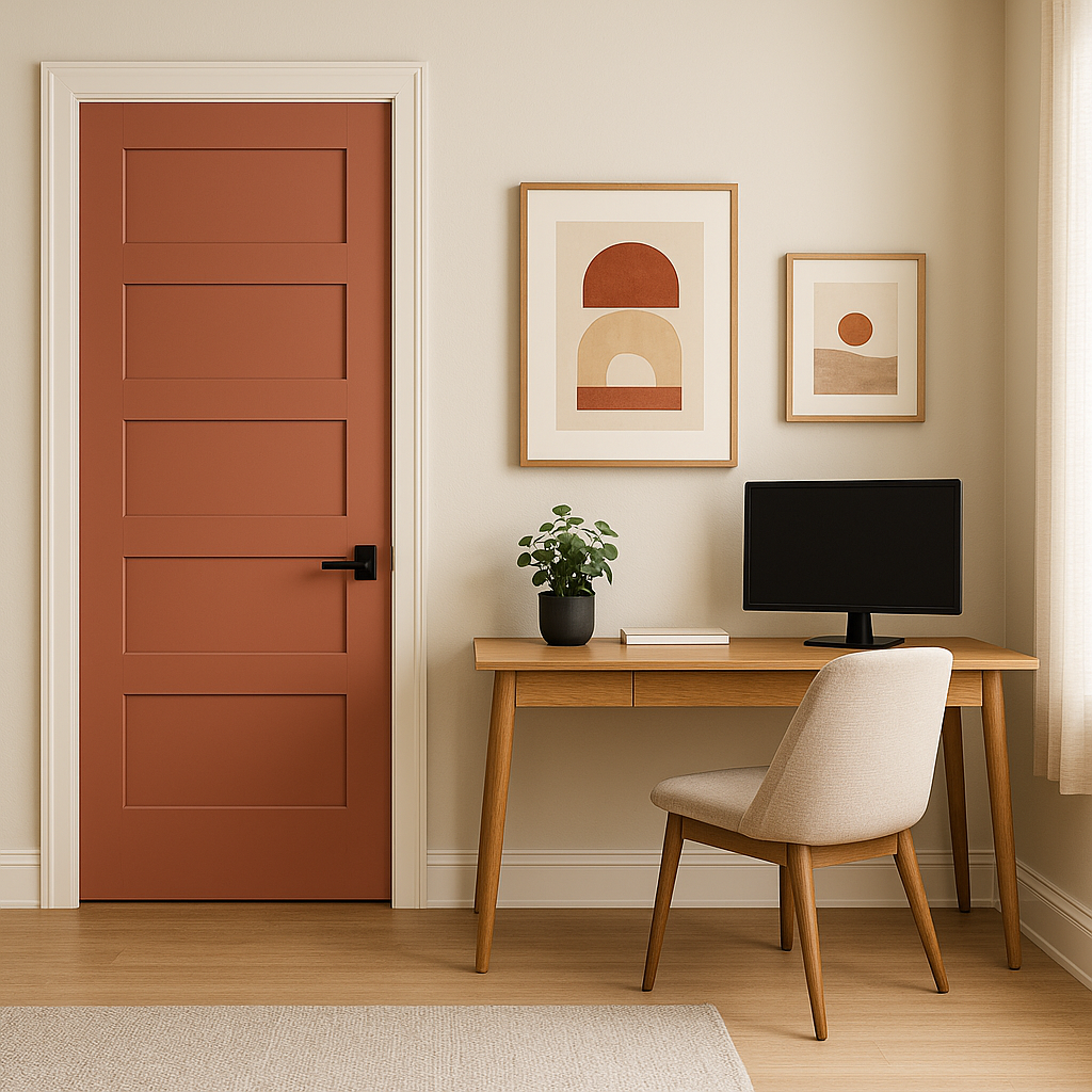
Carter’s versatility extends outdoors, where it acts as a graceful neutral for siding, trim, or shutters. Pair it with darker accents like black or deep green for a classic colonial-inspired exterior, or team it with crisp white for a fresh, modern farmhouse vibe.
Benjamin Moore Carter (CW-230) is more than just a neutral; it’s a timeless shade that effortlessly bridges traditional charm and contemporary sophistication. With its balanced undertones, adaptability to various lighting conditions, and compatibility with a wide range of coordinating colors, Carter is a versatile choice for creating spaces that feel elegant, warm, and refined.
Whether you’re revamping a historic home or designing a sleek modern interior, Carter’s understated beauty ensures that your space will exude timeless appeal and effortless harmony.
View Colors Only by Brand (No Imagery):
Sherwin-Williams
|
Benjamin-Moore
|
Behr
|
Valspar
Live on the Eastern Slope of Colorado and looking for a local painting professional, check out all our painting services and reach out for a free estimate.
Copyright © 2026 : Wild Fox Painting Inc. : 12435 Mead Way, Littleton, CO 80125


