Benjamin Moore Walnut (CW-240) is a rich, warm brown that evokes the natural beauty and depth of finely stained wood. Perfectly suited for traditional, transitional, and modern spaces, Walnut is a color that exudes sophistication while maintaining an inviting and grounded feel. Its versatility makes it a favorite among interior designers for creating cozy and elegant environments.
Walnut leans into warm undertones, featuring hints of reddish-brown that enhance its depth without overpowering its neutrality. These undertones provide a welcoming richness, making Walnut a fantastic choice for areas where you want to create a sense of comfort and timelessness. The subtle warmth brings out the best in surrounding colors, whether you pair it with cool, crisp tones or other earthy hues.
Benjamin Moore Walnut (CW-240) pairs beautifully with a wide range of colors, allowing for seamless coordination in any design scheme. Here are some top recommendations:
Neutral Pairings
Earthy Complements
Cool Contrasts
Accent Colors
Walnut (CW-240) is an incredibly flexible shade that works beautifully in a variety of applications. Its rich tone makes it ideal for creating depth and drama, while its warmth ensures spaces remain welcoming. Here are some popular uses for Walnut:
Walnut is perfect for anchoring social spaces like living rooms or dens. Use it on walls to create a cozy and intimate environment, or incorporate it into furniture and cabinetry for a luxurious feel. Pair it with neutral upholstered furniture and metallic accents for a polished look.
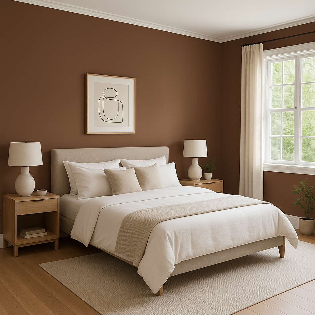
For bedrooms, Walnut offers a calming and cocoon-like effect, ideal for promoting relaxation. Pair it with soft whites or muted blues to create a serene retreat, or add playful pops of color in bedding and decor for a more eclectic style.
Walnut shines in dining rooms, where its rich tone can enhance the formality of the space. Use it as a wall color alongside crisp white trim, or pair it with dark-stained wood furniture for a cohesive and elegant aesthetic.
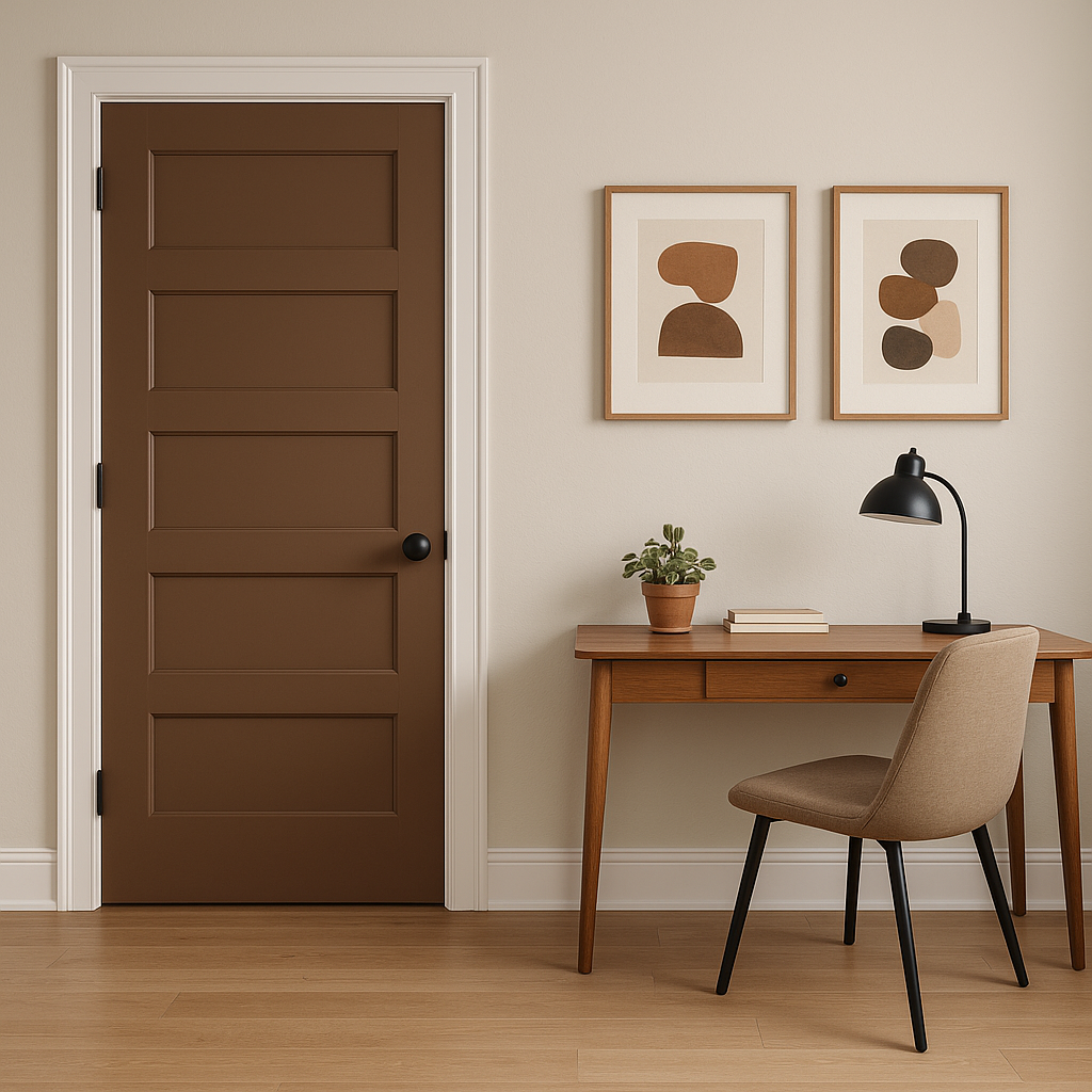
If you're looking to make a statement, Walnut works beautifully as an accent wall. Whether in a home office, hallway, or entryway, its depth adds character and sophistication to any space.
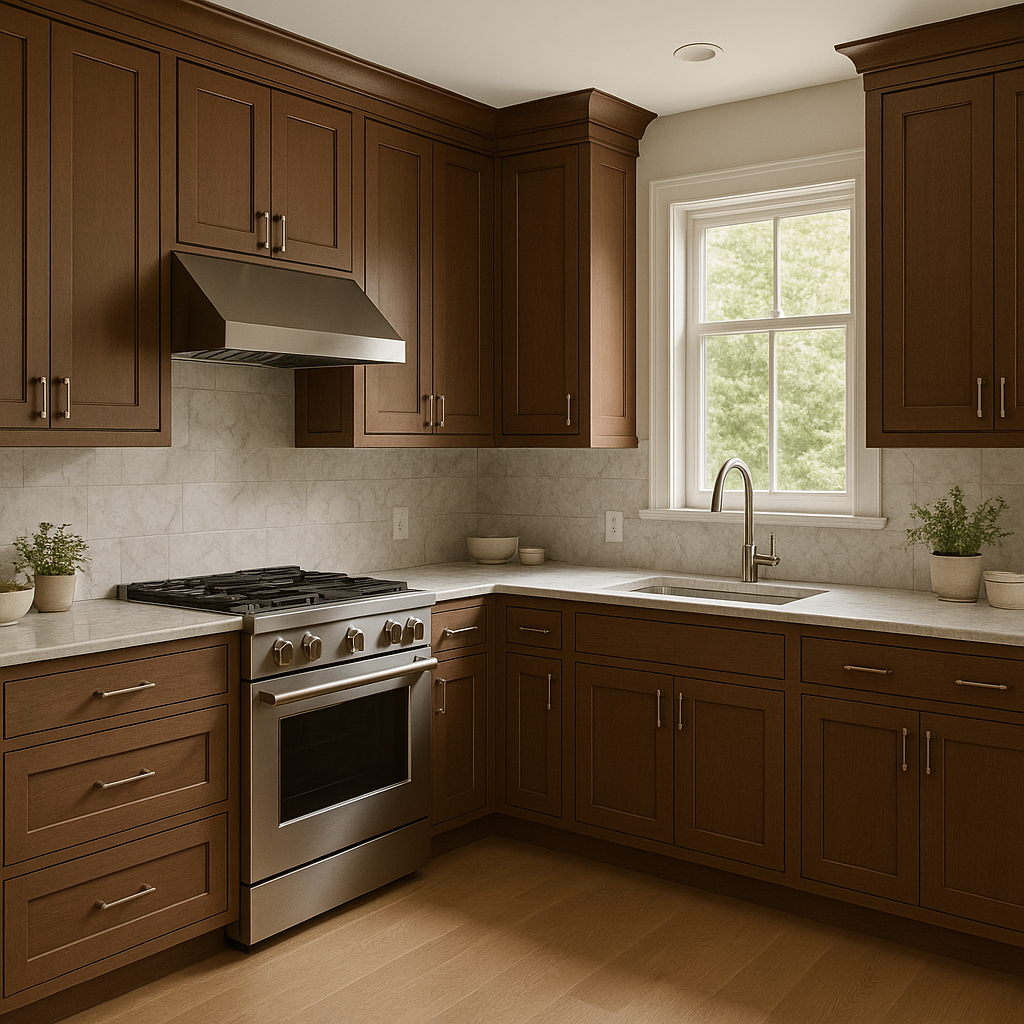
Walnut is an excellent choice for cabinetry or built-ins, offering a nod to the natural beauty of wood. Its warm undertones harmonize with both light and dark countertops, making it a versatile option for kitchens, bathrooms, or custom shelving.
In commercial settings like restaurants, offices, or boutique showrooms, Walnut can elevate the atmosphere with its rich, timeless appeal. Pair it with sleek modern furnishings or vintage-inspired decor for an upscale and memorable impression.
Benjamin Moore Walnut (CW-240) is more than just a paint color—it's a design statement that brings timeless elegance to any space. Whether you're creating a cozy family room, a formal dining area, or a chic commercial setting, Walnut’s warm undertones and versatile nature make it a reliable choice. Pair it with complementary shades like creamy whites, earthy beiges, or bold blues to craft a space that feels cohesive and inviting.
View Colors Only by Brand (No Imagery):
Sherwin-Williams
|
Benjamin-Moore
|
Behr
|
Valspar
Live on the Eastern Slope of Colorado and looking for a local painting professional, check out all our painting services and reach out for a free estimate.
Copyright © 2026 : Wild Fox Painting Inc. : 12435 Mead Way, Littleton, CO 80125


