Benjamin Moore Nicolson (CW-270) is a refined, warm beige that evokes a sense of understated elegance. Part of the esteemed Colonial Williamsburg collection, this versatile hue is deeply rooted in historical charm, yet seamlessly adaptable to modern interiors. Its soft, creamy appearance makes it a welcoming neutral that can suit a variety of spaces and styles.
What sets Nicolson apart from other beige tones are its subtle undertones. This shade carries a delicate balance of warm yellow and muted brown, which gives it a gentle richness without feeling overpowering. These undertones ensure that Nicolson maintains its timeless appeal while feeling cozy and inviting. It’s neither too cool nor too warm, allowing it to harmonize effortlessly in different lighting conditions.
To create a cohesive palette, consider pairing Benjamin Moore Nicolson with complementary hues that enhance its subtle warmth:
Benjamin Moore Nicolson (CW-270) is incredibly versatile, making it suitable for a wide range of applications throughout the home:
Its understated warmth makes it an ideal choice for living rooms, creating a cozy yet elegant atmosphere. Pair it with neutral upholstery, warm wood tones, and soft textures to design a welcoming space for family and guests.
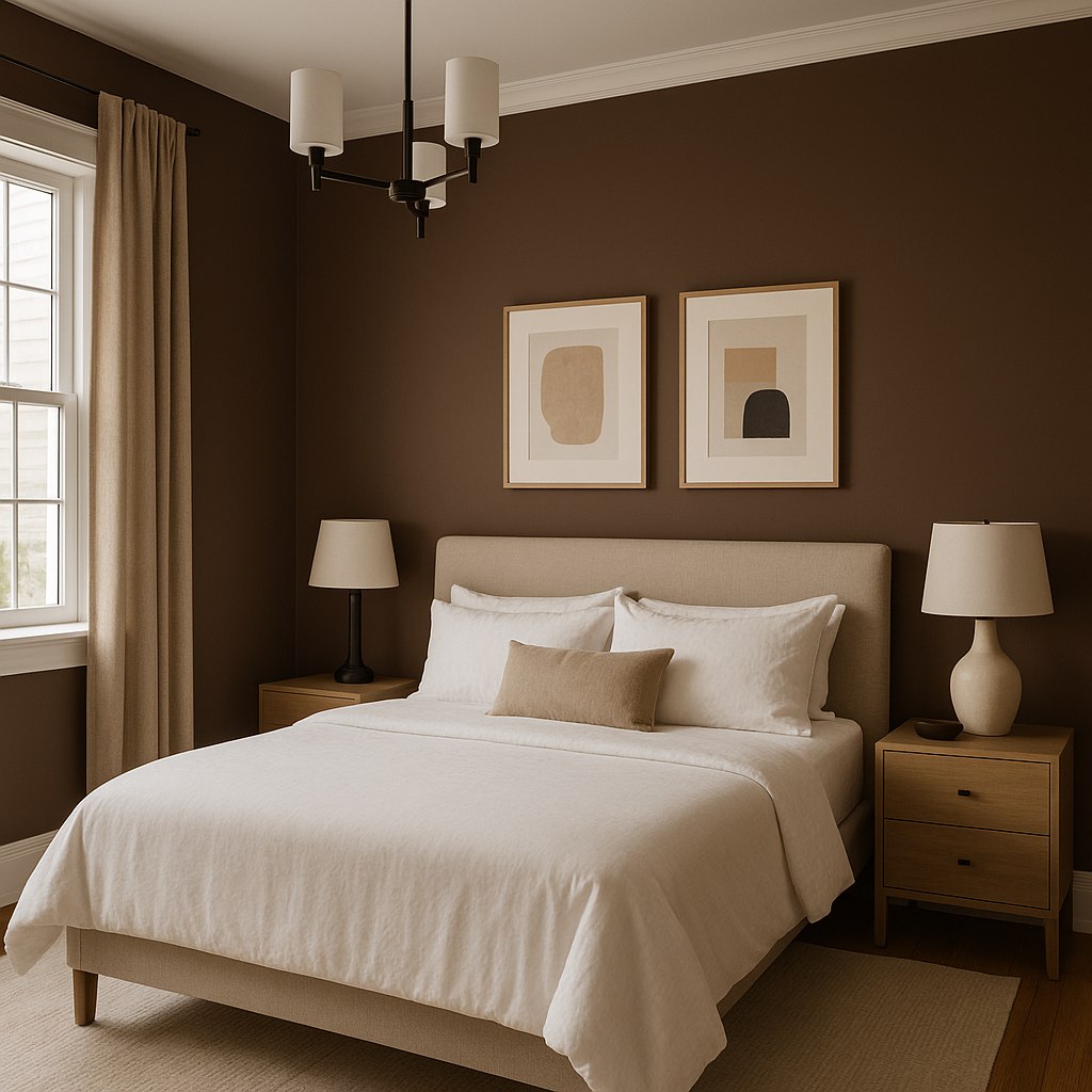
In bedrooms, Nicolson can act as a soothing backdrop for restful retreats. Layer it with soft linens, plush textiles, and accents in muted pastel tones to enhance its calming effect.
For dining areas, Nicolson serves as a warm complement to rich wood furniture and traditional decor. This shade works beautifully with antique or vintage pieces, adding an air of refinement to formal spaces.
Nicolson is perfect for hallways and entryways, where its neutral tone can create an inviting first impression. Pair it with crisp white trim to highlight architectural details, or add bold artwork for visual interest.
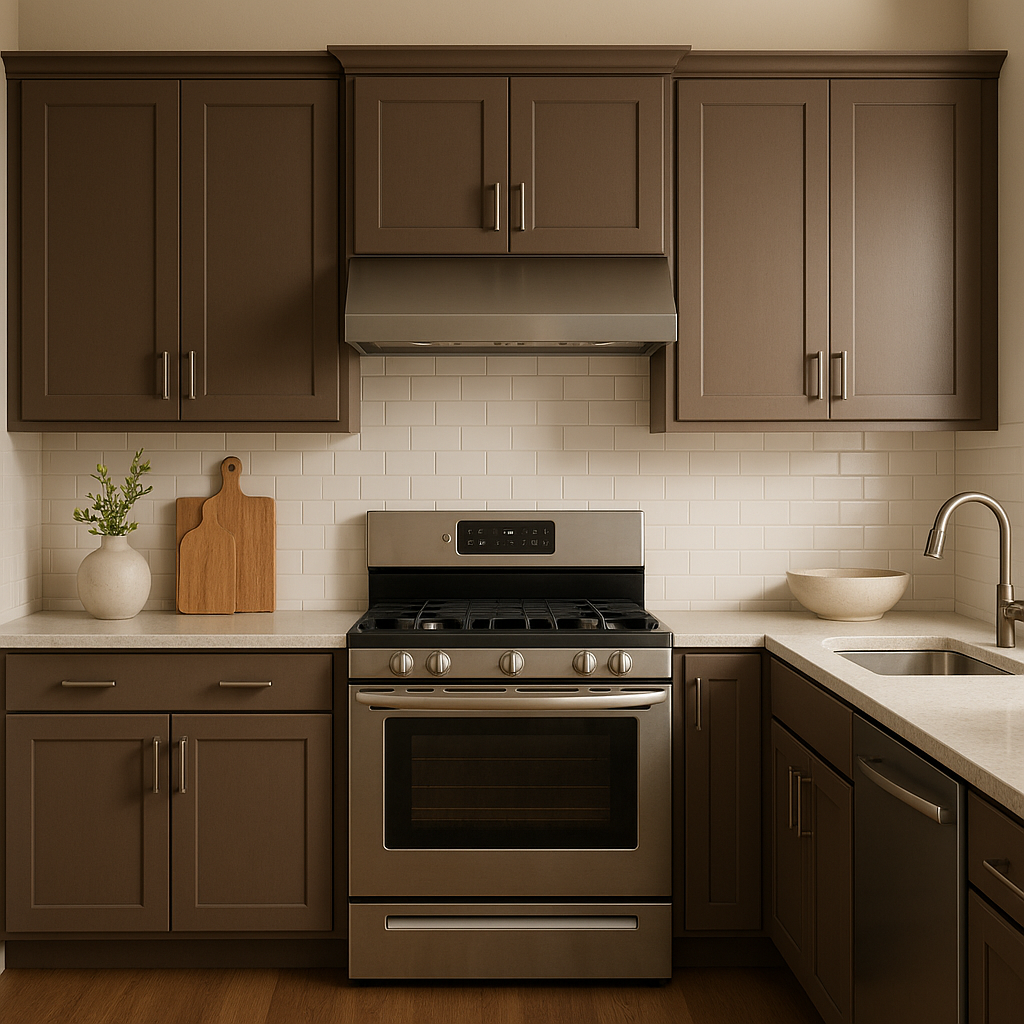
In kitchens, Nicolson pairs beautifully with cream cabinetry, butcher block countertops, and brass fixtures. It creates a soft, timeless aesthetic that feels grounded yet fresh.
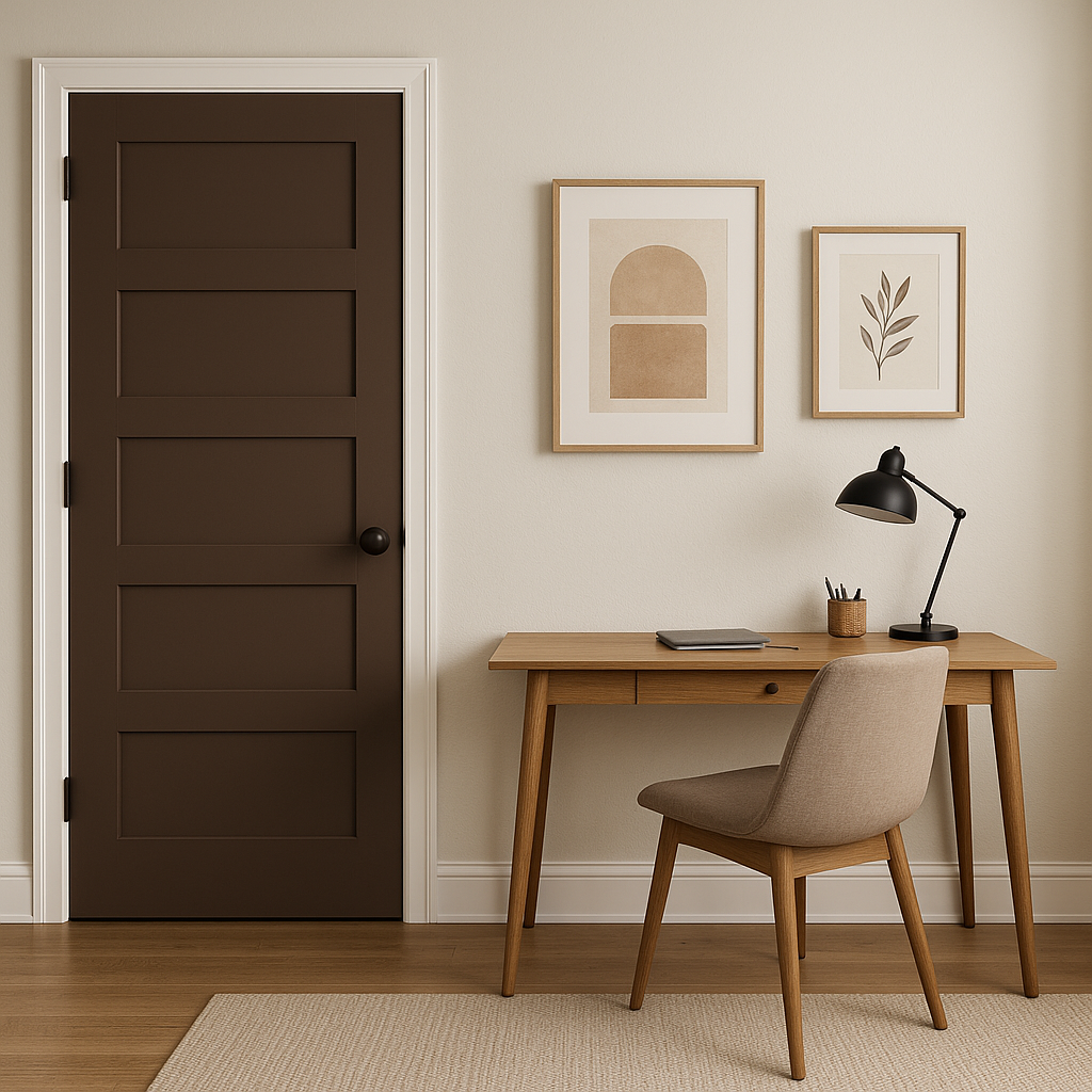
For home offices or libraries, Nicolson provides a neutral yet warm foundation that encourages focus and creativity. Pair it with rich leather furniture or dark wood accents to create a distinguished atmosphere.
Benjamin Moore Nicolson (CW-270) is more than just a paint color—it's a bridge between traditional elegance and contemporary versatility. Its warm beige tone, soft undertones, and ability to pair effortlessly with a wide range of colors make it an ideal choice for homeowners who value timeless design. Whether you’re creating a cozy haven or a sophisticated space, Nicolson has the adaptability to bring your vision to life.
Let this historical yet modern hue enrich your interiors, adding depth and warmth while standing the test of time.
View Colors Only by Brand (No Imagery):
Sherwin-Williams
|
Benjamin-Moore
|
Behr
|
Valspar
Live on the Eastern Slope of Colorado and looking for a local painting professional, check out all our painting services and reach out for a free estimate.
Copyright © 2026 : Wild Fox Painting Inc. : 12435 Mead Way, Littleton, CO 80125


