Benjamin Moore Cornwallis (CW-315) is a beautifully rich and sophisticated hue from the Colonial Williamsburg® Color Collection. This captivating green embodies a sense of timeless elegance drawn from historic interiors, making it a perfect choice for spaces that seek a classic yet approachable aesthetic. Its depth and warmth lend it versatility, allowing it to work seamlessly in both traditional and contemporary designs.
Cornwallis is a mid-tone green with subtle gray undertones that soften its appearance and give it a slightly muted quality. These undertones prevent the color from feeling overly bright or saturated, enabling it to exude a grounded, earthy charm. Its gray influence also makes it adaptable to various lighting conditions, ensuring it looks refined and balanced whether bathed in natural sunlight or artificial lighting.
Cornwallis pairs effortlessly with a range of complementary tones, making it highly versatile for designing harmonious interiors. Here are some coordinating colors to consider:
Off-White and Creams: Pair Cornwallis with soft neutrals like Benjamin Moore White Dove (OC-17) or Benjamin Moore Linen White (OC-146) for a clean and classic look. These hues allow Cornwallis to take center stage while providing a serene backdrop.
Warm Accents: For a more traditional palette, incorporate warm tones like Benjamin Moore Hawthorne Yellow (HC-4) or Benjamin Moore Chestertown Buff (HC-9). These golden shades add a touch of warmth and elegance to Cornwallis’ earthy green.
Deep Contrasts: Create a bold, dramatic effect by pairing Cornwallis with darker hues like Benjamin Moore Black Ink (2127-20) or Benjamin Moore Van Deusen Blue (HC-156). These rich colors emphasize Cornwallis’ depth and add a modern edge to your design.
Wood Tones: Natural wood tones—whether light oak or darker walnut—complement Cornwallis beautifully, enhancing its historic appeal and grounding the space in warmth and texture.
Cornwallis is an incredibly versatile shade that can be used in a variety of spaces to evoke different moods and aesthetics. Here are some suggestions for bringing this charming green into your home:
Living Rooms: Cornwallis adds depth and character to living areas, creating a cozy yet elegant environment. Pair it with neutral furniture and textured fabrics for a well-balanced look.
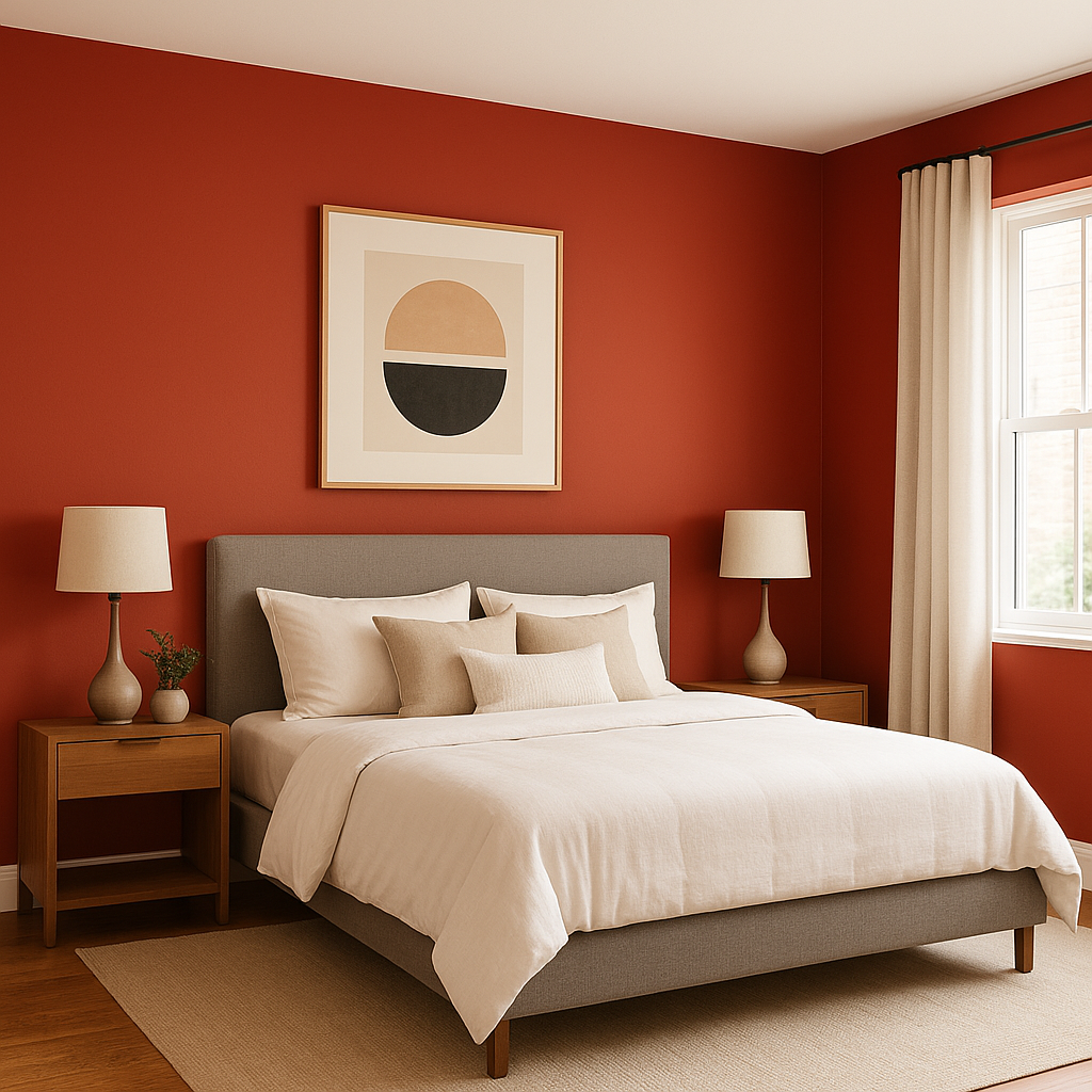
Bedrooms: Its calming undertones make Cornwallis an excellent choice for bedrooms. Use it on accent walls or as a full-wall color to create a relaxing retreat.
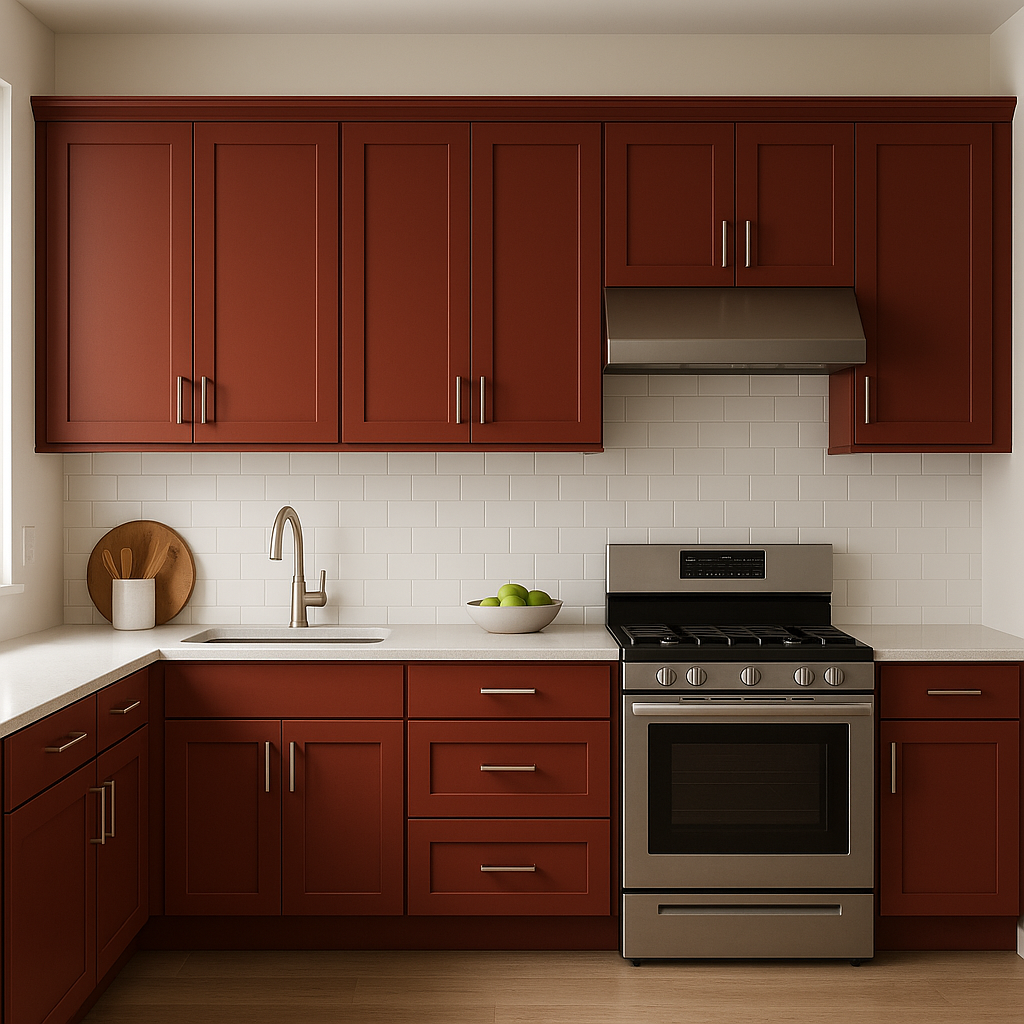
Kitchens: Cornwallis works beautifully in kitchens, especially when paired with white cabinetry or natural wood finishes. Add brass hardware for a touch of sophistication.
Dining Rooms: For a traditional dining room, Cornwallis delivers a stately atmosphere. Pair it with classic wainscoting or crown molding in a crisp white for a polished finish.
Accent Walls: If you’re not ready to commit to an entire room painted in Cornwallis, try it on an accent wall to introduce a subtle yet impactful pop of color.
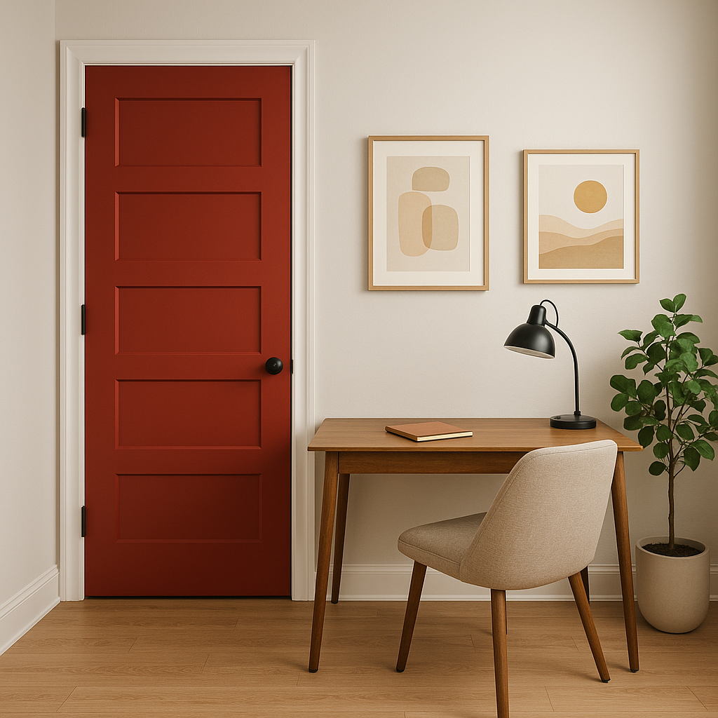
Exteriors: Cornwallis also makes a compelling choice for outdoor applications, such as shutters, front doors, or porch ceilings. Its nature-inspired tone blends seamlessly with surrounding landscapes.
Benjamin Moore Cornwallis (CW-315) is more than just a paint color—it's a reflection of history and an invitation to incorporate timeless beauty into your home. Whether you’re designing a classic interior or adding depth to a contemporary space, Cornwallis adapts to your vision with ease. Its rich green hue, softened by gray undertones, ensures that it remains both striking and understated, making it a favorite among interior designers and homeowners alike.
View Colors Only by Brand (No Imagery):
Sherwin-Williams
|
Benjamin-Moore
|
Behr
|
Valspar
Live on the Eastern Slope of Colorado and looking for a local painting professional, check out all our painting services and reach out for a free estimate.
Copyright © 2026 : Wild Fox Painting Inc. : 12435 Mead Way, Littleton, CO 80125


