Benjamin Moore Palace (CW-35) is a classic, refined neutral that brings an air of understated elegance to any space. This warm greige is part of Benjamin Moore’s Colonial Williamsburg collection, a palette inspired by the rich history and iconic architecture of Colonial America. Palace offers versatility, charm, and timeless appeal, making it a favorite among interior designers seeking a balance between modern minimalism and historical richness.
Palace is a harmonious blend of gray and beige, with subtle warm undertones that exude coziness while maintaining a polished aesthetic. Its delicate warmth prevents it from feeling cold or stark, making it an inviting choice for a variety of interiors. The nuanced undertones include hints of taupe, which add depth and make the color adaptable to various lighting conditions. In spaces with natural light, Palace leans toward its beige hues, while in artificial or dim lighting, its gray tones become more pronounced.
One of Palace's greatest strengths is its versatility in pairing with other colors. Whether you're creating a monochromatic palette or adding bold accents, this hue complements a range of shades:
Palace is a versatile choice that works beautifully in a variety of spaces and design styles. Its neutral qualities make it a go-to option for both residential and commercial interiors. Here are some of the best ways to incorporate this sophisticated shade:
Palace provides a warm, inviting backdrop for living rooms and family spaces. Pair it with upholstered furniture in soft textures, natural wood tones, and accents in metallic finishes for a modern yet comfortable vibe. Its neutrality allows you to layer in colorful accents through throw pillows, rugs, or artwork without overwhelming the space.
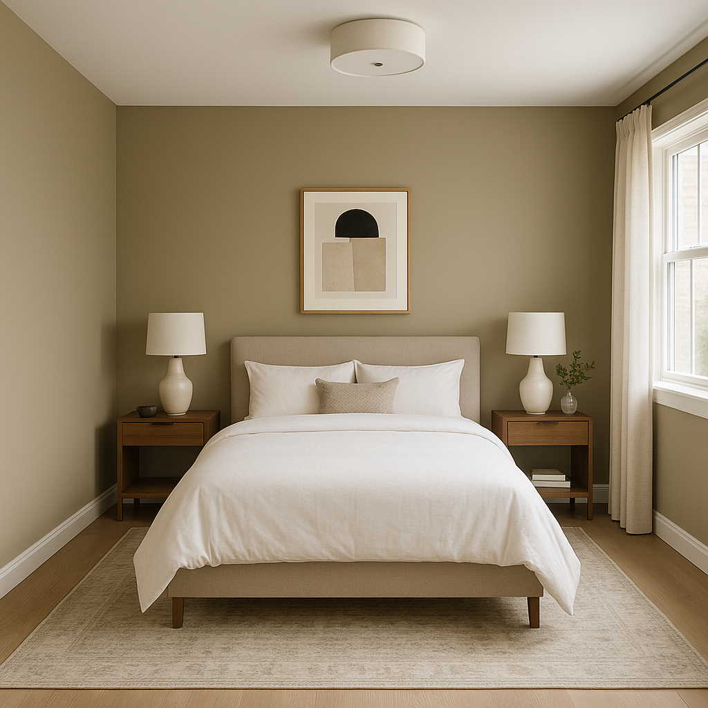
Create a tranquil sanctuary with Palace as your wall color. Its soothing undertones make it ideal for bedrooms, promoting relaxation and restfulness. Pair it with crisp white linens, soft gray accents, or muted blues for a serene retreat.
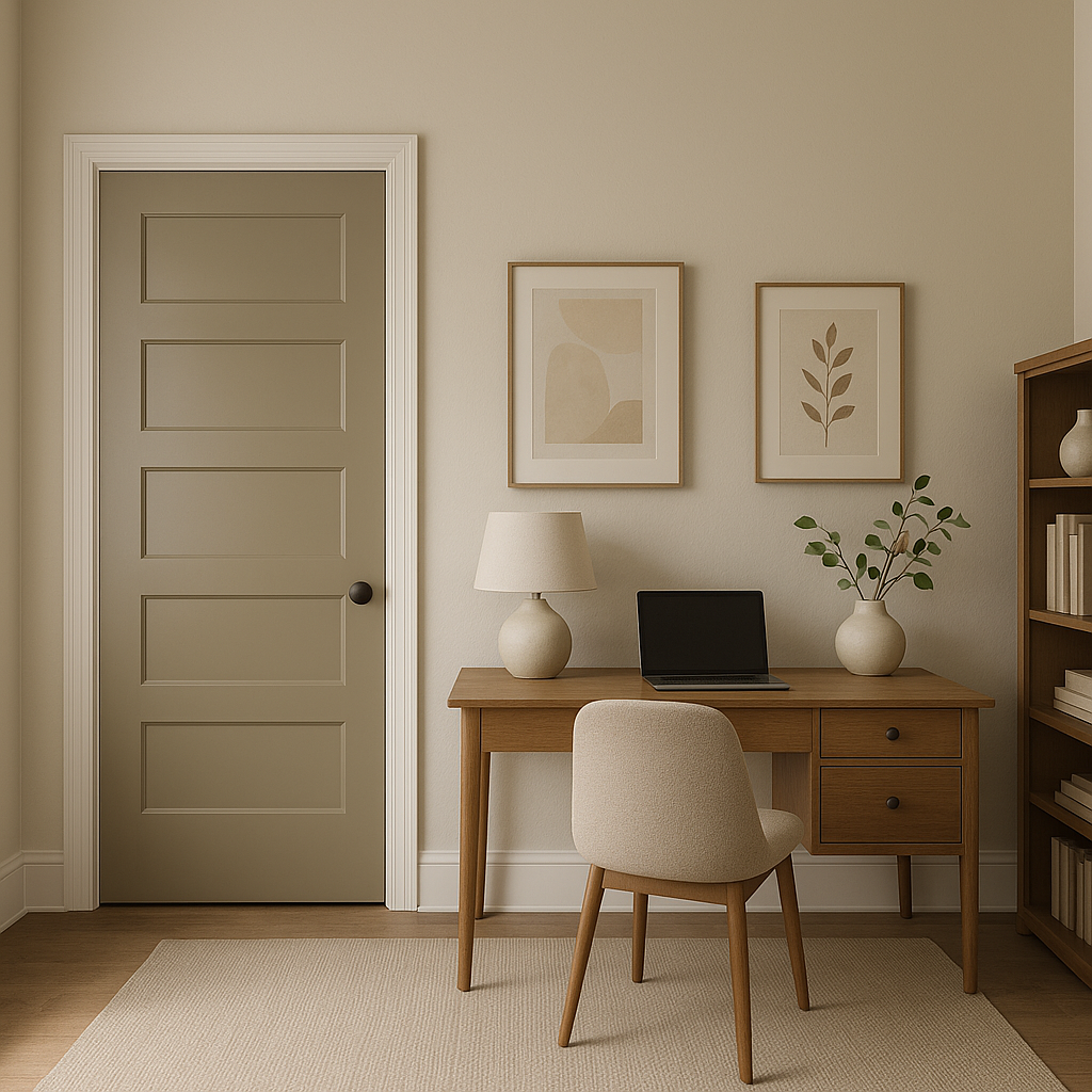
Palace is an excellent choice for home offices, offering a neutral yet stimulating backdrop that enhances focus and productivity. Combine it with dark wood furniture and brass or matte black fixtures for a sophisticated and professional atmosphere.
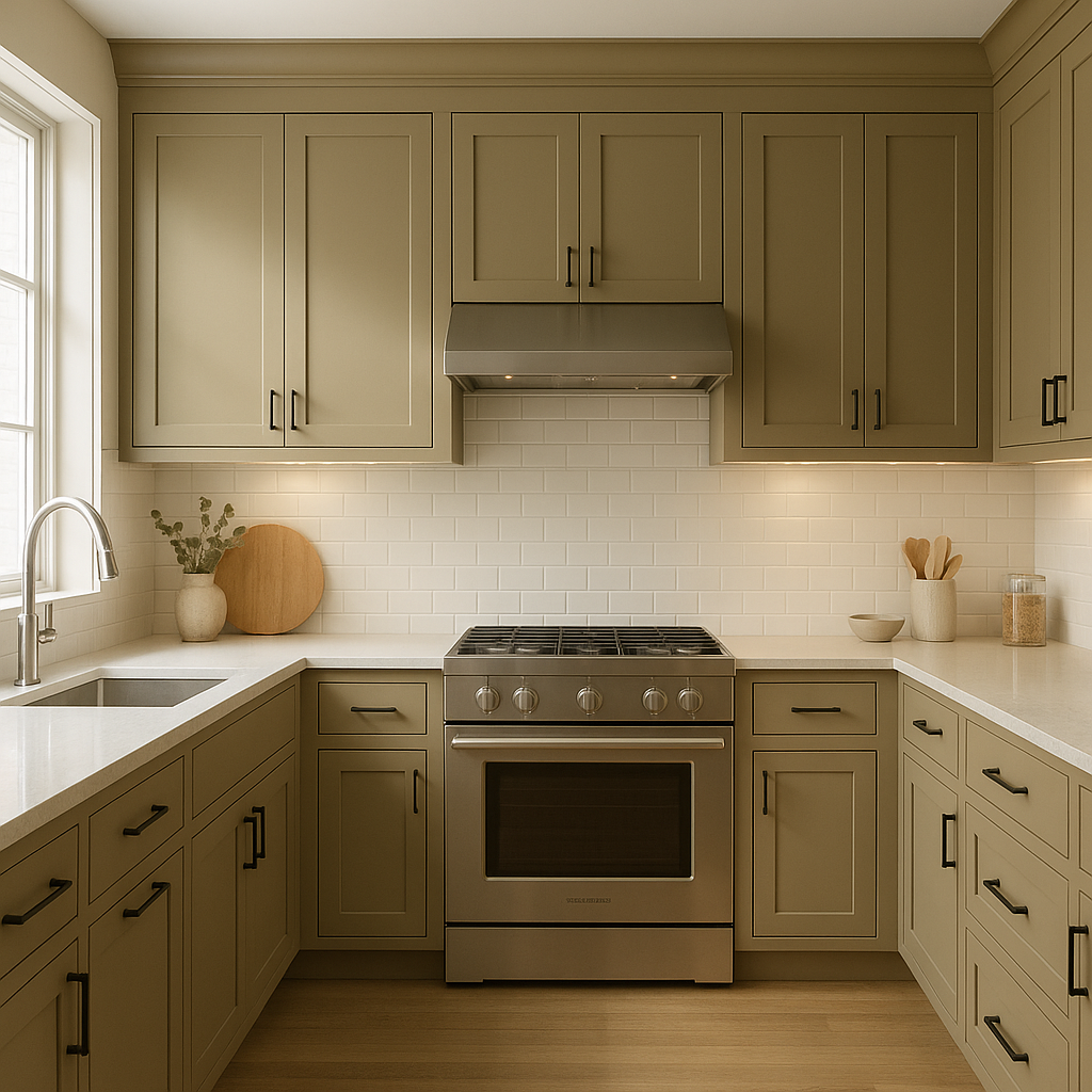
Palace shines in kitchens and dining rooms, especially when paired with white cabinetry and marble countertops. Add pops of color through accessories or artwork for a dynamic look that feels fresh and inviting.
For transitional spaces like hallways or entryways, Palace provides a seamless, polished look. It complements wood floors and neutral rugs, creating an elegant first impression.
In bathrooms, Palace contributes to a spa-like ambiance, especially when combined with crisp white trims, soft gray tiles, or brushed nickel fixtures. Add greenery or textured towels for subtle contrast.
Benjamin Moore Palace (CW-35) is more than just a paint color—it's a versatile design element that adapts to a wide range of styles and spaces. Its warm undertones and balanced blend of gray and beige provide the perfect neutral base for creating cohesive, sophisticated interiors. Whether you're designing a traditional home steeped in history or a modern space with clean lines, Palace is an excellent choice that will stand the test of time.
View Colors Only by Brand (No Imagery):
Sherwin-Williams
|
Benjamin-Moore
|
Behr
|
Valspar
Live on the Eastern Slope of Colorado and looking for a local painting professional, check out all our painting services and reach out for a free estimate.
Copyright © 2026 : Wild Fox Painting Inc. : 12435 Mead Way, Littleton, CO 80125


