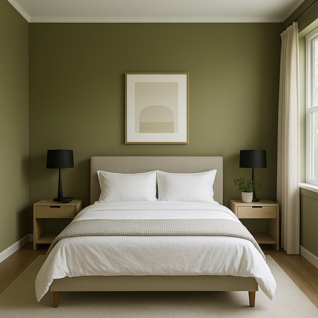
Benjamin Moore Timson (CW-470) is a captivating medium green hue from the Colonial Williamsburg® Collection. This color evokes a sense of refined elegance and historical charm, making it a versatile choice for both traditional and modern interiors. Its rich, earthy quality creates a soothing atmosphere while still being bold enough to make a statement. Whether used as an accent or a primary wall color, Timson is an inviting shade that bridges the gap between timeless sophistication and contemporary style.
Timson (CW-470) carries subtle undertones of gray and olive, which give the green its balanced and grounded character. These undertones enhance its versatility, ensuring it complements a wide variety of design schemes. The gray undertones soften the overall look, providing a muted, calming quality, while the olive hints bring warmth and depth. This unique combination makes Timson an excellent choice for spaces that need a touch of nature-inspired serenity without being overly bright or saturated.
To create a harmonious palette, pair Benjamin Moore Timson with complementary shades that accentuate its earthy and refined nature. Below are some ideal coordinating colors:
Neutral Pairings:
Dramatic Accents:
Soft Pastels:
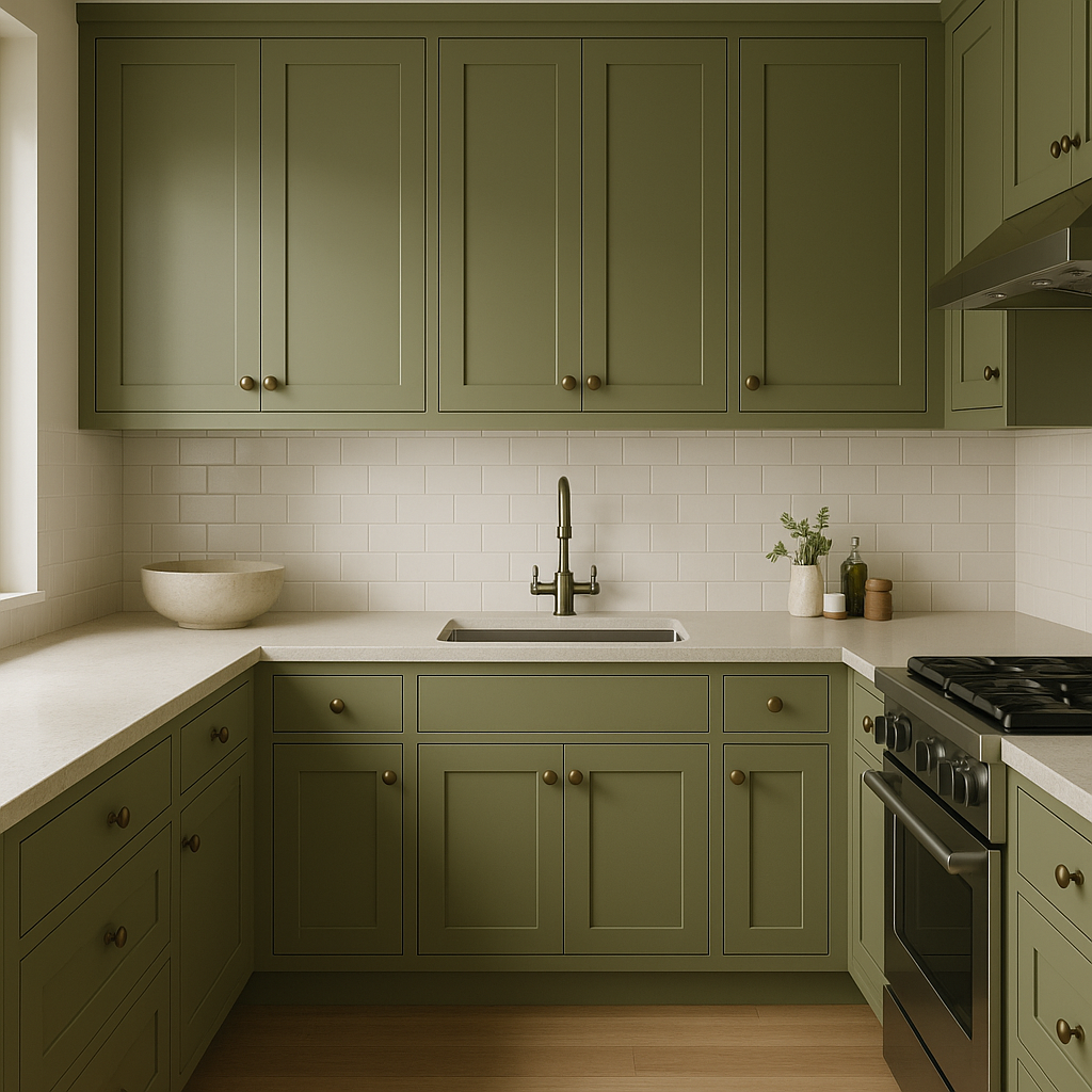
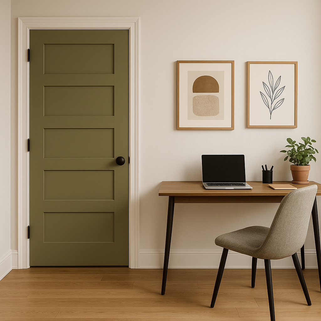
Benjamin Moore Timson is an incredibly versatile green that works beautifully in a variety of spaces, from living rooms to kitchens, and even exteriors. Here are some suggestions for incorporating this color into your home or design project:
Benjamin Moore Timson (CW-470) strikes the perfect balance between boldness and subtlety, making it a versatile green that can elevate your space with ease. Its grounding qualities, historical charm, and sophisticated undertones make it an enduring choice that will remain stylish for years to come. Whether you're updating a single room or reimagining your entire home, Timson is a color that promises depth, elegance, and timeless beauty.
View Colors Only by Brand (No Imagery):
Sherwin-Williams
|
Benjamin-Moore
|
Behr
|
Valspar
Live on the Eastern Slope of Colorado and looking for a local painting professional, check out all our painting services and reach out for a free estimate.
Copyright © 2026 : Wild Fox Painting Inc. : 12435 Mead Way, Littleton, CO 80125


