Benjamin Moore Palmer (CW-475) is a sophisticated and versatile gray that exudes timeless elegance. Part of the esteemed Williamsburg® Paint Color Collection, this shade draws inspiration from the refined palettes of 18th-century design, making it a perfect choice for those who seek a harmonious blend of historical charm and modern sensibility. Its neutral characteristics and adaptability make it a go-to option for both contemporary and traditional interiors.
Palmer is a warm gray with subtle green undertones that add depth and complexity. These undertones prevent it from feeling too cold or sterile, giving it a welcoming presence in any room. The green undertone is understated but noticeable in certain lighting conditions, offering a natural, organic quality that works beautifully in a variety of spaces. Whether under bright natural light or soft artificial light, Palmer maintains a serene and balanced appearance.
Benjamin Moore Palmer pairs effortlessly with a wide range of colors, making it an adaptable choice for creating cohesive designs. Here are a few suggestions for coordinating colors:
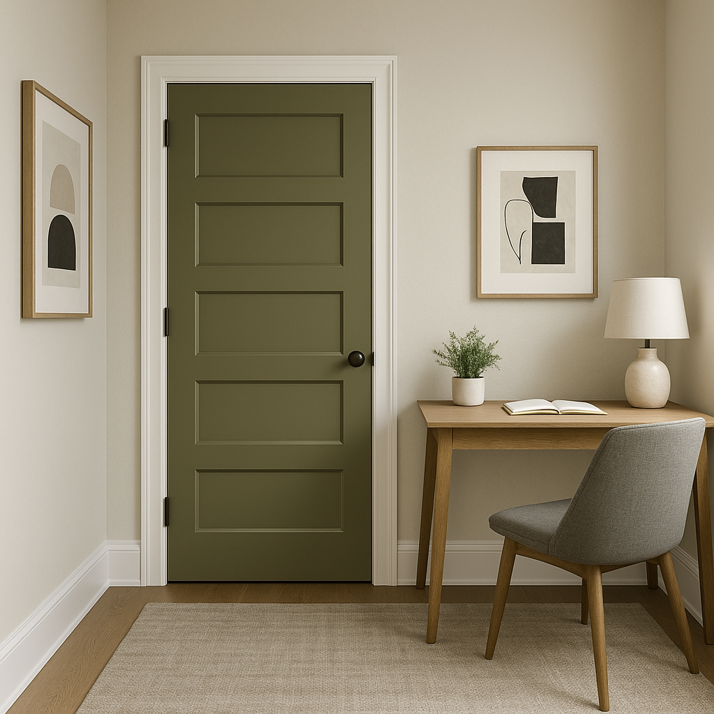
Benjamin Moore Palmer’s versatility makes it suitable for a wide variety of applications, from entire rooms to accent walls. Its neutral nature allows it to act as a grounding backdrop or a statement color, depending on how it’s styled. Here are some ideas for incorporating Palmer into your home:
Palmer’s warm undertones create an inviting and comfortable atmosphere, making it an excellent choice for living rooms. Pair it with plush textiles, wooden furniture, and metallic accents to strike a balance between cozy and refined.
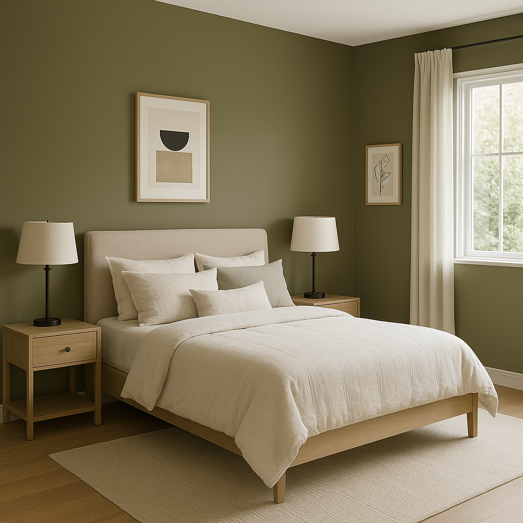
In a bedroom, Palmer offers a soothing and restful vibe. Use it on all walls for a serene retreat, or as an accent wall behind the bed for added depth. Pair it with soft linens and muted decor for a tranquil setting.
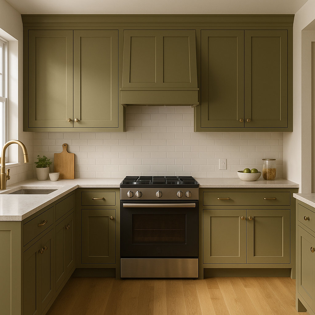
For a kitchen that feels both timeless and fresh, consider Palmer for cabinets or walls. Its green undertones pair beautifully with natural stone countertops, brass hardware, and warm wood finishes.
Palmer’s subtle sophistication works wonderfully in bathrooms, especially when paired with crisp white trim and soft blue or aqua accents. It creates a spa-like environment that feels clean and serene.
For transitional spaces like hallways or entryways, Palmer acts as the perfect neutral backdrop. Its versatility ensures it complements various artwork, furnishings, and decor styles.
Benjamin Moore Palmer is more than just a neutral paint color—it’s a timeless statement that works in harmony with both modern and traditional aesthetics. Its subtle green undertones lend a touch of individuality without overwhelming a space, and its ability to coordinate with a wide range of colors makes it a designer favorite. Whether you're aiming for a cozy, rustic feel or a sleek, contemporary look, Palmer has the versatility to bring your vision to life while adding a layer of understated sophistication.
View Colors Only by Brand (No Imagery):
Sherwin-Williams
|
Benjamin-Moore
|
Behr
|
Valspar
Live on the Eastern Slope of Colorado and looking for a local painting professional, check out all our painting services and reach out for a free estimate.
Copyright © 2026 : Wild Fox Painting Inc. : 12435 Mead Way, Littleton, CO 80125


