Benjamin Moore Burgess (CW-485) is a refined, versatile neutral from the Colonial Williamsburg collection. This shade is steeped in historic elegance, yet its understated appeal makes it an ideal choice for contemporary spaces as well. With its muted taupe-gray base, Burgess feels grounded and sophisticated, offering a timeless backdrop for interiors that range from traditional to modern.
Burgess is more than just a basic neutral. Its subtle warm undertones create a soft and inviting atmosphere, making it feel less stark than cooler grays. The earthy warmth ensures this color works beautifully in spaces where comfort and coziness are key. Depending on the lighting, it may lean slightly beige or gray, giving it a chameleon-like quality that adapts seamlessly to different environments.
The adaptability of Benjamin Moore Burgess makes it easy to pair with a wide range of colors. Below are some suggestions for coordinating hues:
Burgess is a fantastic choice for a variety of interior applications, thanks to its flexible and understated nature:
Use Burgess in living rooms or family areas to cultivate a calm, welcoming environment. Its warm undertones make it perfect for rooms where people gather and relax. Pair it with cozy textures like linen curtains or plush rugs to enhance its inviting character.
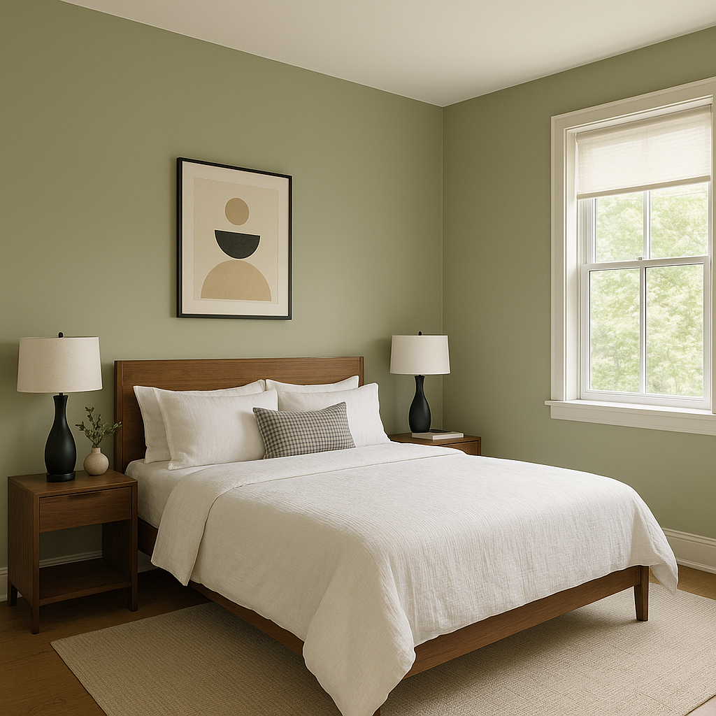
Burgess is an excellent option for bedrooms, as its muted neutrality promotes restfulness and serenity. Layer it with soft bedding in complementary tones such as cream, taupe, or dusty blue for a tranquil retreat.
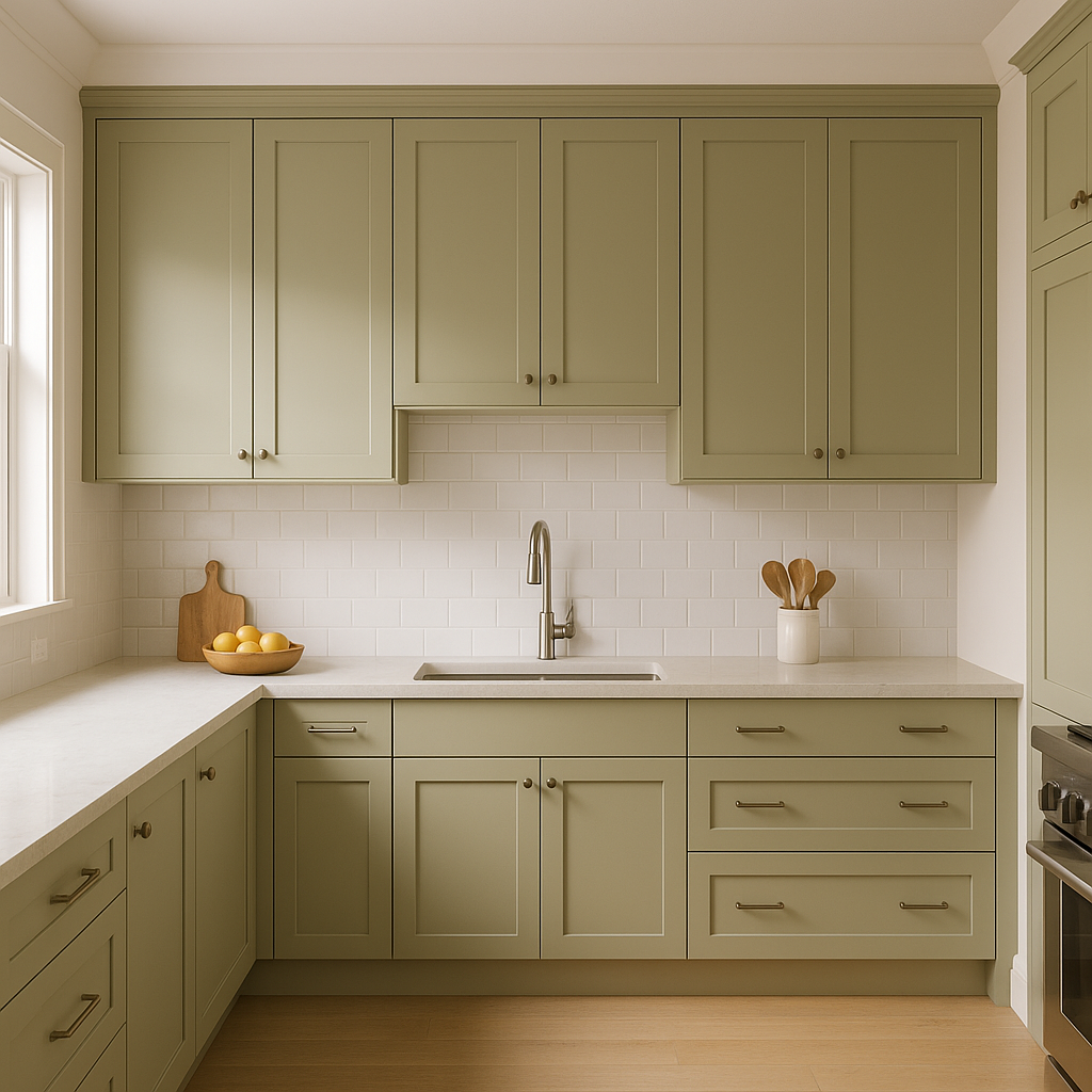
This shade works beautifully in kitchens, creating a subtle backdrop for cabinetry and countertops. Pair it with white or light wood finishes for a clean look, or opt for darker woods to bring out its warmth.
In bathrooms, Burgess lends an elegant and spa-like feel. Pair it with marble accents, polished chrome fixtures, and soft lighting to create a luxurious yet understated space.
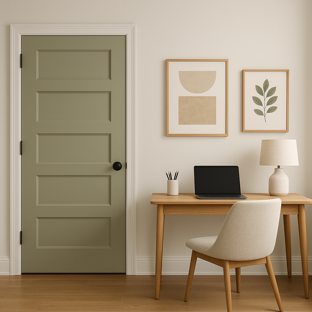
For home offices or studies, Burgess sets a productive yet soothing tone. Its versatility allows it to work well with both traditional wood furniture and modern minimalist designs.
Burgess is a fantastic choice for entryways and hallways, offering a neutral backdrop that connects adjoining rooms harmoniously. Add pops of color through artwork or furniture to personalize the space without overwhelming it.
The appearance of Burgess can vary depending on the lighting conditions. In natural light, its warm undertones shine, creating a cozy and inviting ambiance. In artificial light, particularly warm lighting, the taupe hues become more pronounced, adding depth and richness to the room. Be sure to test swatches in different lighting scenarios to see how Burgess interacts with your space.
Benjamin Moore Burgess (CW-485) is a masterclass in understated elegance and versatility. Whether you're looking to create a historic-inspired interior or a modern haven, this warm taupe-gray is a dependable choice that adapts beautifully to your design vision. Its subtle charm, combined with its ability to coordinate effortlessly with a variety of colors, makes it a standout neutral for any home or office environment.
View Colors Only by Brand (No Imagery):
Sherwin-Williams
|
Benjamin-Moore
|
Behr
|
Valspar
Live on the Eastern Slope of Colorado and looking for a local painting professional, check out all our painting services and reach out for a free estimate.
Copyright © 2026 : Wild Fox Painting Inc. : 12435 Mead Way, Littleton, CO 80125


