Benjamin Moore Colonial (CW-530) is a refined, historic hue that captures the essence of understated sophistication. This color, part of the Benjamin Moore Williamsburg® Color Collection, evokes a sense of timeless charm and authenticity, making it a versatile choice for both traditional and modern interiors.
Colonial (CW-530) is best described as a rich, muted gray-green, offering a soft yet grounded presence that works beautifully as a backdrop or a statement color. Its subtle undertones of earthy green lend warmth and depth, creating a balanced and serene atmosphere that feels connected to nature.
The undertones of Colonial (CW-530) are rooted in muted green and gray, giving the color a versatile personality. The soft green undertones add warmth and a touch of organic charm, while the gray base lends a neutral, calming quality. These undertones make Colonial (CW-530) adaptable to a variety of lighting conditions, from soft natural light to artificial warm incandescent light.
In spaces with cooler lighting, the gray aspects of the color may feel more pronounced, creating a sophisticated and slightly moody ambiance. Conversely, in areas with warmer, golden light, the green undertones will emerge more prominently, infusing the space with an inviting, earthy character.
Benjamin Moore Colonial (CW-530) pairs beautifully with a variety of complementary shades, allowing for endless design possibilities. Here are some exceptional coordinating colors:
These color pairings allow Colonial (CW-530) to shine in both monochromatic palettes and dynamic contrasts, making it ideal for creating a cohesive design.
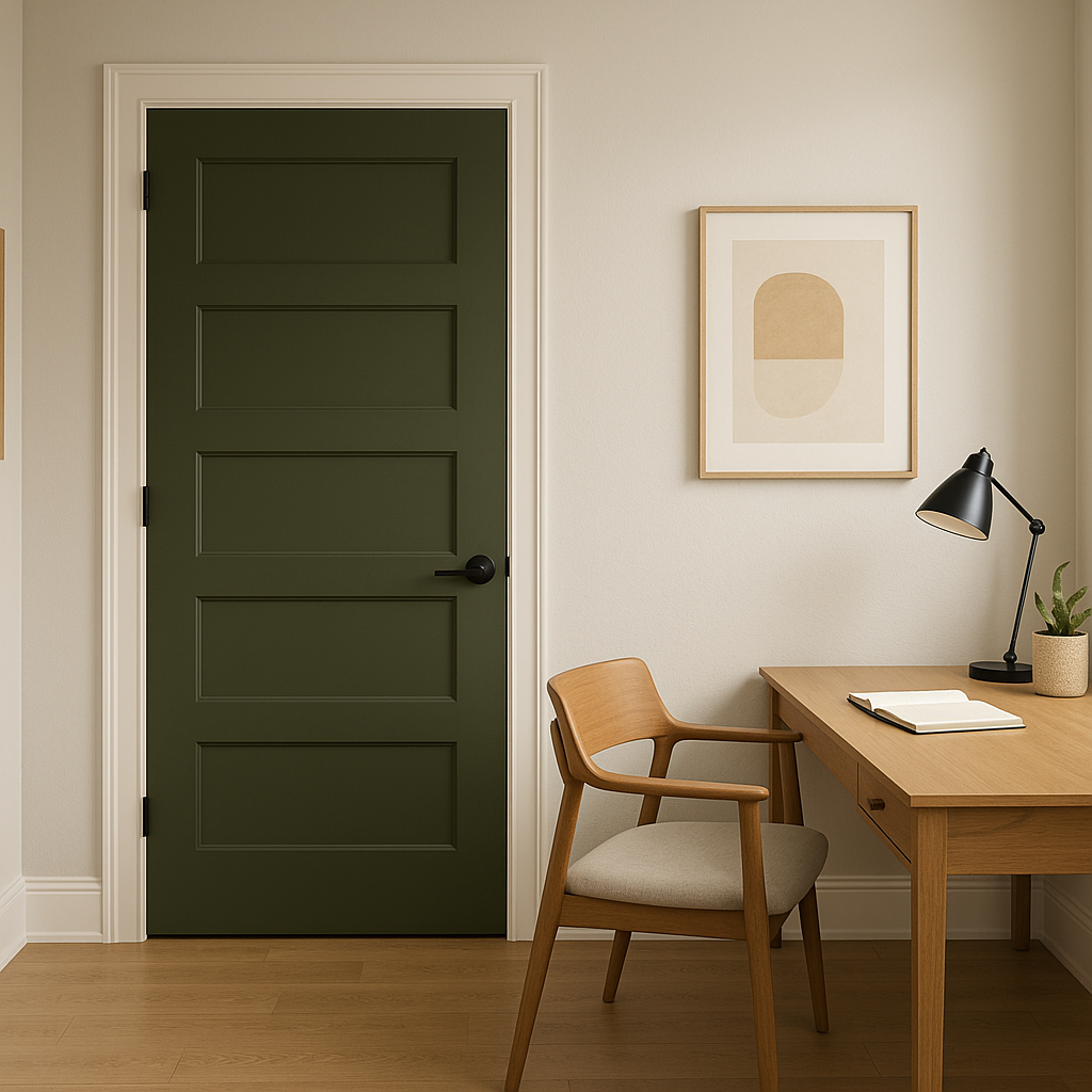
Colonial (CW-530) is an incredibly versatile color that can be used in a variety of ways throughout your home. Its historic roots make it a natural fit for spaces that celebrate traditional design, yet its muted tones feel equally at home in contemporary settings.
In living rooms, Colonial (CW-530) serves as a calming wall color that anchors the space without overpowering it. Pair it with crisp white trim for a fresh, classic look or layer it with darker accents like navy or charcoal for a dramatic edge.
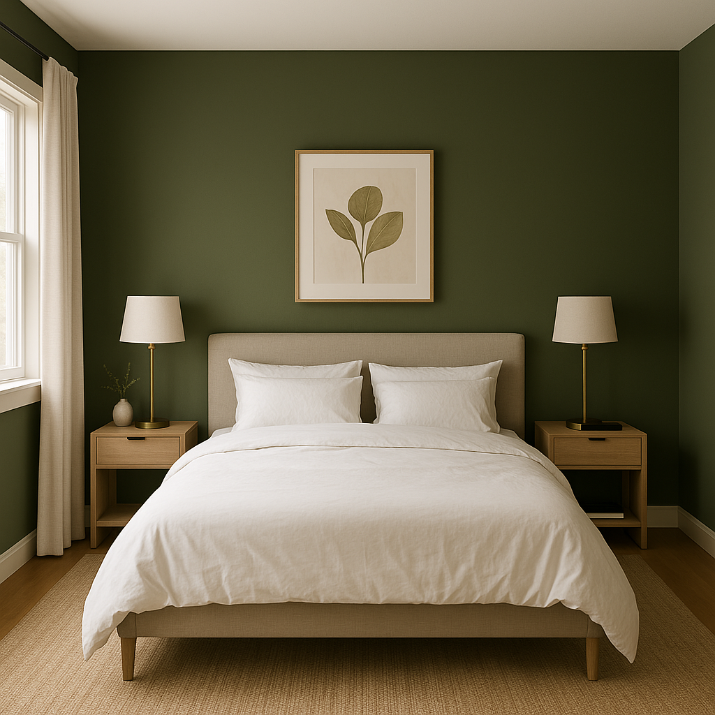
For bedrooms, Colonial offers a serene and restful ambiance, perfect for creating a sanctuary-like retreat. Coordinate it with soft linens in neutral tones or muted greens to enhance the tranquil atmosphere.
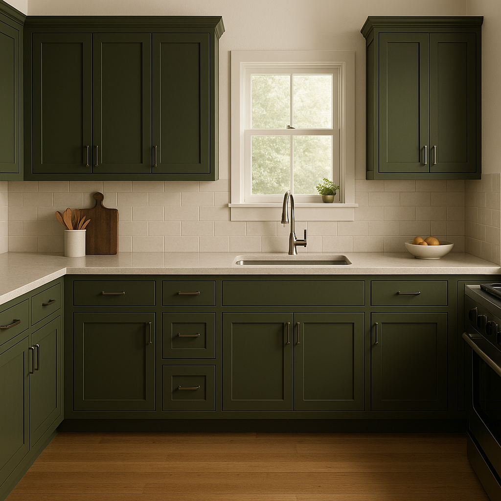
As a kitchen or dining room color, Colonial (CW-530) feels grounded and inviting. Use it on cabinetry for a vintage-inspired aesthetic or as a wall color paired with warm wood tones and brass accents.
In bathrooms, Colonial (CW-530) exudes spa-like tranquility. Pair it with white subway tiles, marble countertops, and brushed nickel fixtures for a timeless and elegant look.
Colonial (CW-530) translates beautifully to exterior applications as well. Whether used for siding or accents, its muted gray-green tone complements natural surroundings and traditional architectural styles. Pair it with crisp white trim and black shutters for an iconic look, or integrate it with earthy stone finishes for a rustic vibe.
Benjamin Moore Colonial (CW-530) is more than just a color; it’s a design statement that bridges history and modernity. Whether you're creating a cozy retreat or an elegant gathering space, this timeless hue offers versatility, sophistication, and an undeniable sense of charm.
View Colors Only by Brand (No Imagery):
Sherwin-Williams
|
Benjamin-Moore
|
Behr
|
Valspar
Live on the Eastern Slope of Colorado and looking for a local painting professional, check out all our painting services and reach out for a free estimate.
Copyright © 2026 : Wild Fox Painting Inc. : 12435 Mead Way, Littleton, CO 80125


