Benjamin Moore Spotswood CW-545 is a rich, sophisticated paint color from the brand's Historic Collection. This shade exudes timeless charm and is perfect for creating a refined, grounded atmosphere in any space. With its deep, muted green tone, Spotswood CW-545 is a versatile choice that bridges the gap between classic and contemporary design styles. Its restrained yet impactful presence makes it a favorite among interior designers for both residential and commercial spaces.
Spotswood CW-545 is a deep olive green with warm undertones. The earthy base gives it a welcoming and organic feel, while subtle hints of brown and gray add depth and complexity. These undertones allow it to adapt beautifully to various lighting conditions. In natural light, it leans into its green richness, while under artificial light, the brown and gray undertones become more pronounced, creating a cozy and intimate ambiance.
Benjamin Moore Spotswood CW-545 pairs effortlessly with a variety of neutral and accent shades, making it a highly versatile choice for diverse design schemes. Here are some complementary colors to consider:
Spotswood CW-545’s versatility makes it suitable for a wide range of applications, from traditional interiors to modern, eclectic spaces. Here are some ideas on how to use this color:
Create a warm and inviting living space by using Spotswood CW-545 on the walls. Pair it with neutral furniture and gold or brass accents to add a touch of luxury. This color works particularly well in rooms with ample natural light, where its green tones can shine.
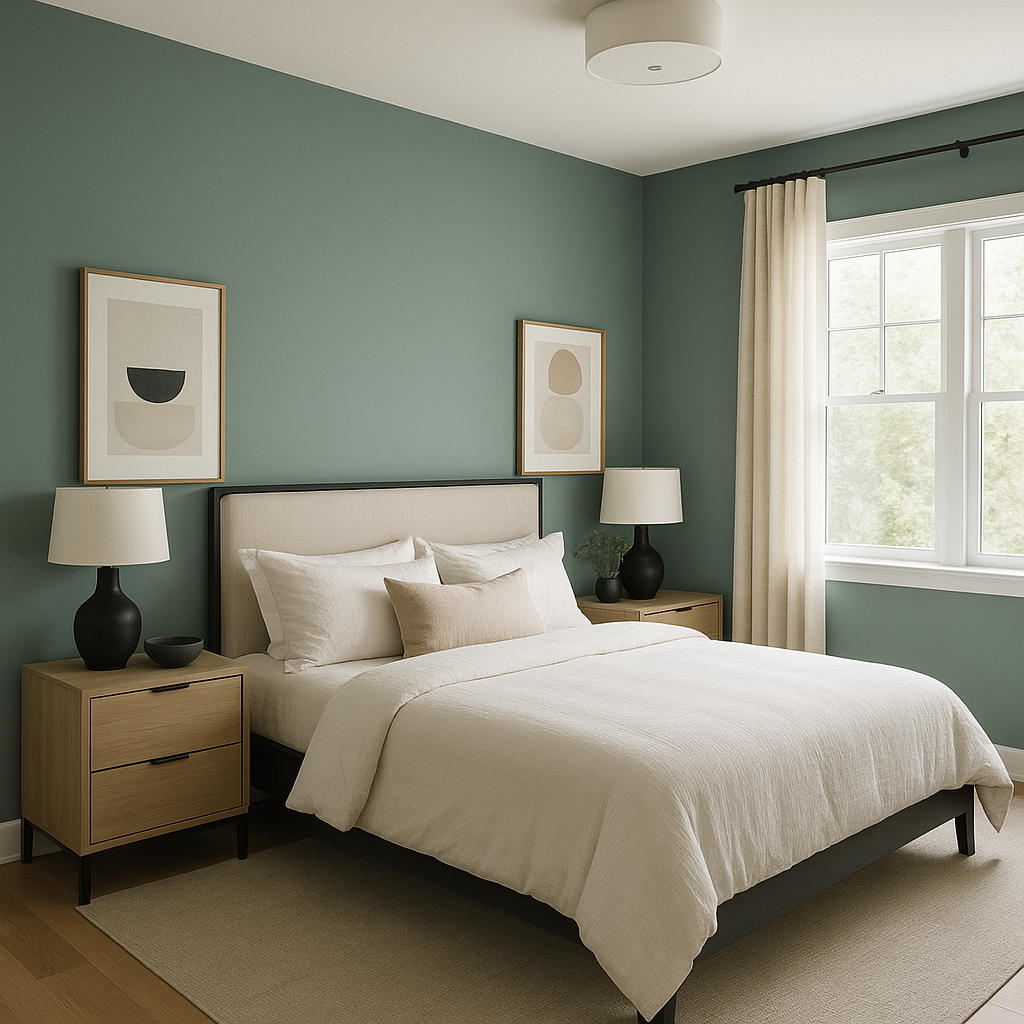
For a cozy and serene retreat, use Spotswood CW-545 on an accent wall behind the bed. Combine it with soft, neutral bedding and warm wood furniture for a restful aesthetic.
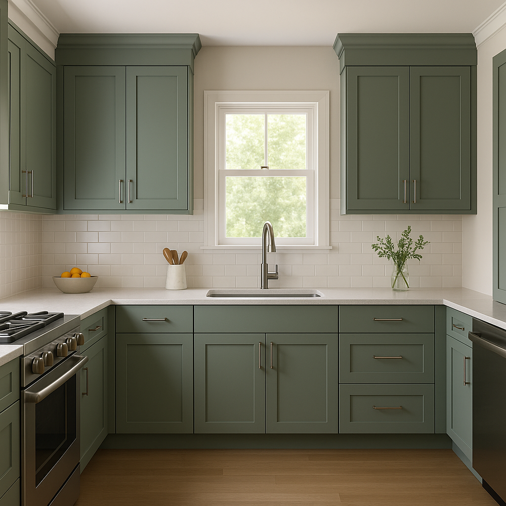
Spotswood CW-545 is an excellent choice for cabinetry in kitchens or built-ins in dining rooms. Pair it with white subway tiles or marble countertops for a clean, classic look that feels both modern and timeless.
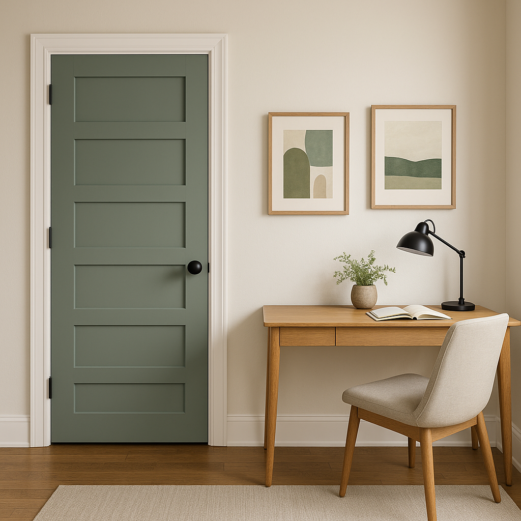
This shade fosters focus and productivity, making it a great option for a home office. Use it on the walls or as a backdrop for shelving to create a sophisticated work environment.
On exteriors, Spotswood CW-545 offers a stately, historic appeal. Use it on siding, shutters, or doors for a striking yet understated appearance. It pairs beautifully with white trim and natural wood tones.
Benjamin Moore Spotswood CW-545 stands out for its ability to blend seamlessly into both classic and contemporary designs. Its warm undertones and muted depth make it a versatile color that complements a variety of architectural styles and interior aesthetics. Whether you’re looking to create a tranquil bedroom, a statement-making kitchen, or a timeless exterior, Spotswood CW-545 delivers a sense of understated elegance that will stand the test of time.
View Colors Only by Brand (No Imagery):
Sherwin-Williams
|
Benjamin-Moore
|
Behr
|
Valspar
Live on the Eastern Slope of Colorado and looking for a local painting professional, check out all our painting services and reach out for a free estimate.
Copyright © 2026 : Wild Fox Painting Inc. : 12435 Mead Way, Littleton, CO 80125


