Benjamin Moore Randolph (CW-615) is a sophisticated and versatile hue that effortlessly bridges the gap between classic and contemporary design. Part of the Colonial Williamsburg collection, this shade evokes a sense of history while remaining perfectly suited to modern interiors. Randolph is a medium-toned gray with subtle undertones that give it depth, making it an ideal choice for creating a refined yet approachable ambiance in any space.
One of the defining characteristics of Randolph is its understated warmth. While it is primarily a gray, it carries soft beige undertones that lend it a greige quality. This warm undertone prevents it from feeling too stark or cold, making it a cozy neutral that works beautifully in spaces where comfort and elegance are equally desired. In different lighting conditions, Randolph may lean slightly warmer or cooler, offering subtle shifts in mood throughout the day.
Randolph pairs seamlessly with a range of complementary hues, allowing you to create a cohesive and harmonious palette for your home. Here are some coordinating colors that work exceptionally well:
These coordinating colors allow Randolph to shine in various design schemes, whether you’re aiming for a timeless colonial-inspired look or a more modern vibe.
Randolph’s balanced, medium tone makes it a versatile choice for nearly any room or design style. Here are some ideas for incorporating this elegant gray into your home:
In living spaces, Randolph creates a grounding backdrop that enhances both bold and understated furnishings. Pair it with soft, neutral upholstery and natural wood accents for a warm and inviting atmosphere. Alternatively, introduce vibrant throw pillows or artwork to add pops of color against Randolph’s calming base.
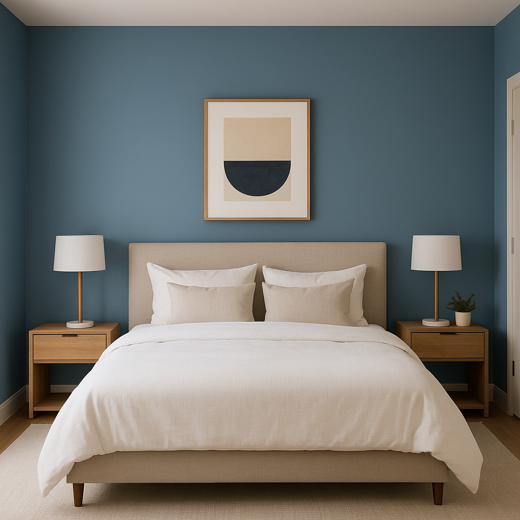
For bedrooms, Randolph fosters a serene and restful environment. Combine it with crisp white bedding and textured fabrics for a sophisticated retreat. Adding metallic accents like brushed gold or antique brass in lighting or hardware can elevate the space further.
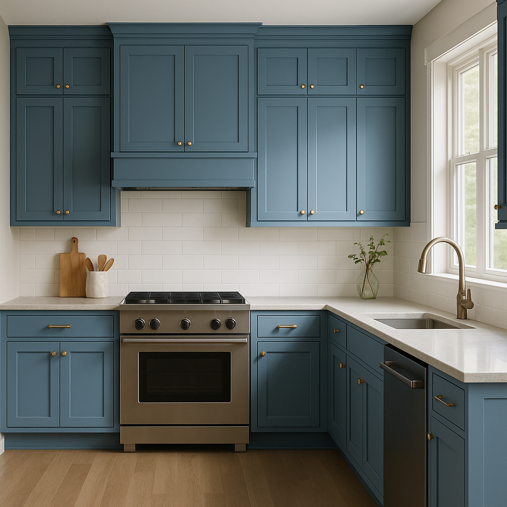
Randolph is an excellent choice for kitchen cabinetry or walls. Its understated warmth pairs beautifully with marble or quartz countertops and white subway tile backsplashes. Add polished nickel or matte black hardware for a modern touch.
In bathrooms, Randolph offers a spa-like quality when paired with soft whites and natural stone. Use it on walls for a soothing effect, or opt for it as a vanity color to create a focal point in the space.
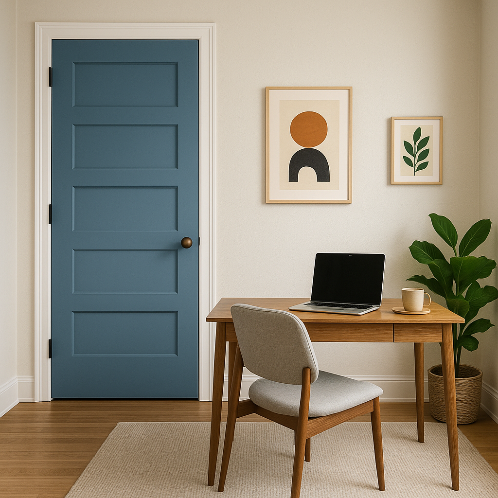
For home offices, Randolph delivers a professional yet inviting atmosphere. Pair it with traditional wood furniture and navy accents for a timeless look, or incorporate modern elements like sleek desks and minimalist décor for a contemporary workspace.
Like all paints, Randolph will shift subtly depending on the lighting in your space. In rooms with ample natural light, its beige undertones may become more pronounced, creating a warmer feel. In spaces with artificial or cooler lighting, it leans more toward a true gray. Testing Randolph in different areas of your home before committing to it is always a good idea to ensure it aligns with your desired aesthetic.
With its timeless appeal and versatility, Randolph (CW-615) is a color that complements both traditional and modern design sensibilities. Its ability to adapt across various lighting conditions, pair well with a wide spectrum of hues, and evoke a sense of calm makes it an excellent choice for homeowners and designers alike. Whether you’re striving for a period-inspired look or a fresh, updated aesthetic, Randolph delivers understated elegance and enduring charm.
Transform your space with Benjamin Moore Randolph (CW-615), and experience the perfect balance of classic sophistication and modern versatility.
View Colors Only by Brand (No Imagery):
Sherwin-Williams
|
Benjamin-Moore
|
Behr
|
Valspar
Live on the Eastern Slope of Colorado and looking for a local painting professional, check out all our painting services and reach out for a free estimate.
Copyright © 2026 : Wild Fox Painting Inc. : 12435 Mead Way, Littleton, CO 80125


