Benjamin Moore Pearl (CW-640) is a refined and versatile neutral that exudes understated sophistication. Part of the Colonial Williamsburg collection, this shade seamlessly blends historical charm with modern sensibilities, making it a perfect choice for homeowners and designers seeking a timeless aesthetic. Its soft, creamy beige tone is warm yet restrained, lending an air of tranquility to any space it inhabits. Whether you're designing a cozy living room, a serene bedroom, or a welcoming entryway, Pearl's adaptability makes it a standout choice.
Pearl (CW-640) has delicate undertones of beige and gray, giving it a balanced warmth that avoids leaning too yellow or too cool. These subtle undertones allow it to harmonize effortlessly with a wide range of palettes, while maintaining its neutrality. The gray undertones provide a grounding effect, ensuring the color feels modern and sophisticated, while the beige warmth introduces an inviting softness. This gentle interplay between warm and cool makes Pearl ideal for spaces that require a calming and versatile backdrop.
Benjamin Moore Pearl pairs beautifully with a variety of complementary shades, allowing for endless design possibilities. Here are a few coordinating color suggestions:
This neutral shade is incredibly versatile, making it suitable for a wide range of applications across different interior styles. Here are a few ways to incorporate Pearl into your home design:
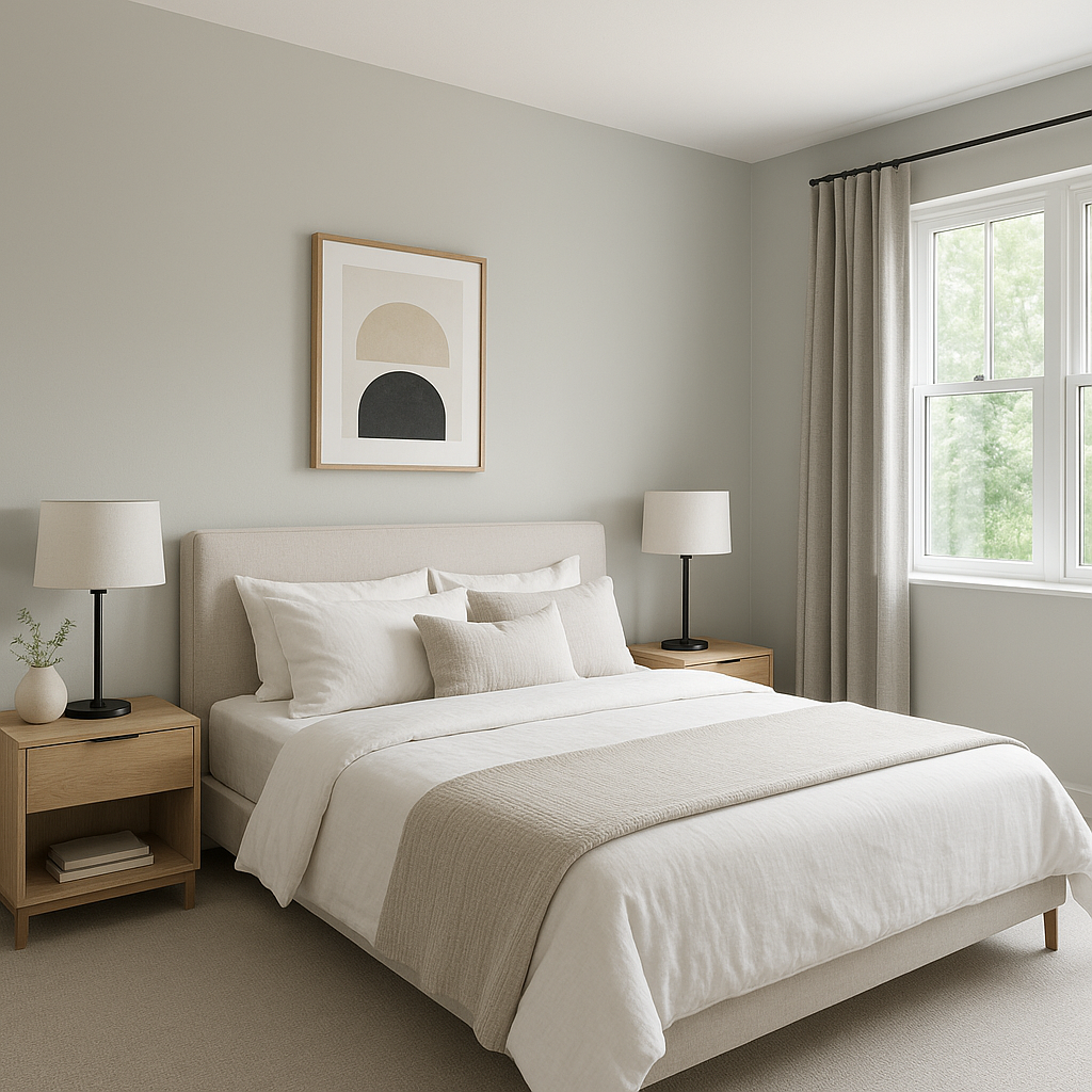
Pearl is an excellent choice for walls in any room where you want to create a soothing, neutral backdrop. Its warmth makes it ideal for living areas, dining rooms, and bedrooms, while its subtle gray undertones ensure it feels modern in contemporary spaces.
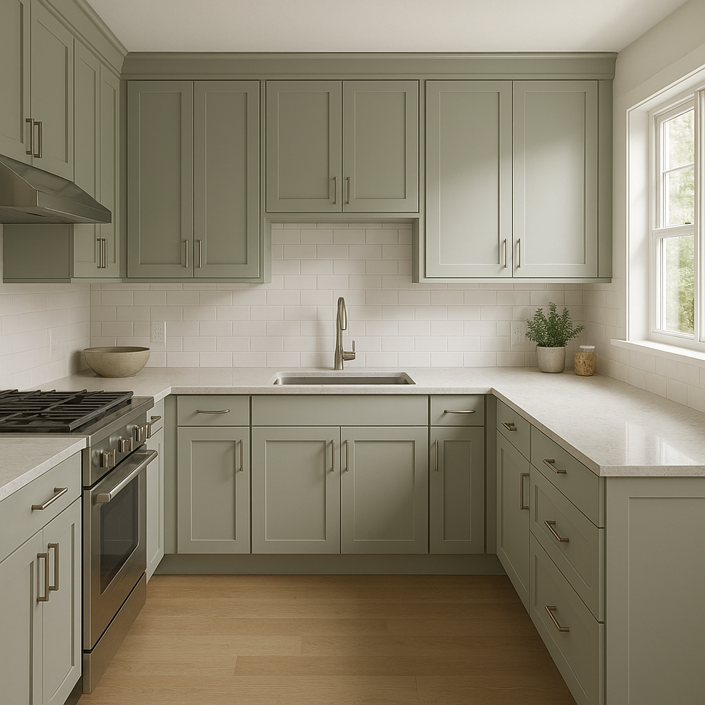
For kitchen cabinetry, Pearl offers a soft and inviting alternative to stark whites. Pair it with brushed brass or matte black hardware for a striking combination that feels both timeless and fresh.
In open-concept layouts, Pearl works beautifully as a unifying color that ties together adjoining spaces. Its neutrality ensures it transitions seamlessly between living, dining, and kitchen areas without overwhelming the design.
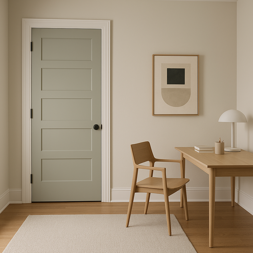
Pearl can also be used on ceilings and trim to create a more cohesive look within a room. It’s particularly effective in spaces with architectural detailing, where its soft tone enhances crown moldings, wainscoting, or coffered ceilings.
Thanks to its origins in the Colonial Williamsburg collection, Pearl is an excellent choice for historically inspired interiors. However, its understated elegance also makes it incredibly adaptable to modern minimalism, coastal chic, and even Scandinavian design styles.
Benjamin Moore Pearl (CW-640) is a masterful neutral that brings sophistication, warmth, and versatility to your design palette. Whether used as a primary wall color or an accent within a larger scheme, it serves as the perfect foundation for creating inviting and elegant interiors.
View Colors Only by Brand (No Imagery):
Sherwin-Williams
|
Benjamin-Moore
|
Behr
|
Valspar
Live on the Eastern Slope of Colorado and looking for a local painting professional, check out all our painting services and reach out for a free estimate.
Copyright © 2026 : Wild Fox Painting Inc. : 12435 Mead Way, Littleton, CO 80125


