Benjamin Moore Carter (CW-80) is an exceptional paint color that embodies sophistication and understated charm. Part of the esteemed Colonial Williamsburg collection, this hue draws inspiration from the rich history and carefully curated aesthetics of Williamsburg homes. Carter is a soft, warm off-white that feels classic yet versatile, allowing it to seamlessly enhance both traditional and modern spaces. Whether you're refreshing your walls, trim, or cabinetry, Carter creates an inviting and harmonious backdrop for a wide variety of design styles.
Carter (CW-80) is a warm neutral with subtle beige undertones that lend it a creamy softness. Its warmth makes it more approachable than stark whites, yet it remains light enough to brighten a space. Beneath its refined surface, you may notice the faintest hint of gray, which prevents it from veering too yellow, ensuring balance and versatility. This gentle interplay of undertones allows Carter to adapt beautifully to different lighting conditions—appearing warmer in direct sunlight and slightly more muted in dimmer settings.
Benjamin Moore Carter (CW-80) pairs effortlessly with a wide range of coordinating colors, making it a dream choice for designing harmonious palettes.
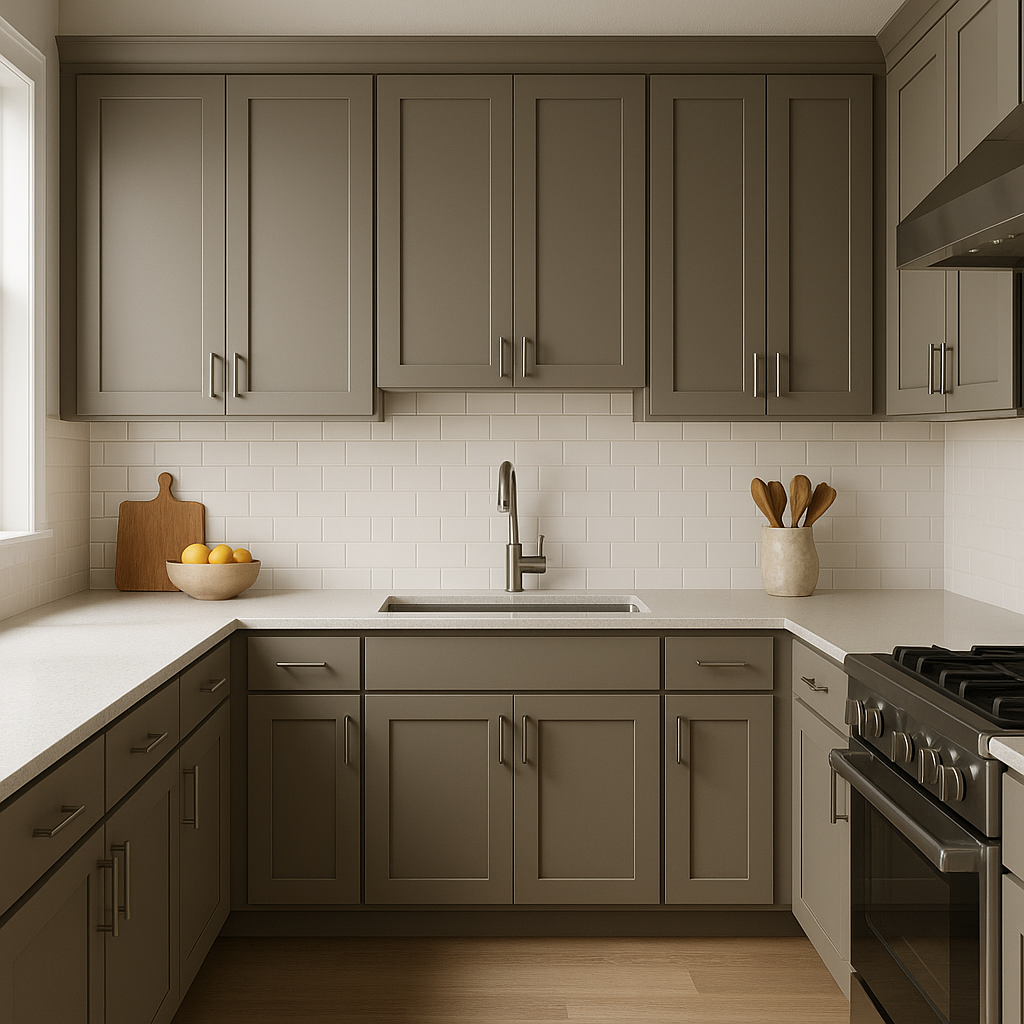
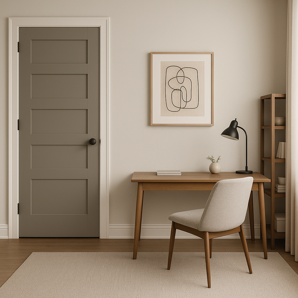
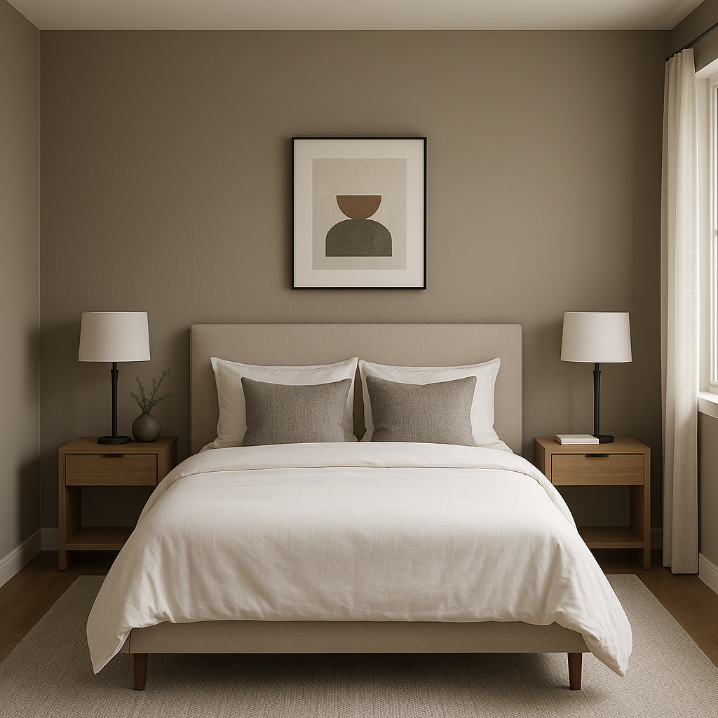
Carter’s versatility makes it an excellent choice for a variety of applications throughout your home. Its warm, inviting tone works well in spaces where comfort and elegance are key.
Benjamin Moore Carter (CW-80) is a testament to timeless design and adaptability. With its warm beige undertones and creamy softness, it brings a sense of balance and refinement to any interior. Whether you're aiming for a traditional Colonial aesthetic or blending old-world charm with modern sensibilities, Carter delivers a polished and inviting look that will elevate your space for years to come.
View Colors Only by Brand (No Imagery):
Sherwin-Williams
|
Benjamin-Moore
|
Behr
|
Valspar
Live on the Eastern Slope of Colorado and looking for a local painting professional, check out all our painting services and reach out for a free estimate.
Copyright © 2026 : Wild Fox Painting Inc. : 12435 Mead Way, Littleton, CO 80125


