Benjamin Moore Tate (HC-112) is a sophisticated and versatile mid-tone neutral that effortlessly balances warmth and depth. As part of Benjamin Moore's Historical Collection, it draws inspiration from classic architecture and historical landmarks, making it an excellent choice for creating spaces that feel both grounded and elegant. Its understated charm makes Tate a favorite among interior designers for its ability to complement a wide variety of design styles, from traditional to modern.
Tate (HC-112) is a warm taupe with subtle gray undertones that add a hint of softness and sophistication. The beige foundation ensures warmth, while the gray undertones prevent it from feeling too yellow or overly saturated. This balanced combination makes Tate a highly adaptable neutral, perfect for spaces that need a cozy yet refined atmosphere.
Its undertones work beautifully in rooms that receive both natural and artificial light. In brighter settings, Tate leans slightly toward a soft greige, whereas in lower-light conditions, its warm taupe character becomes more pronounced. This dynamic quality ensures that Tate complements a wide spectrum of lighting environments without feeling flat or dull.
One of the strengths of Benjamin Moore Tate is its ability to pair seamlessly with other hues, making it a versatile backdrop for both bold accents and muted palettes.
Tate's versatility makes it suitable for a wide range of interior applications. Whether you're designing a cozy family room or a professional office, this neutral hue provides a polished backdrop for your decor.
Tate is ideal for living rooms where you want warmth without heaviness. Pair it with plush fabrics and textured accents to create a welcoming space. Add pops of color through throw pillows or artwork for a dynamic yet balanced aesthetic.
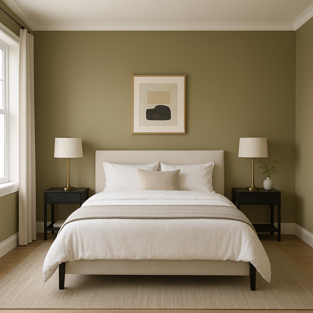
With its soothing taupe-gray undertones, Tate offers a calming vibe perfect for bedrooms. Coordinate it with soft linens, warm wood furniture, and muted accent colors to create a tranquil retreat.
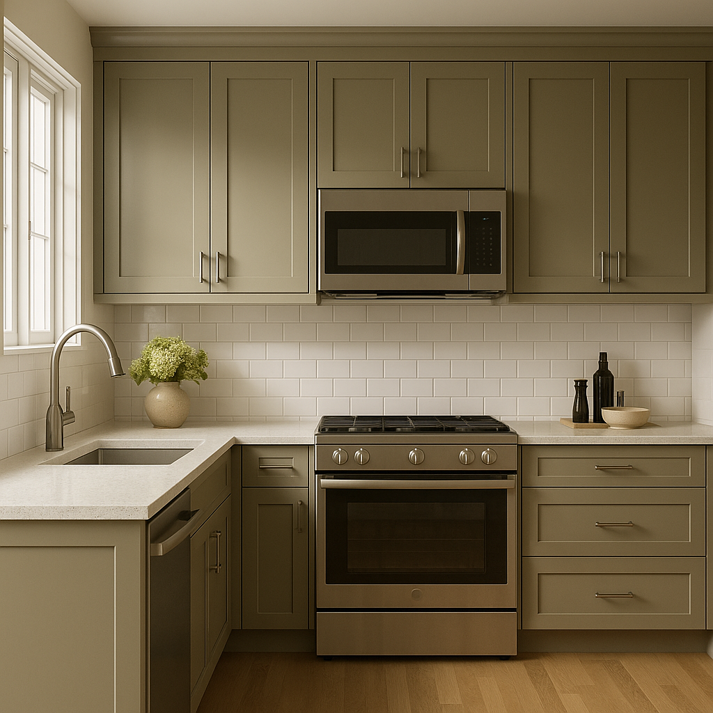
Tate works beautifully in kitchens, especially alongside white or off-white cabinetry. Its neutral tone complements stainless steel appliances and natural stone countertops, creating a timeless and cohesive look.
For bathrooms, Tate adds warmth without overwhelming small spaces. Pair it with crisp whites like White Dove for a clean and airy feel, or introduce metallic fixtures for a modern touch.
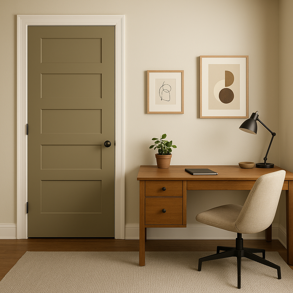
Tate is an excellent choice for transitional spaces like hallways and entryways. Its neutral tone sets the stage for other design elements while maintaining an inviting ambiance.
Benjamin Moore Tate is a timeless, elegant choice for those seeking a neutral color that adapts beautifully to different styles and spaces. Its warm taupe-gray undertones strike the perfect balance between cozy and refined, making it a reliable and sophisticated backdrop for any interior. Whether you're redecorating a single room or designing an entire home, Tate's versatility ensures that it will remain a classic staple for years to come.
View Colors Only by Brand (No Imagery):
Sherwin-Williams
|
Benjamin-Moore
|
Behr
|
Valspar
Live on the Eastern Slope of Colorado and looking for a local painting professional, check out all our painting services and reach out for a free estimate.
Copyright © 2026 : Wild Fox Painting Inc. : 12435 Mead Way, Littleton, CO 80125


