Benjamin Moore Van (HC-120) is a versatile, soft green-gray hue that exudes calm sophistication. Part of Benjamin Moore's Historical Collection, this shade is steeped in timeless elegance, making it an excellent choice for a wide variety of design styles, from classic to contemporary. Its understated charm and subtlety allow it to complement both bold and muted palettes, making it a favorite among interior designers and homeowners alike.
Van (HC-120) has a beautifully balanced mix of green and gray undertones. The green leans toward a soft sage, offering a natural, organic feel, while the gray lends a subtle coolness that keeps the color grounded and refined. Depending on your lighting conditions, Van may appear slightly warmer or cooler, making it a chameleon-like neutral that adapts to its surroundings. In natural light, the green undertones are more pronounced, creating a soothing, earthy vibe. In artificial or dim lighting, the gray takes center stage, giving the space a more modern and sophisticated edge.
Creating a cohesive color palette with Van (HC-120) is effortless, thanks to its versatile nature. Here are some coordinating colors to consider:
These color pairings allow you to explore a range of styles, from airy and light to dramatic and moody, depending on the atmosphere you want to create.
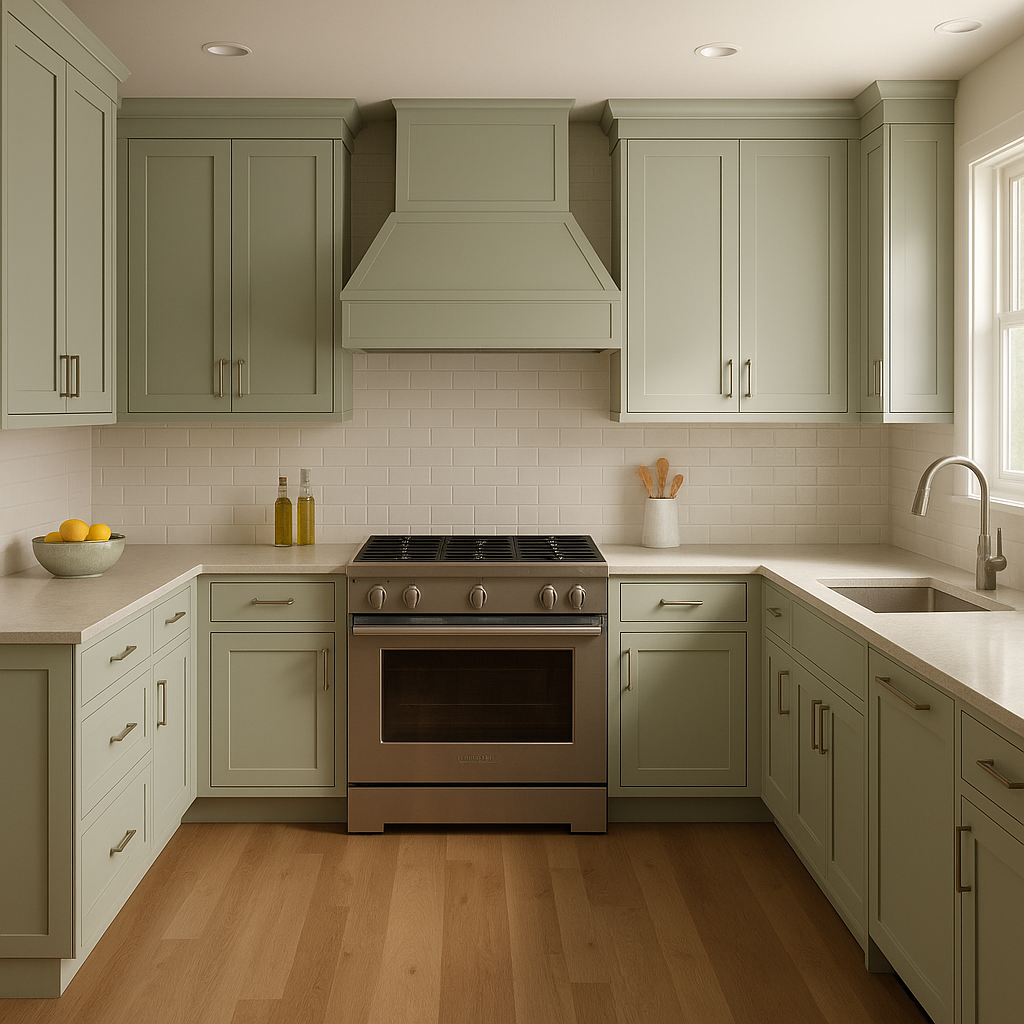
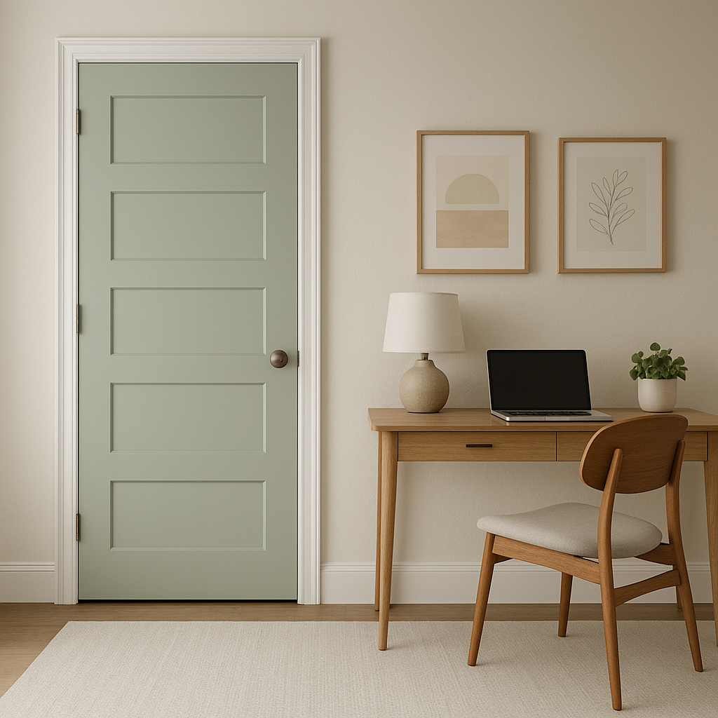
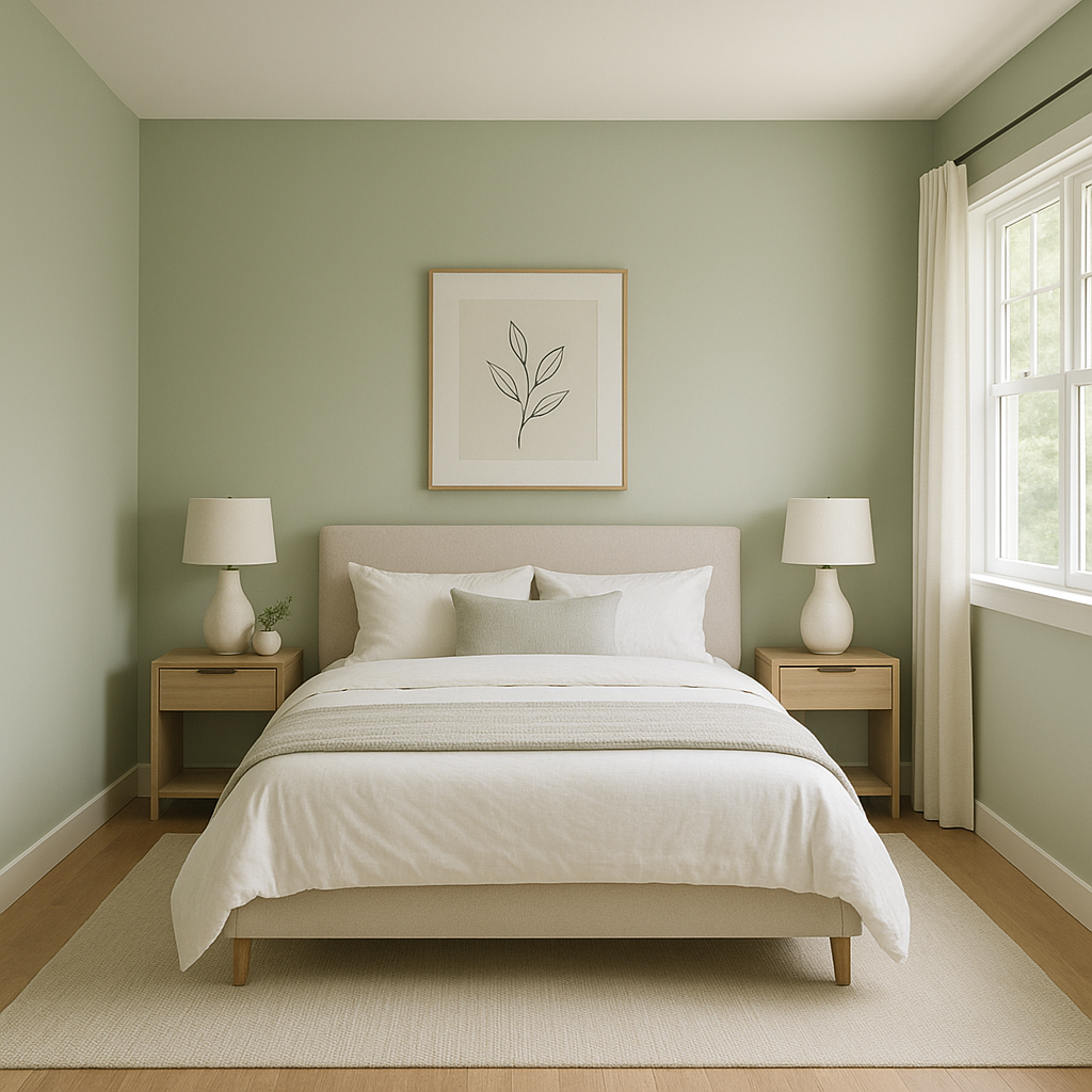
Van’s gentle and adaptable qualities make it suitable for a wide array of applications throughout your home. Here are some ideas for incorporating this stunning color into your spaces:
Benjamin Moore Van (HC-120) is a stunning neutral that seamlessly bridges the gap between green and gray. Its ability to adapt to different lighting and design styles makes it a go-to choice for interior designers and homeowners alike. Whether you’re aiming for a serene retreat, a modern aesthetic, or a classic look, Van is a color that delivers understated elegance and timeless charm.
View Colors Only by Brand (No Imagery):
Sherwin-Williams
|
Benjamin-Moore
|
Behr
|
Valspar
Live on the Eastern Slope of Colorado and looking for a local painting professional, check out all our painting services and reach out for a free estimate.
Copyright © 2026 : Wild Fox Painting Inc. : 12435 Mead Way, Littleton, CO 80125


