Benjamin Moore Peale Green (HC-121) is a sophisticated and versatile shade that effortlessly marries tradition with contemporary flair. Named after Charles Willson Peale, an American painter and naturalist from the 18th century, this historic color is part of Benjamin Moore’s iconic Historical Collection, celebrated for its classic and enduring appeal. Peale Green is the perfect choice for creating spaces that exude warmth, richness, and refinement while maintaining a welcoming atmosphere.
Peale Green is a deep, muted green with subtle gray undertones that lend it a soft, velvety character. These gray undertones help balance its richness, preventing it from feeling overly saturated or overwhelming. The result is a color that feels grounded and sophisticated, making it adaptable to a wide range of interior styles. The green itself leans slightly warm, which adds a sense of coziness to the spaces it inhabits, while the gray undertones provide a calming, neutralizing effect.
Peale Green pairs beautifully with an array of complementary and contrasting shades, allowing for endless design possibilities. Here are some coordinating colors to consider:
Warm Neutrals: Colors like Benjamin Moore White Dove (OC-17) or Benjamin Moore Edgecomb Gray (HC-173) create a harmonious and balanced palette. The warmth of these neutrals enhances the subtle warmth of Peale Green, offering a classic and understated look.
Creamy Whites: For a crisp and elegant contrast, pair Peale Green with creamy whites such as Benjamin Moore Simply White (OC-117). This combination can brighten the space while maintaining a timeless aesthetic.
Earthy Browns: Shades like Benjamin Moore Kendall Charcoal (HC-166) or Alexandria Beige (HC-77) complement Peale Green’s natural qualities, resulting in a rich and grounded design.
Soft Blues: To add a touch of lightness and tranquility, consider pairing Peale Green with soft blues like Benjamin Moore Smoke (2122-40) or Woodlawn Blue (HC-147). These cooler tones bring balance to the warmth of Peale Green.
Gold and Brass Accents: Metallic accents in gold or brass work exceptionally well with Peale Green, enhancing its luxurious appeal.
Peale Green is a remarkably versatile color that can be used in a variety of settings to create different moods:
Peale Green is an excellent choice for living rooms where you want to cultivate a cozy yet elegant atmosphere. It works beautifully as a wall color paired with crisp white trim and natural wood furniture. Layering textures like velvet, leather, or linen in coordinating shades can enhance the richness of the room.
For a formal yet inviting dining room, Peale Green serves as a stunning backdrop for furniture in dark wood finishes. Pair it with brass or gold accents in light fixtures, mirrors, or tableware to elevate the space’s sophistication.
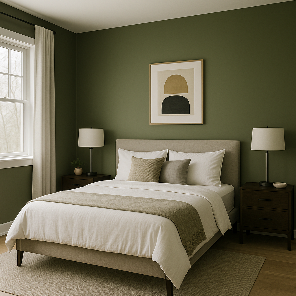
In the bedroom, Peale Green promotes relaxation and serenity. Use it on the walls and pair it with soft bedding in neutral tones like cream or taupe for a calming retreat. Accent pillows or throws in complementary colors like muted blues can add depth and interest.
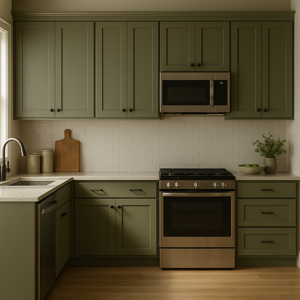
Peale Green is a bold yet refined choice for kitchen cabinetry. Pair it with white subway tile backsplashes, marble countertops, and brushed gold hardware for a fresh and modern look. Alternatively, use it as an accent color on a kitchen island to ground the space.
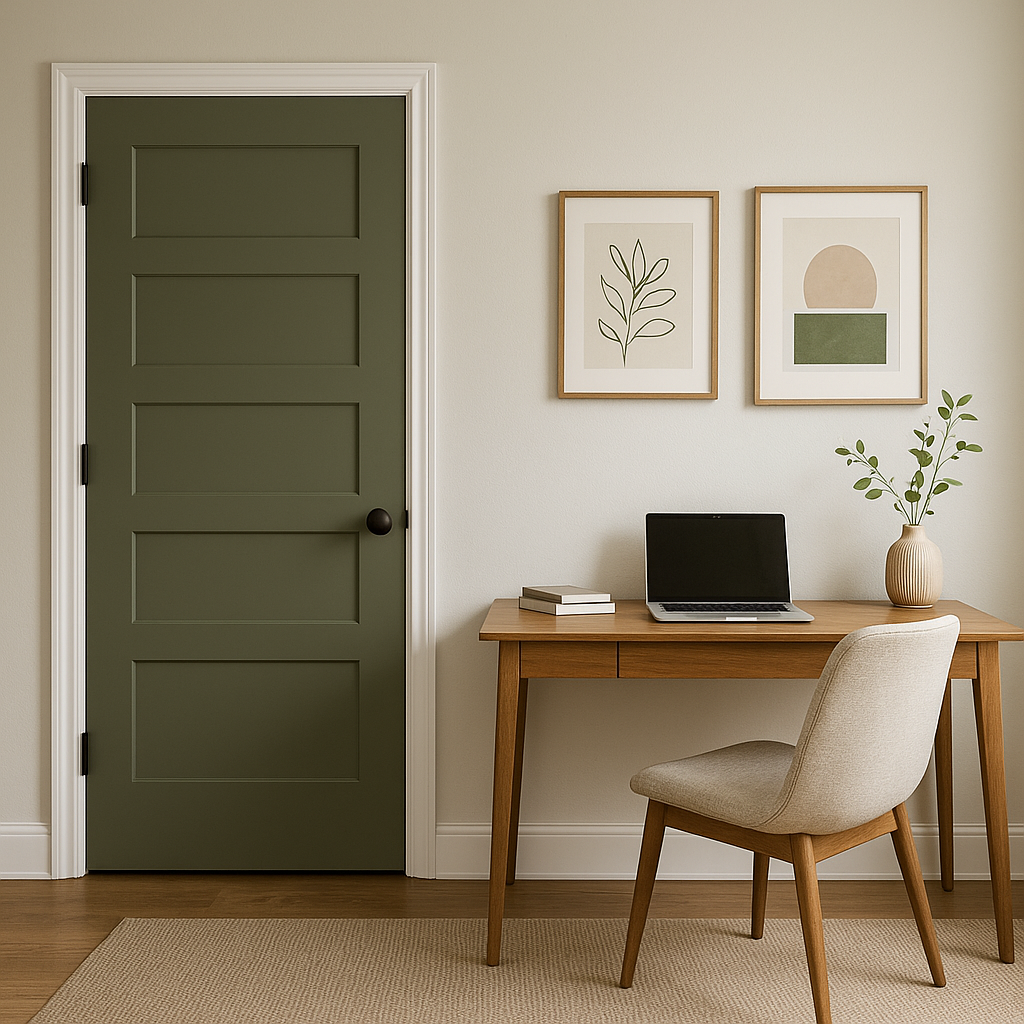
For a productive and inspiring home office, Peale Green can create a sense of focus and calm. Pair it with natural wood desks and shelves, along with white or light gray accessories, to maintain a balanced and professional aesthetic.
Make a memorable first impression by using Peale Green in your entryway. This color sets the tone for a welcoming and sophisticated home. Add a console table in a dark wood finish and decorative accents in brass or copper for a cohesive look.
Peale Green is ideal for homeowners and designers seeking a color that feels both timeless and versatile. Its ability to adapt to traditional, transitional, and modern designs makes it a go-to choice for creating spaces that feel elegant yet approachable. Whether you’re looking to design a cozy retreat or a statement-making room, Peale Green offers the perfect balance of richness and subtlety.
Benjamin Moore Peale Green (HC-121) is more than just a paint color; it’s a design tool that allows you to craft spaces that are as functional as they are beautiful. By pairing it with thoughtfully chosen coordinating colors and utilizing its depth and warmth, you can effortlessly transform any room into a masterpiece.
View Colors Only by Brand (No Imagery):
Sherwin-Williams
|
Benjamin-Moore
|
Behr
|
Valspar
Live on the Eastern Slope of Colorado and looking for a local painting professional, check out all our painting services and reach out for a free estimate.
Copyright © 2026 : Wild Fox Painting Inc. : 12435 Mead Way, Littleton, CO 80125


